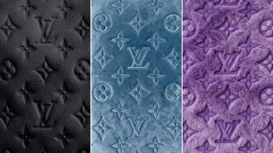
Luxury Impasto Oil Painting Wallpapers for iPhone (4K)
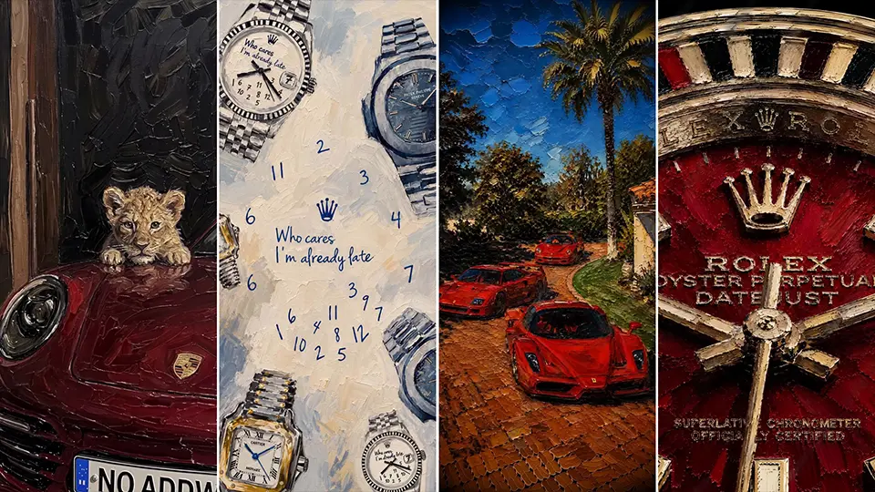
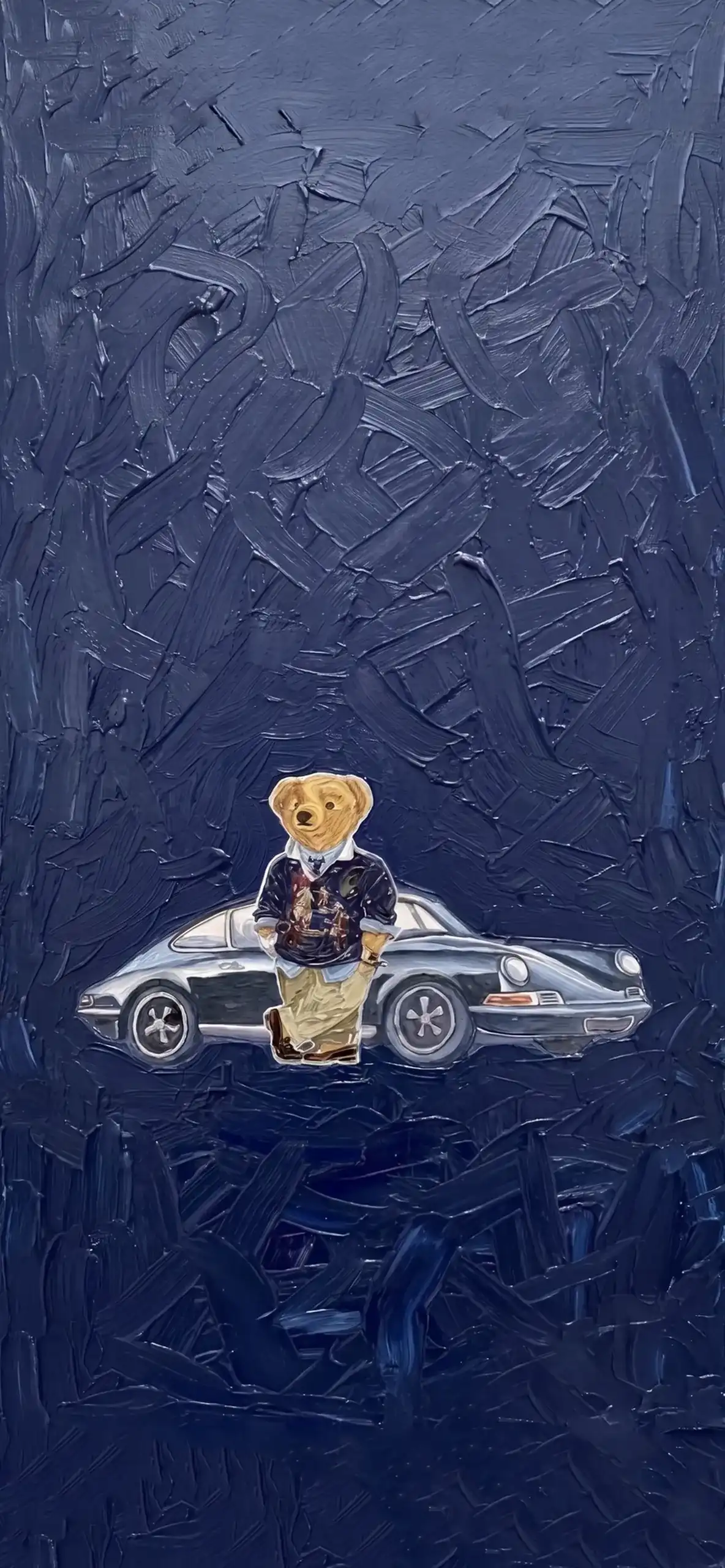
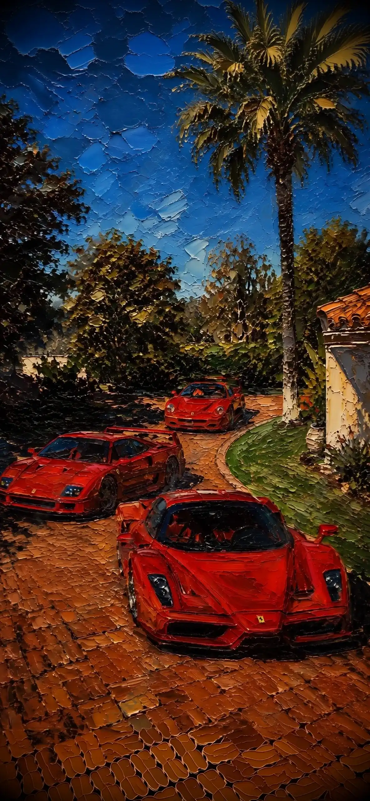
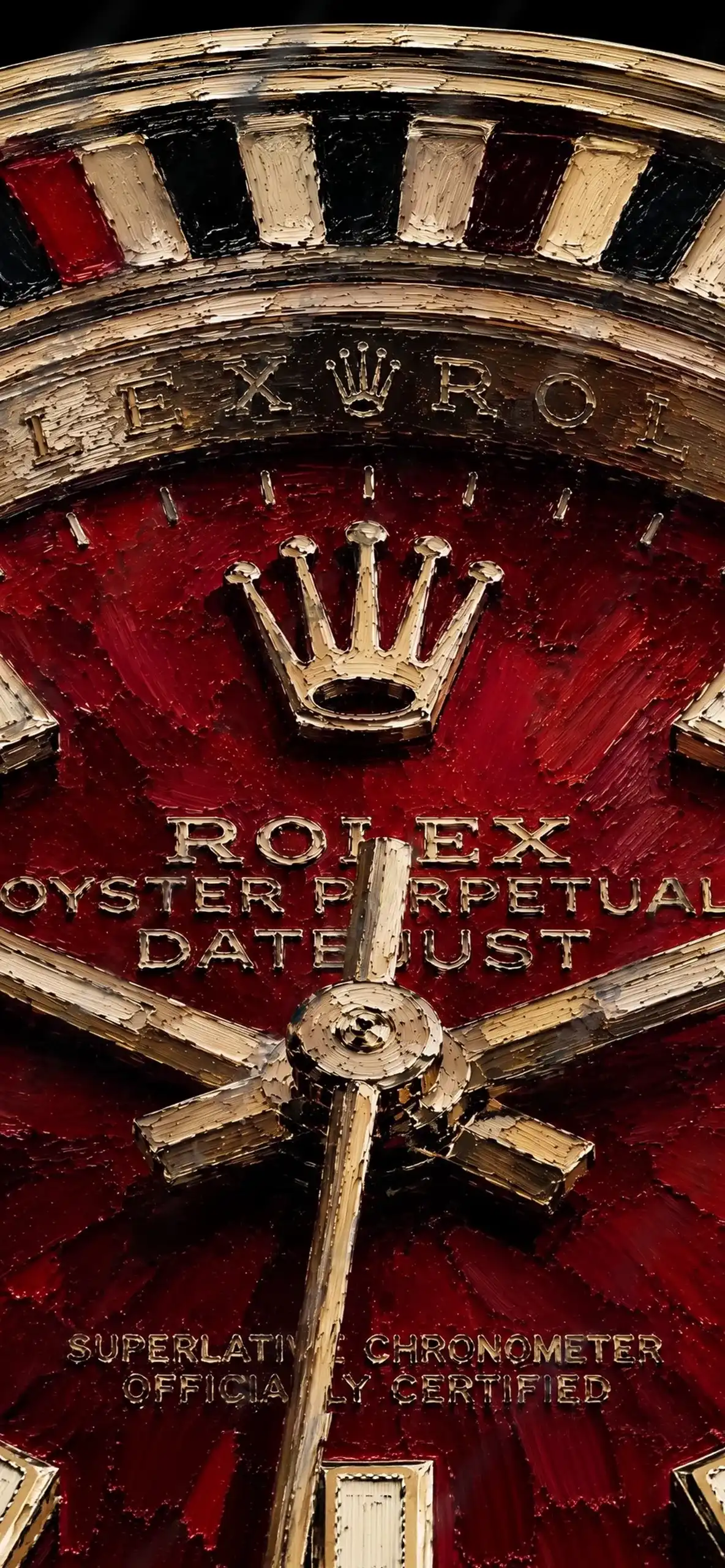
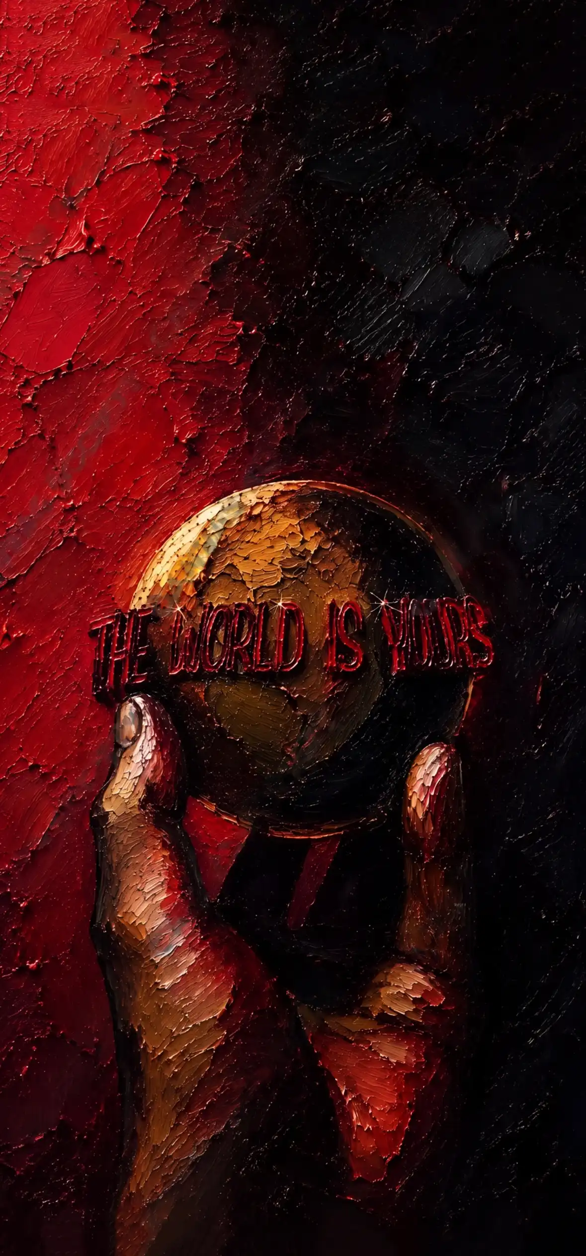
There’s a specific kind of satisfaction that comes from unlocking your phone and seeing something that actually looks like art, not a stock photo, not a filtered sunset, but something with real texture and depth to it. That’s exactly what impasto oil painting wallpapers bring to the table. If you’re not familiar with the term, impasto is a painting technique where the artist applies paint thickly enough that you can actually see the ridges, swirls, and brush marks sitting on the canvas. Translated into a wallpaper, it gives your screen this rich, tactile quality that flat digital art just can’t replicate.
Why Impasto Wallpapers Feel So Different
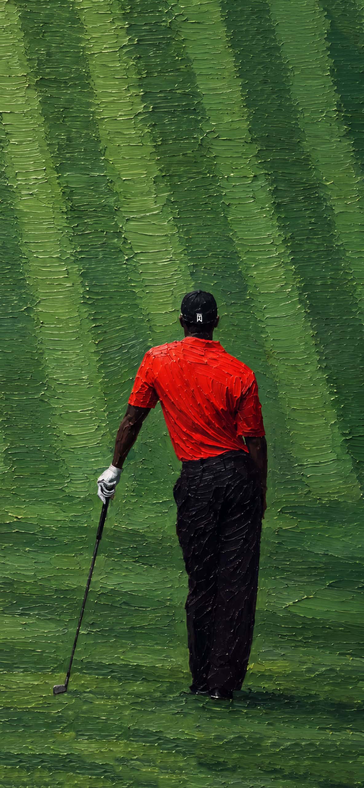
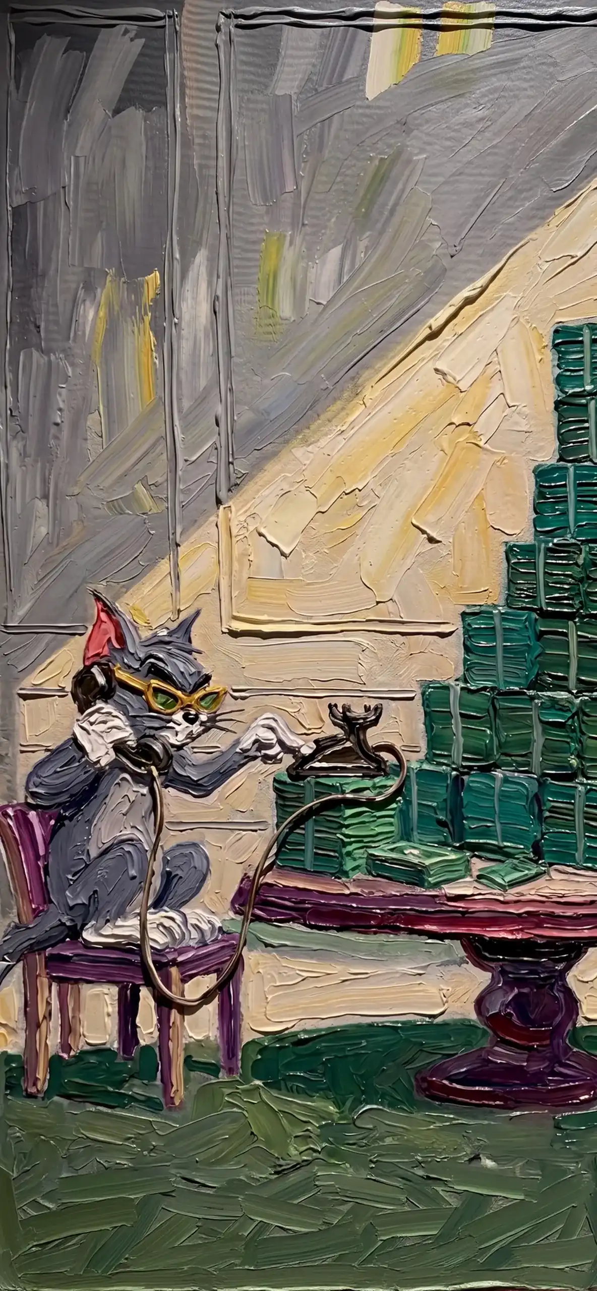
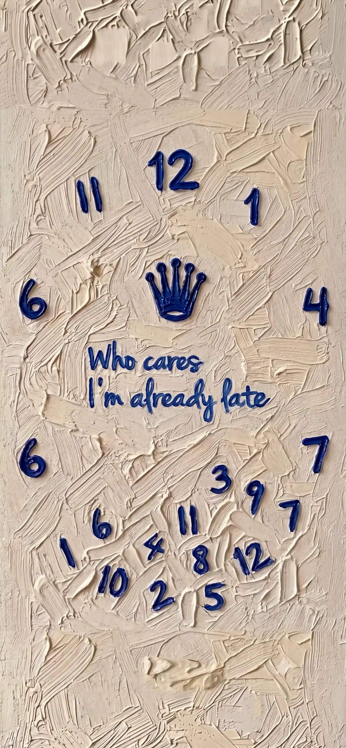
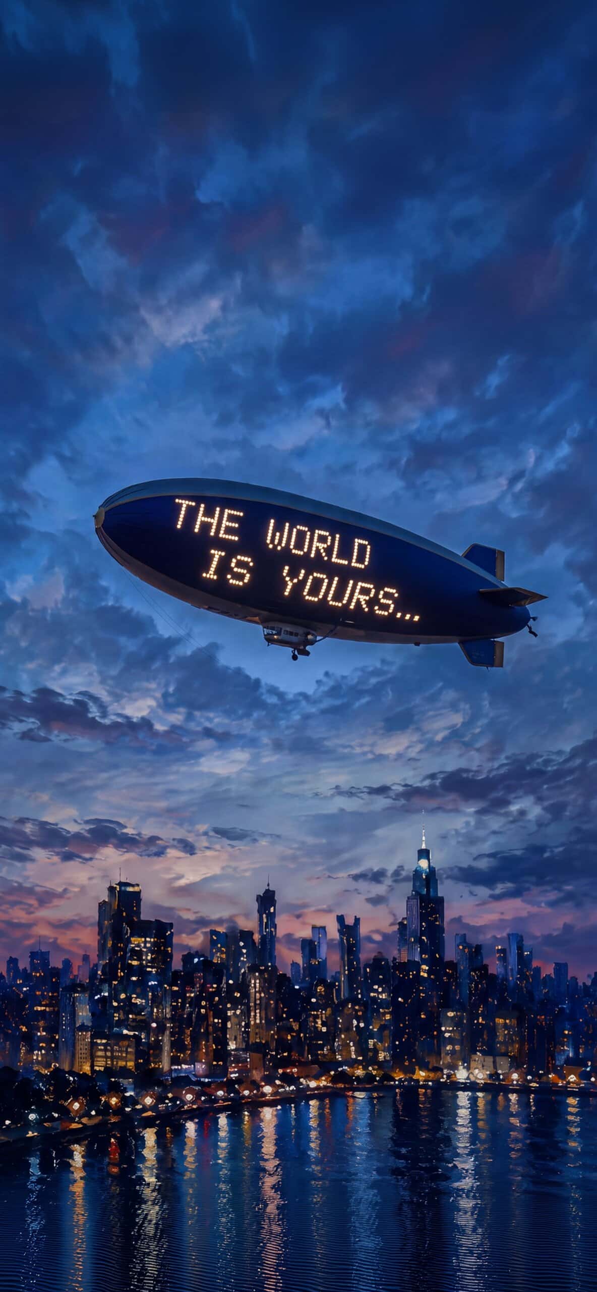
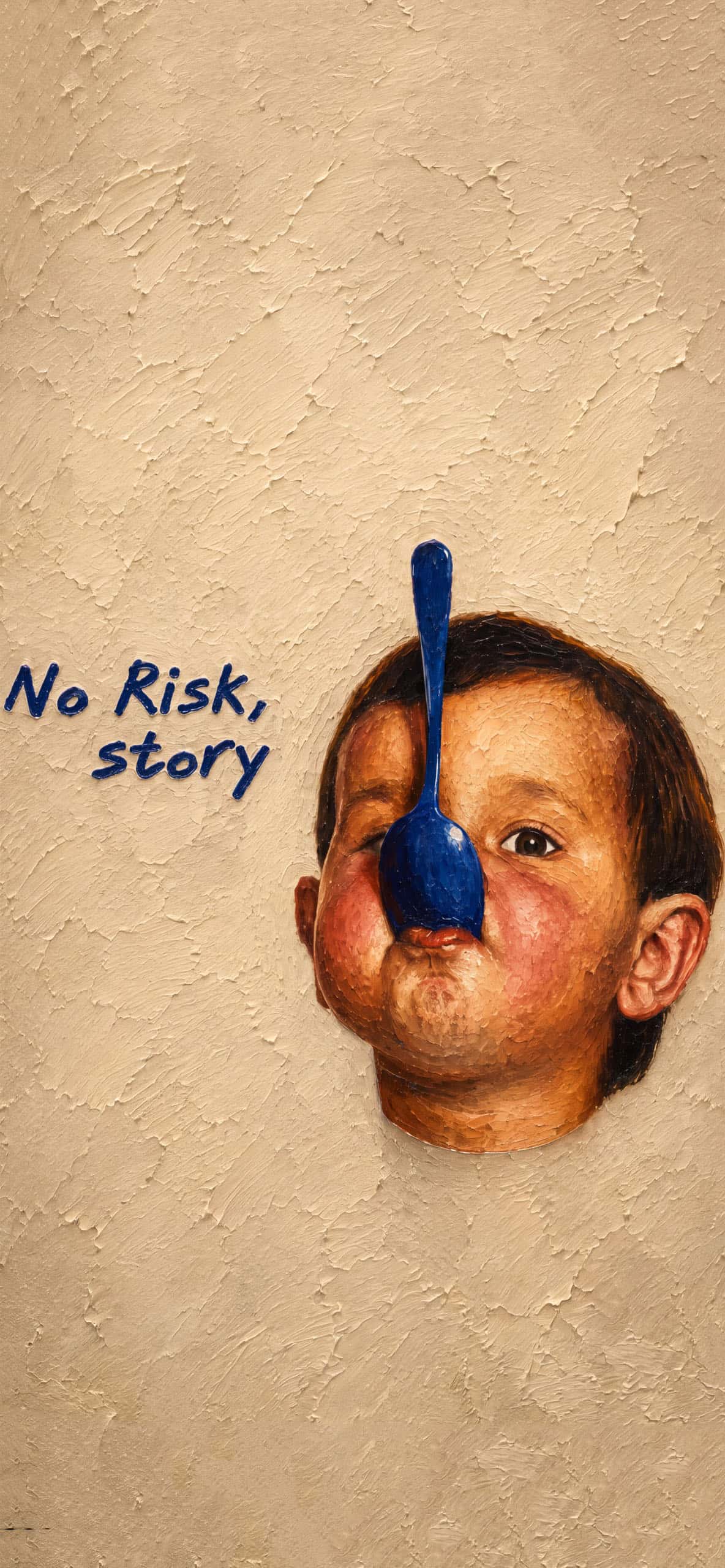
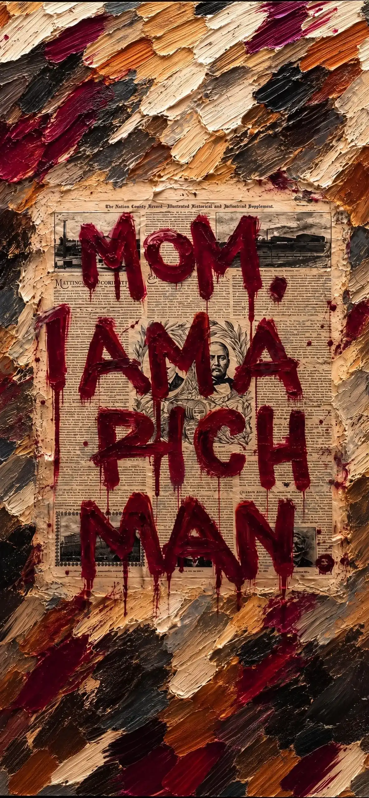
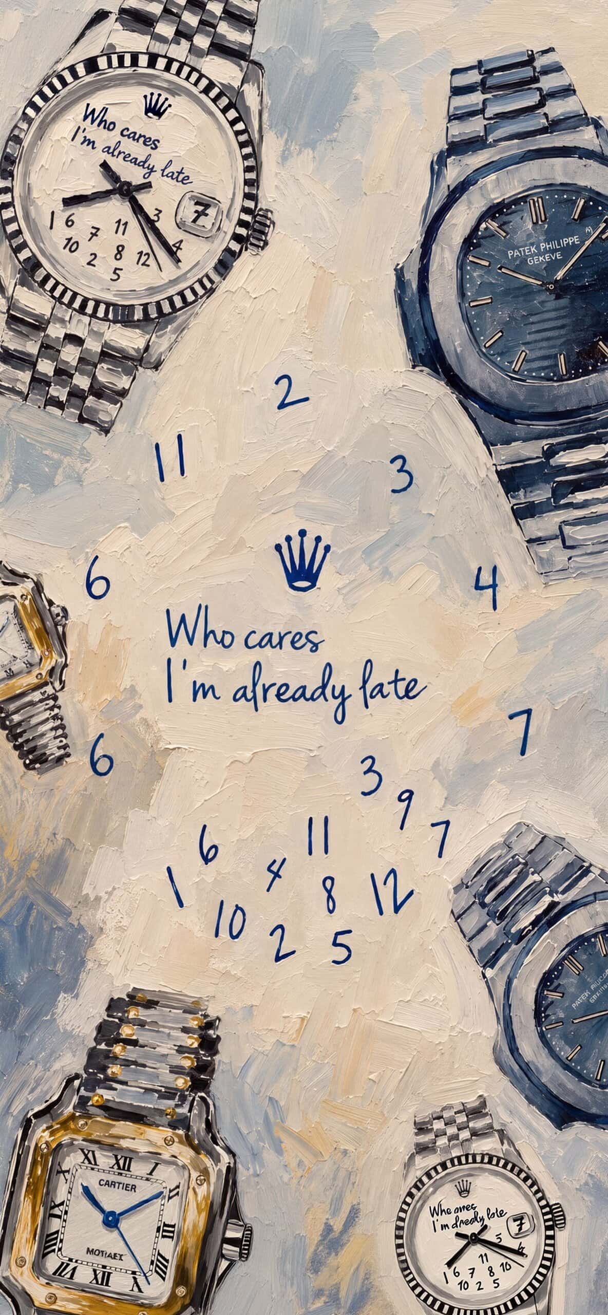
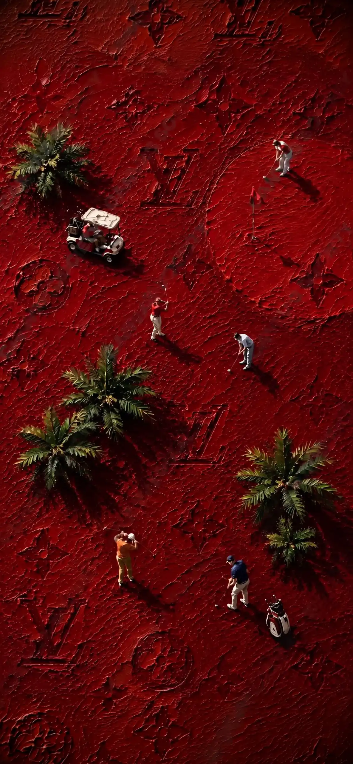
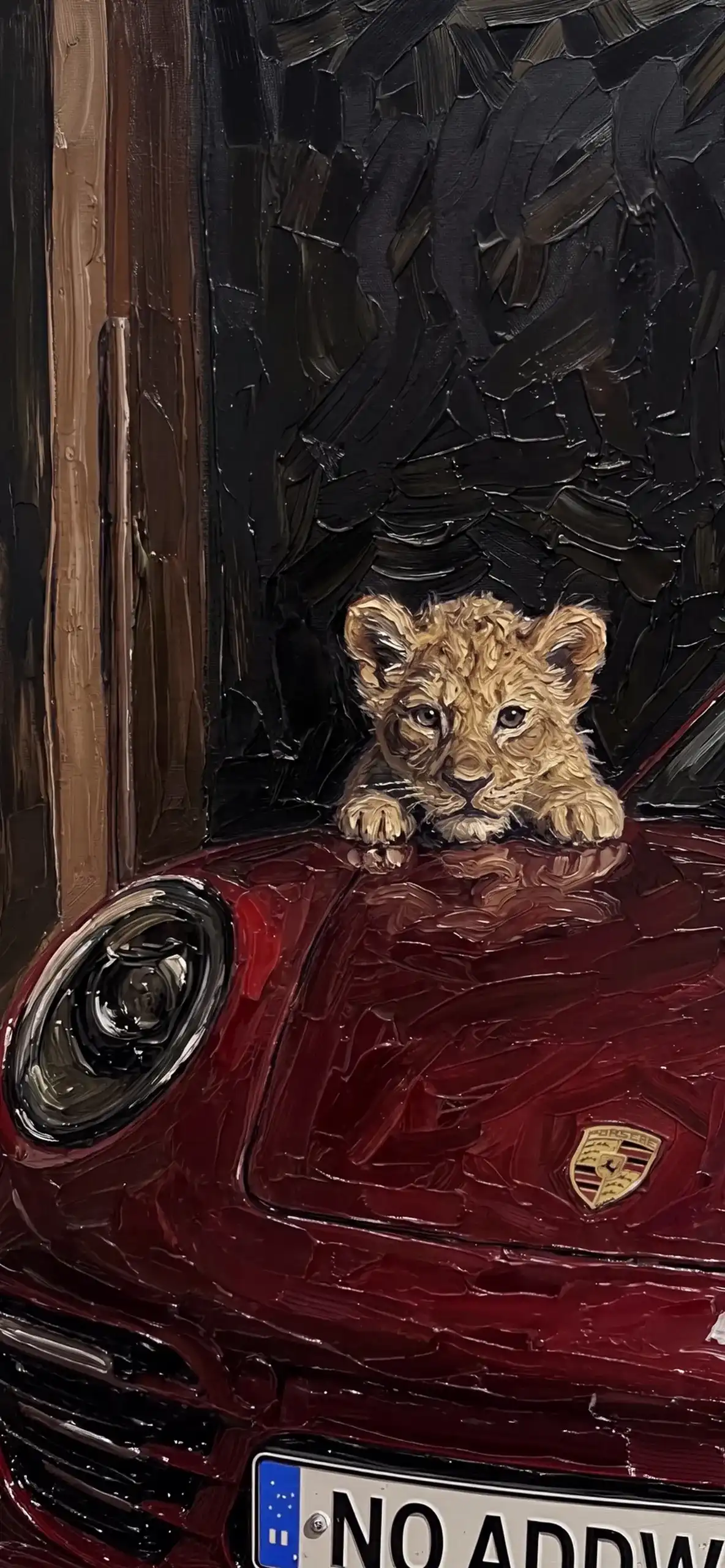
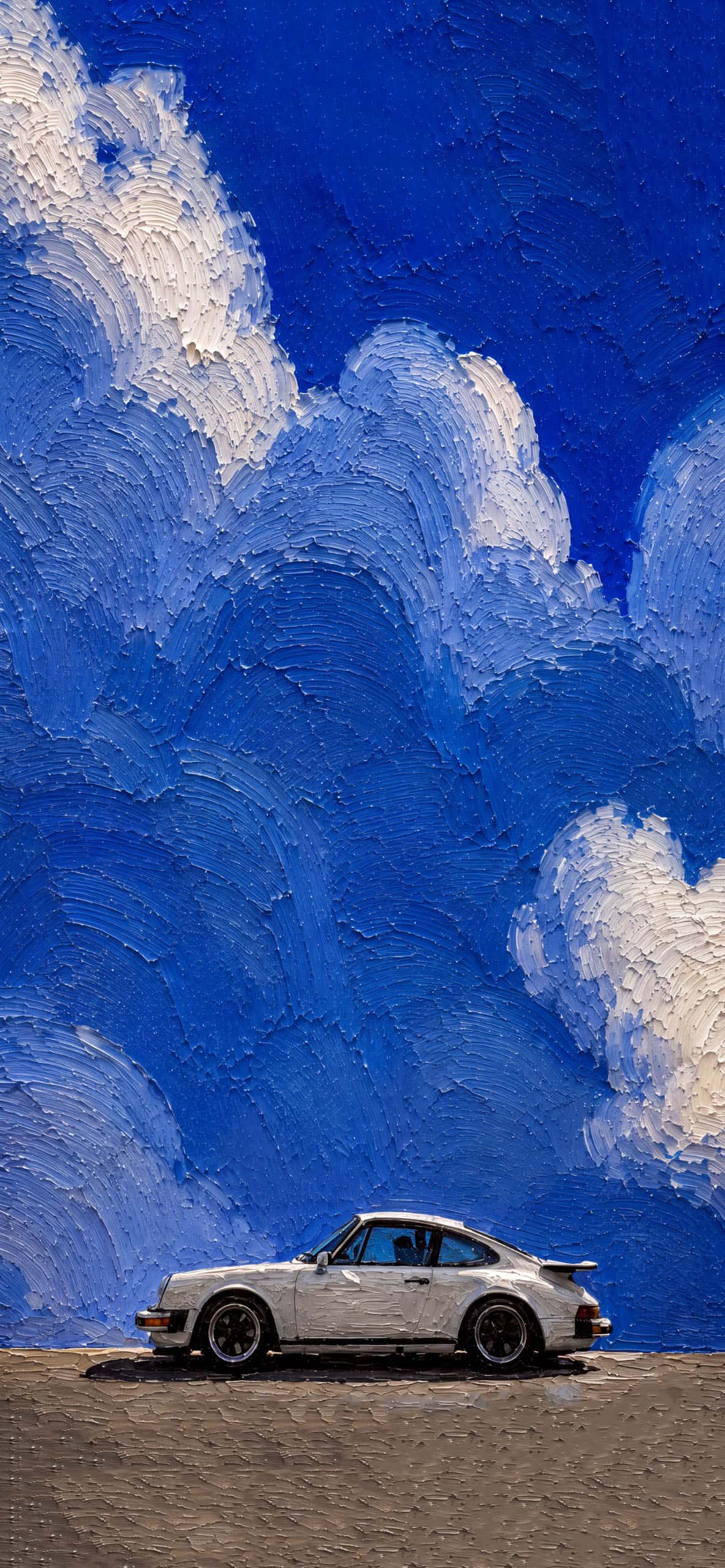
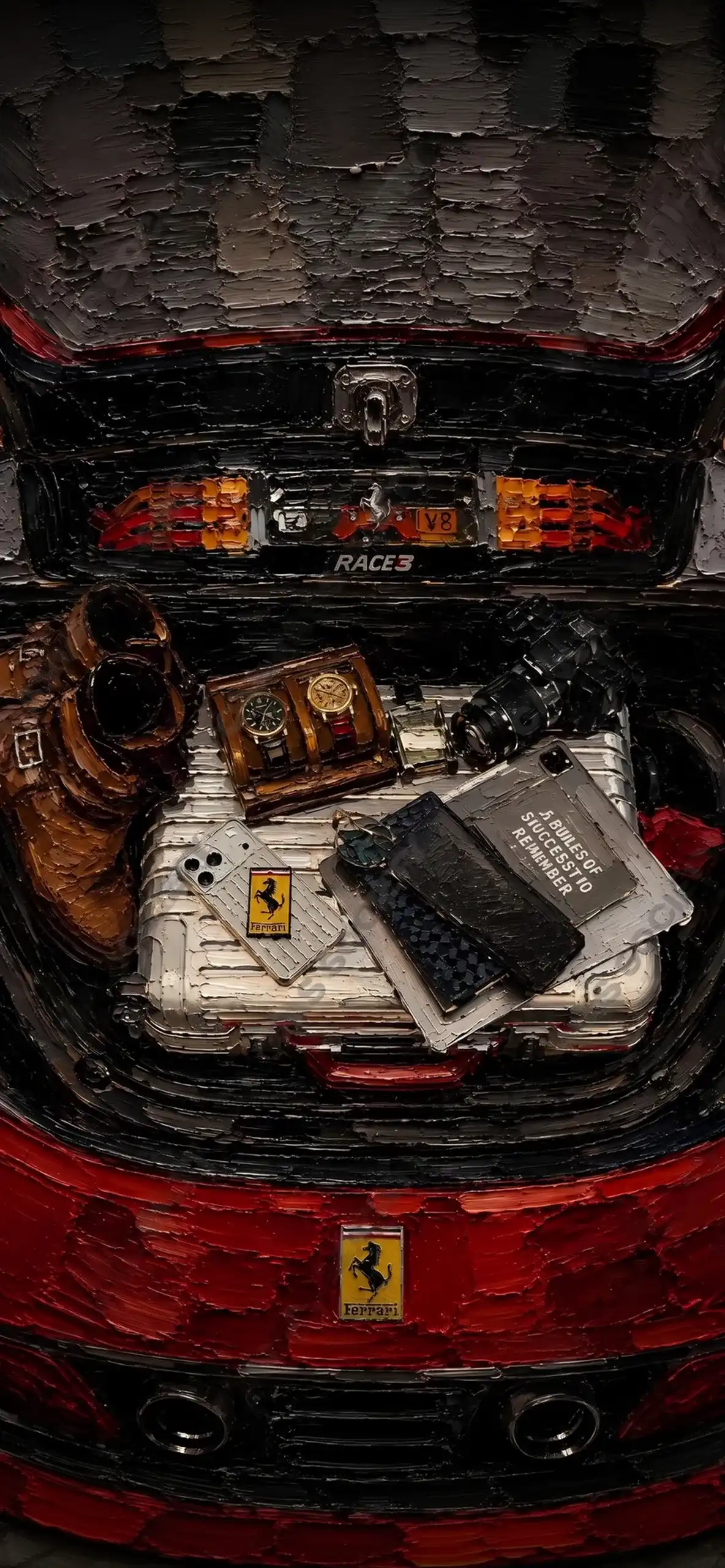
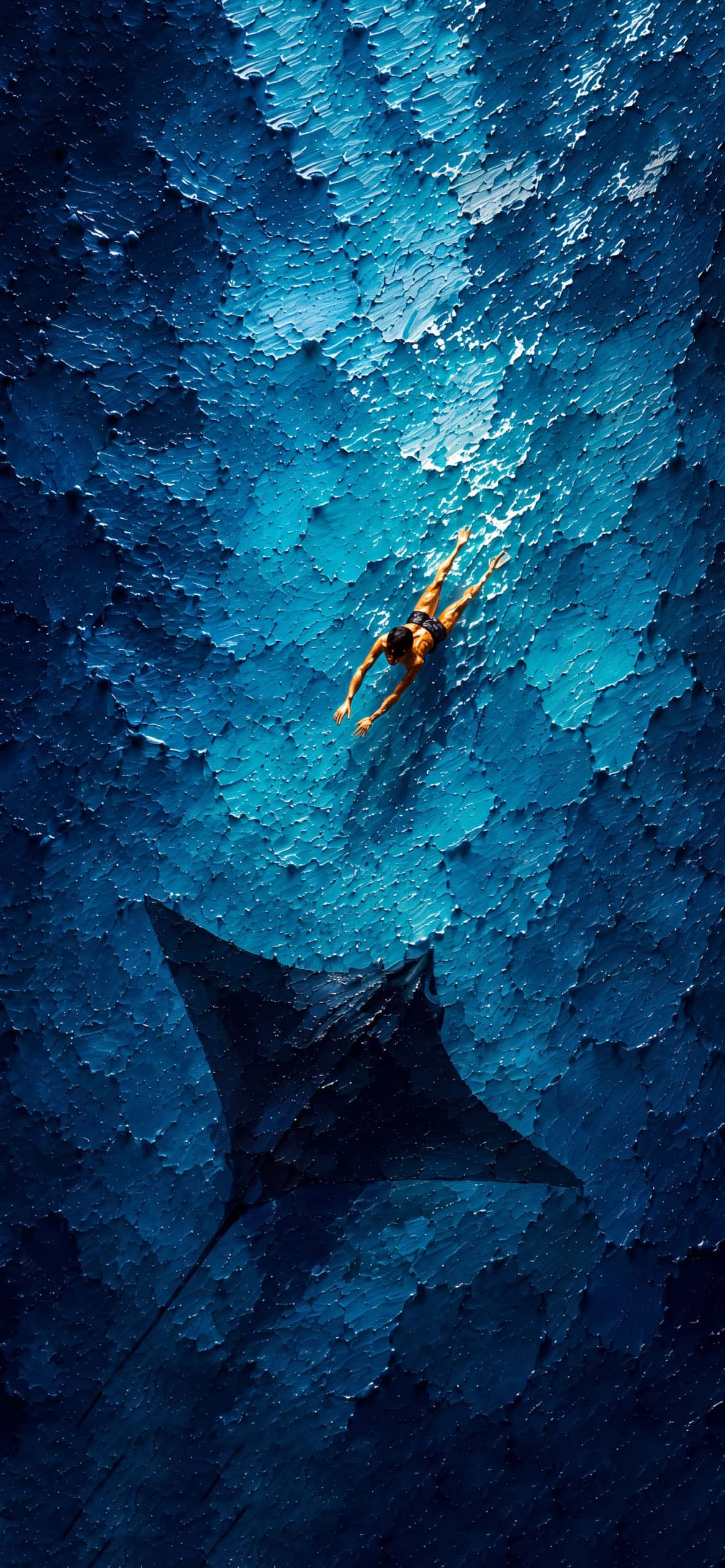
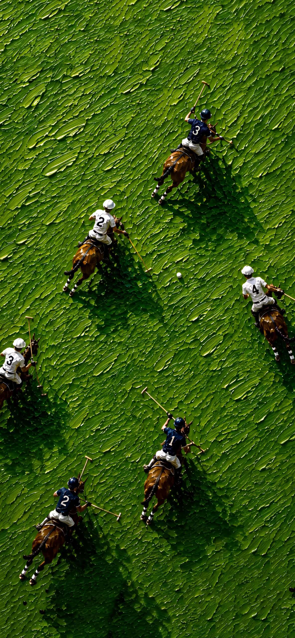
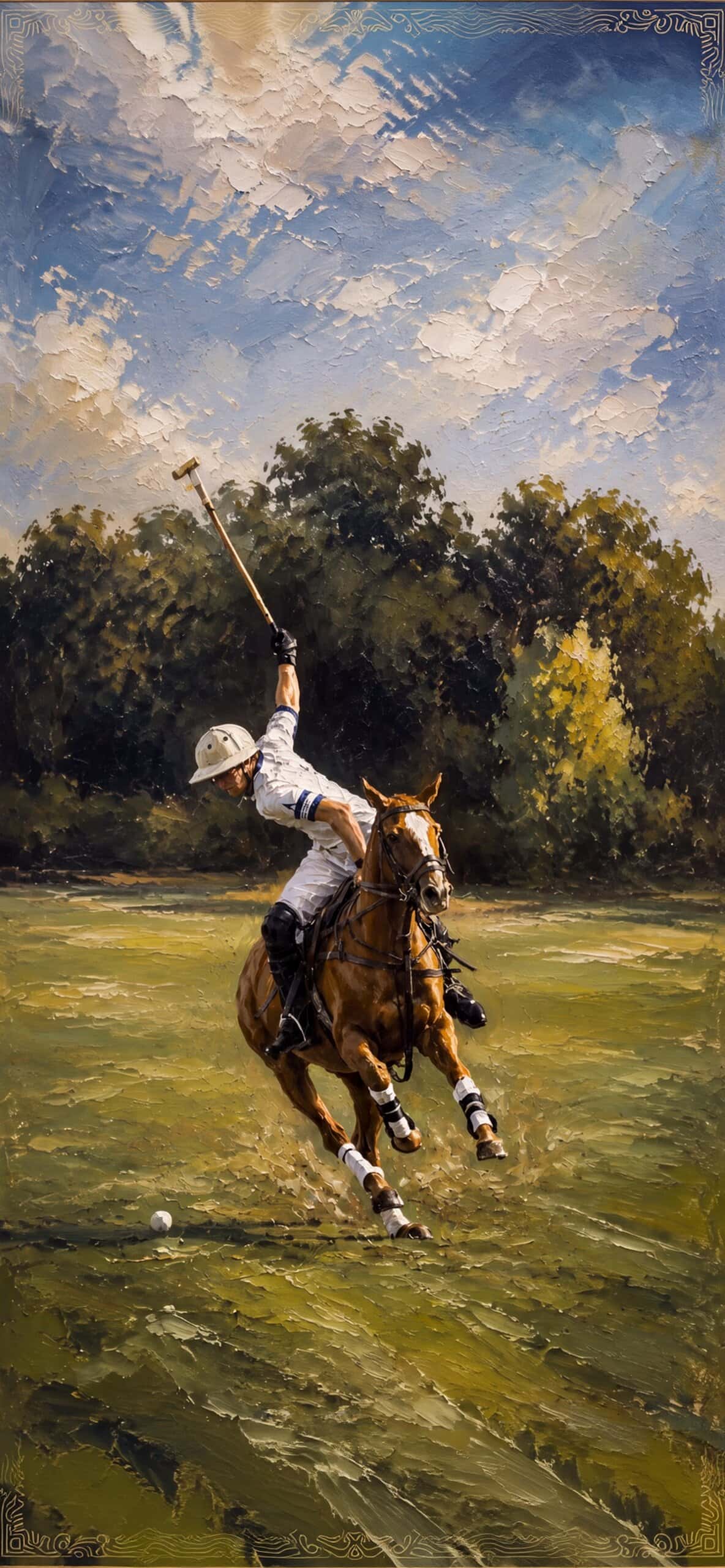
Most wallpapers are smooth by design, gradients, soft photography, clean vector art. Impasto flips that completely. The whole appeal is in the roughness, the way light catches the raised paint and creates natural shadows across the piece. On a high-resolution iPhone display, that texture actually reads as three-dimensional, especially with darker, moodier color palettes like deep burgundy, emerald, or gold-flecked black.
It’s become a popular choice for anyone who wants their phone to feel a little more like a curated space rather than just a device. There’s a reason interior designers have leaned into textured, painterly aesthetics for years, and now that same energy has made its way onto lock screens.
The Color Palettes That Work Best
Luxury impasto wallpapers tend to lean into a few signature palettes. Deep jewel tones, think sapphire blue, emerald green, and rich burgundy, give off an old-money, gallery-wall kind of feeling. Metallic gold and bronze strokes layered over black or charcoal backgrounds create a more dramatic, almost baroque look. For something softer, cream and blush tones with subtle texture give a quieter, more romantic feel without losing that painterly quality.
Abstract florals done in the impasto style have also become incredibly popular lately, thick petals and layered brushwork that almost look like they’re sculpted onto the screen rather than painted.
Why Resolution Matters Even More Here
With most wallpaper styles, low resolution just makes things look a bit soft. With impasto art, it’s a bigger problem, because the entire point of the style is the texture. If the file isn’t sharp enough, all those brushstroke details flatten out and you lose the exact thing that made the wallpaper interesting in the first place.
Download Wallpapers:
 Download Image
  Download Image
  Download Image
  Download Image
  Download Image
  Download Image
  Download Image
  Download Image
  Download Image
For the best result on an iPhone, look for files at 4K resolution, ideally sized around 1290 x 2796 pixels or higher depending on your model. This keeps every ridge and shadow in the paint crisp, so the texture actually reads properly instead of turning into a blurry mess of color.
Making It Work With Your Home Screen
Because impasto wallpapers already carry so much visual weight, less is more when it comes to styling your home screen around them. Simple, monochrome widgets tend to work best, and it’s usually smart to keep icon clutter to a minimum so the painting itself stays the focal point. A lot of people also match their icon color scheme to whichever tone dominates the painting, gold icons for a warm palette, deep blue or green icons for cooler tones.
If you’re setting one as your lock screen specifically, take a second to adjust the zoom and positioning so the thickest, most textured part of the brushwork lands somewhere visible rather than getting hidden behind the clock or notifications.
Download Wallpapers:
 Download Image
  Download Image
  Download Image
  Download Image
  Download Image
  Download Image
  Download Image
  Download Image
  Download Image
  Download Image
At the end of the day, a good impasto wallpaper does something most wallpapers don’t, it makes your phone feel a little more like a piece of art you chose on purpose, not just a background you settled for.