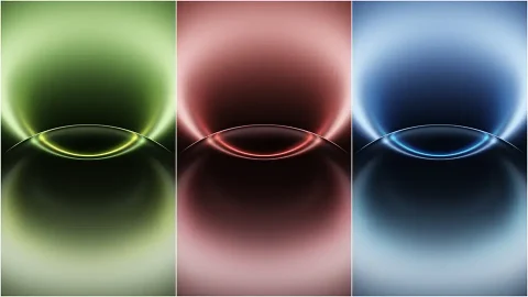
Honor Magic 9 Wallpapers for iPhone 4K
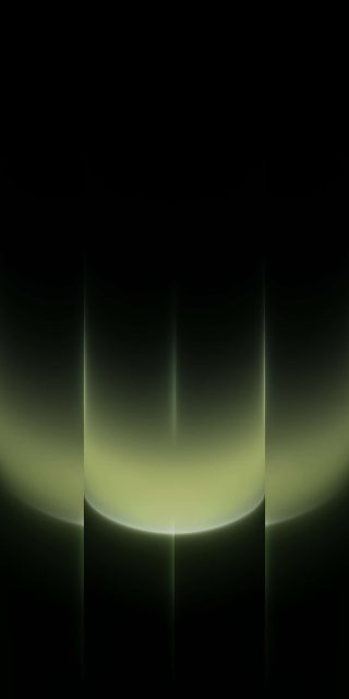
There’s a particular style of stock wallpaper that Android flagships have leaned into over the past couple of years — a soft-edged sphere, lit from one side, sitting against a black canvas that fades into the color at a diagonal. Honor’s Magic 9 default set follows that formula, and it’s genuinely one of the better executions of it, which is why it’s worth pulling onto an iPhone.
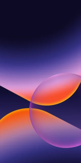
All four wallpapers here use the same basic shape: a glowing orb positioned in the lower-right of the frame, with a sharp diagonal line cutting across where the color meets a flat black lower section. It’s a layout choice that does something smart — it keeps roughly half the screen in true black, which means your lock screen clock and widgets sit in open space rather than fighting a gradient for visibility.
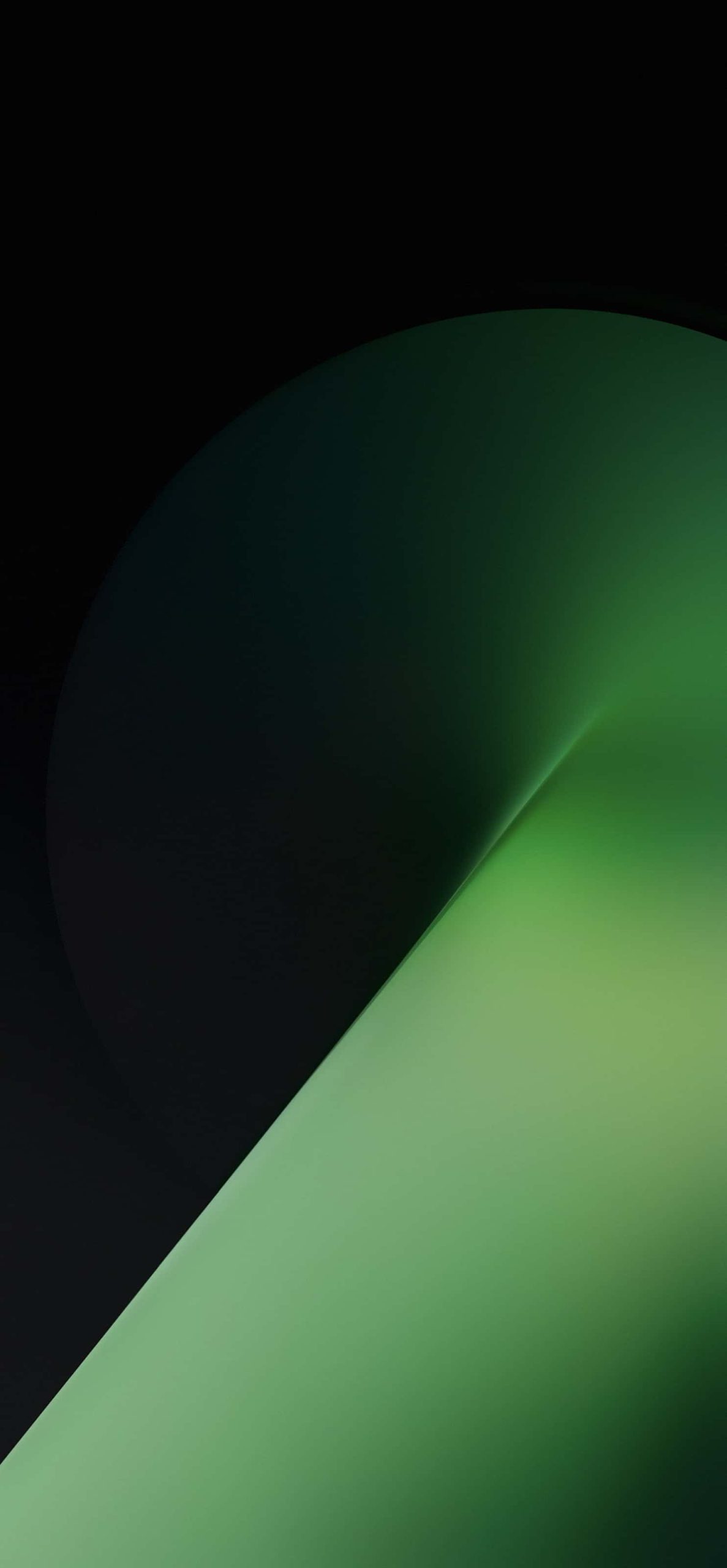
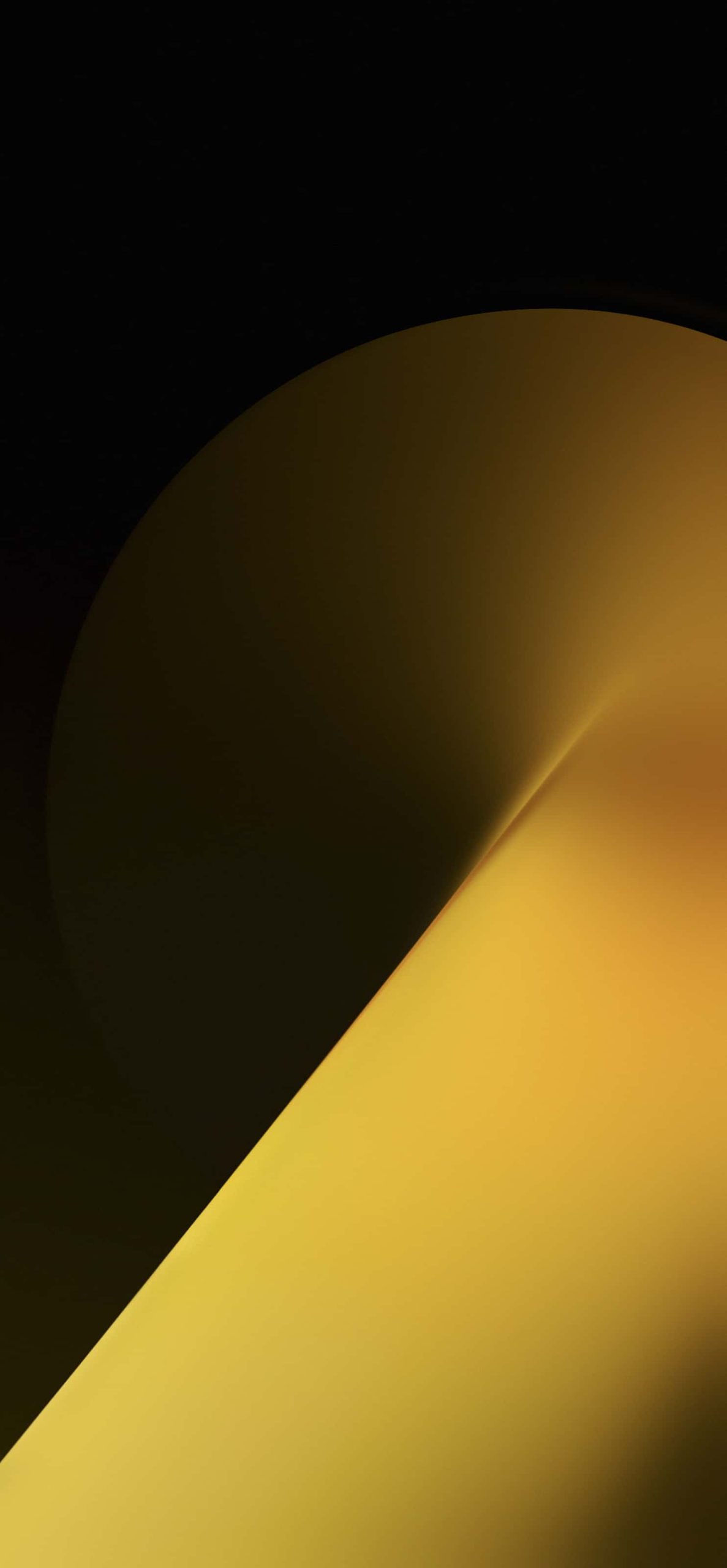
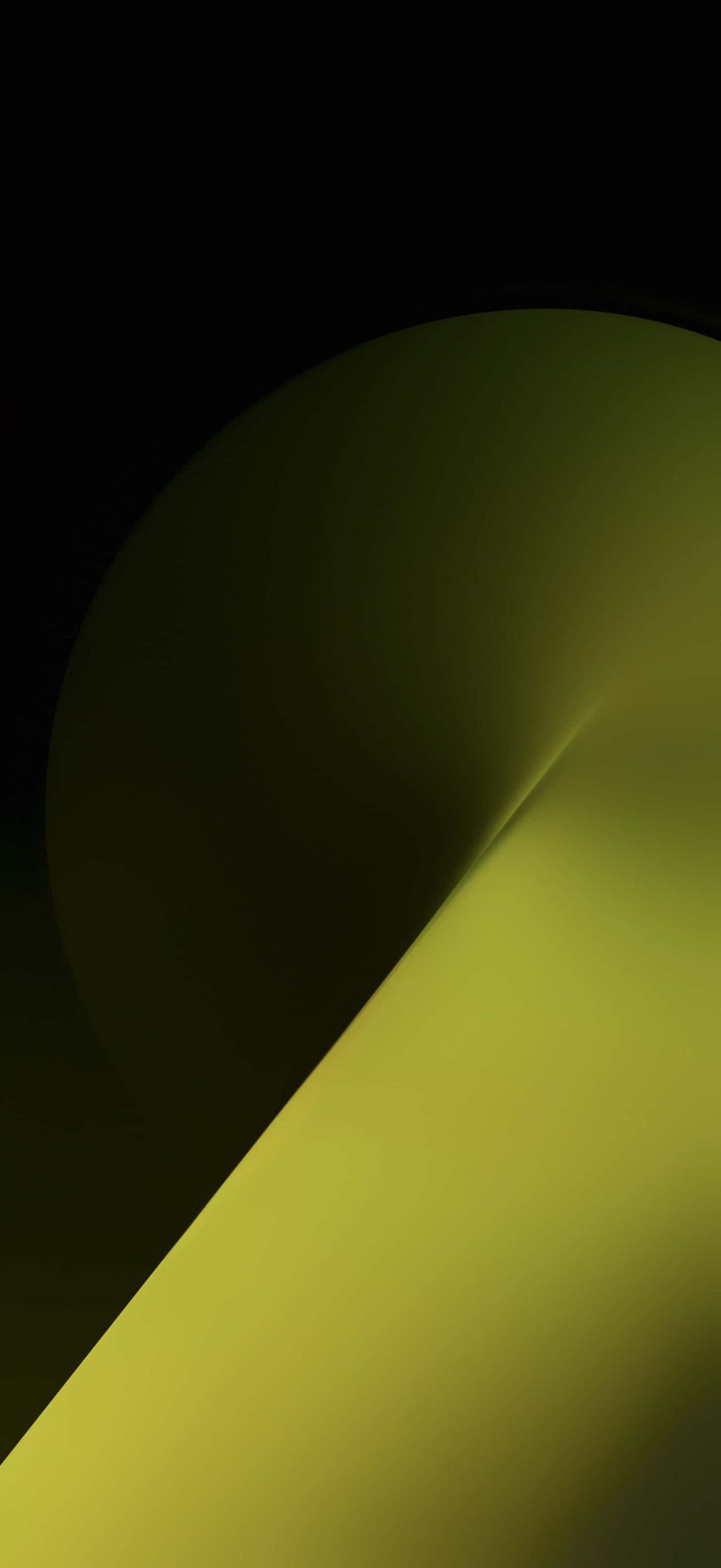
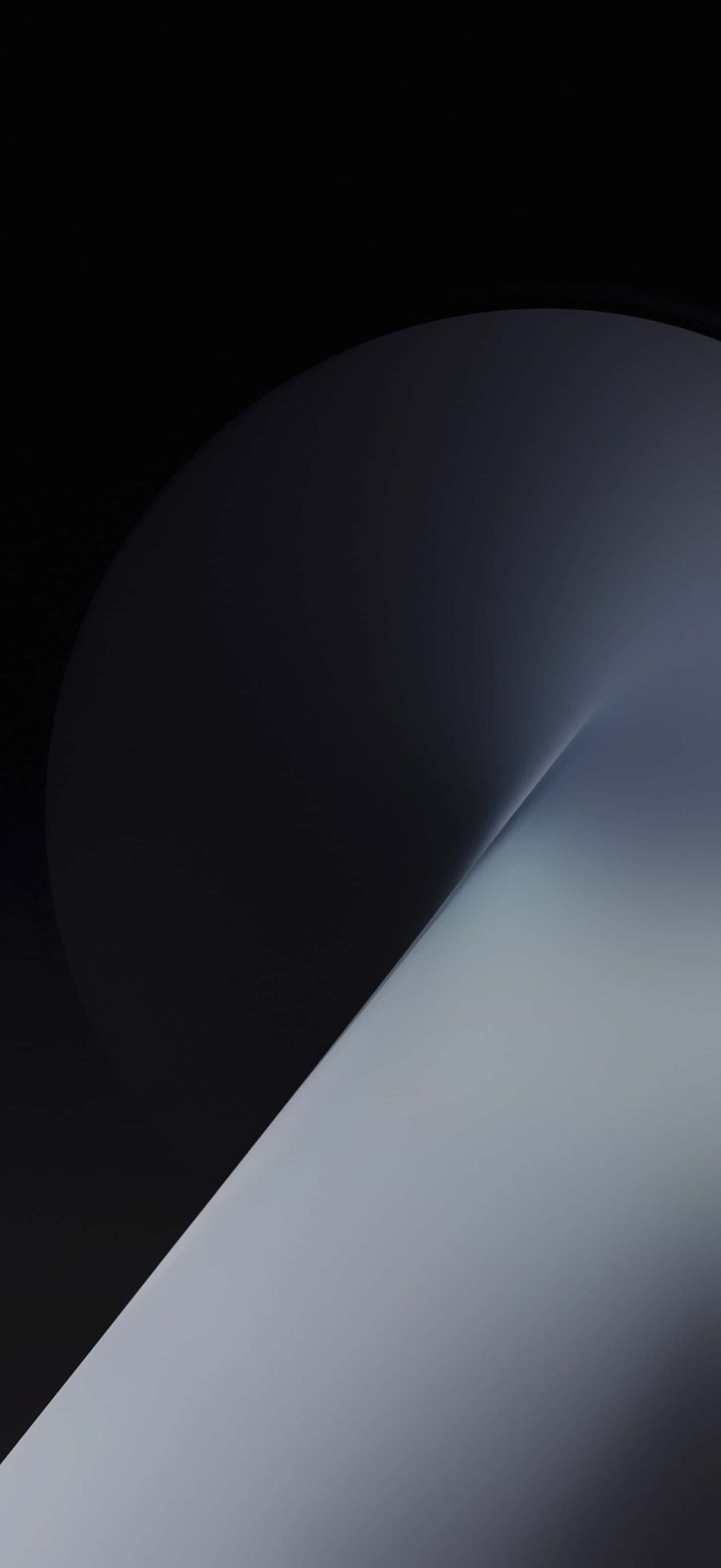
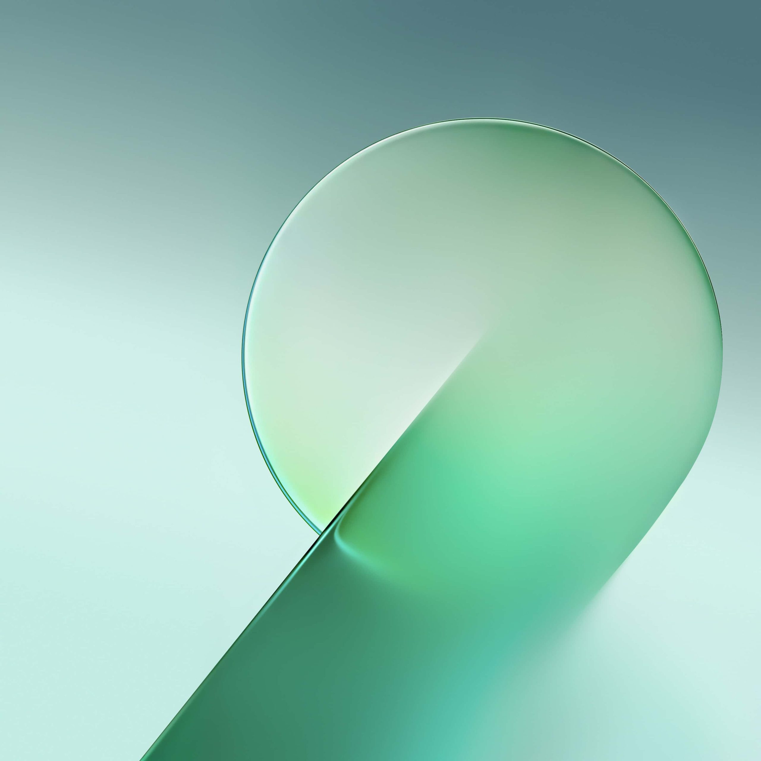
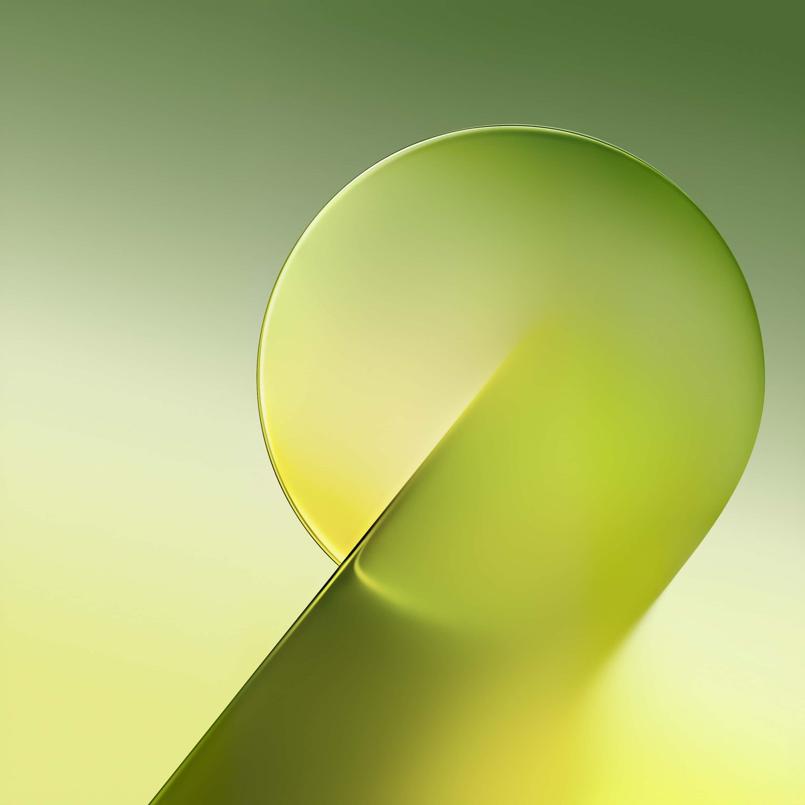
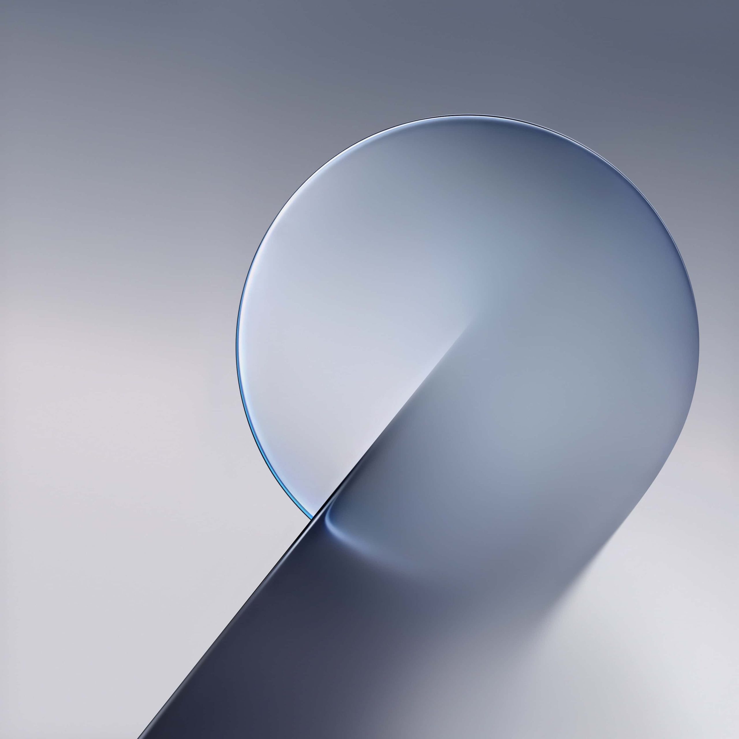
The four colorways each have a distinct personality. The emerald version leans cool and almost teal at the edges, with the orb’s highlight catching a brighter mint tone near its center. Gold goes warmer and richer, more amber than yellow, with a subtle orange undertone where the light source hits. Lime is the most electric of the four — a yellow-green that reads almost neon against the black, higher contrast than the others. Silver is the outlier, trading color entirely for a cool blue-grey gradient that feels closer to brushed metal than the saturated tones in the rest of the set.
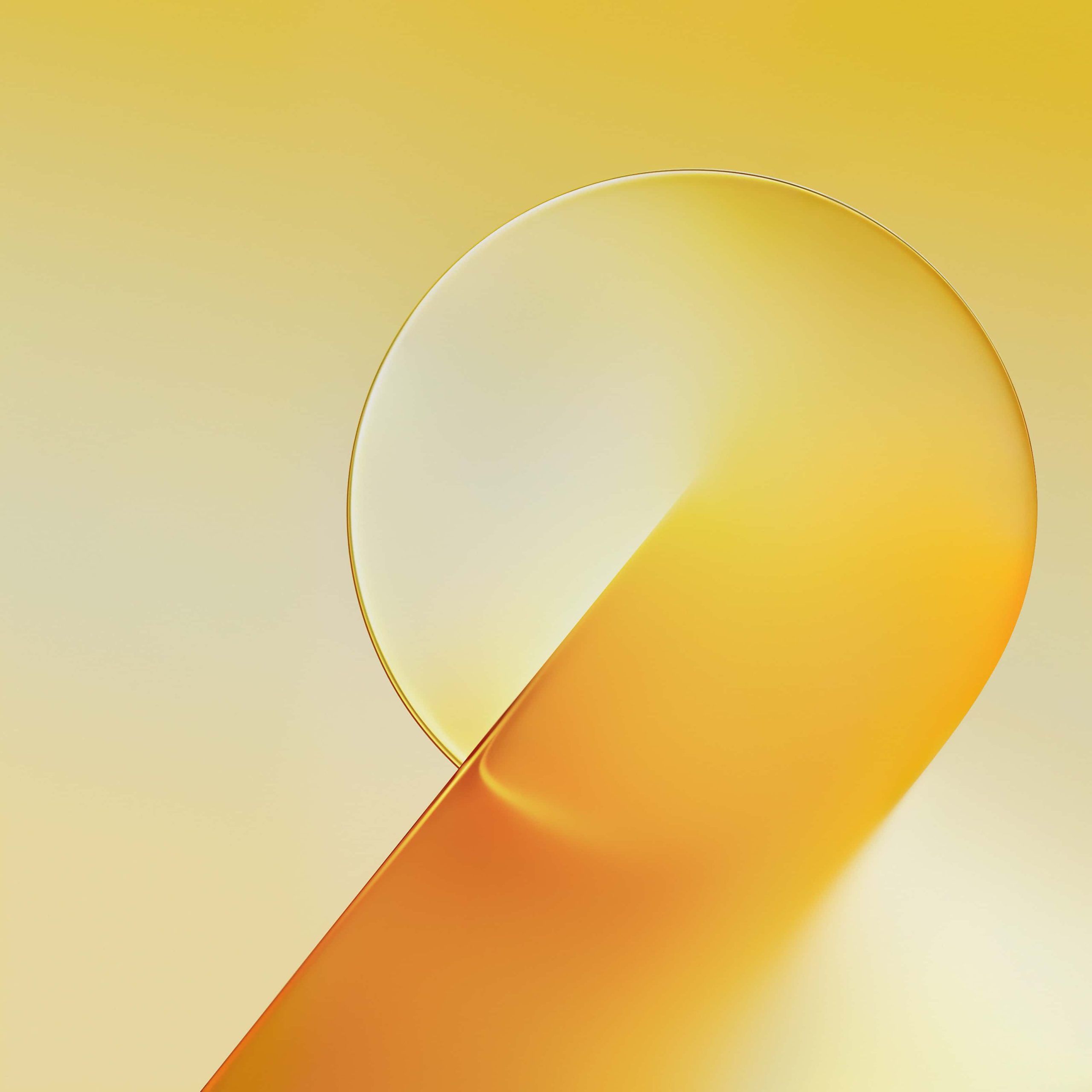
What makes these work as wallpapers rather than just screensavers is the restraint. There’s no texture, no noise, no competing elements — just a clean light source and a gradient, which means they never clash with app icons or widget colors on your home screen. You could reasonably run the gold one with a warm-toned icon pack, or the silver one on a minimalist black-and-white setup, and neither would feel out of place.
Because the black portion of each image is a genuine, deep black rather than dark grey, these render noticeably better on OLED iPhones (12 and later), where that section of the screen effectively turns off. On LCD models the contrast will be softer, though the gradients still hold up fine.
To set one up: save the image, go to Settings, tap Wallpaper, choose “Add New Wallpaper,” and select it from your library. Reposition as needed, then apply to your lock screen, home screen, or both.
Related posts:

Download Official Huawei Mate 90 Wallpapers [4K UHD Original Pack]
Download Official Xiaomi 18 Pro Wallpapers [4K UHD Original Pack]
ColorOS 17 Wallpapers for iPhone 4K | Official OPPO HD Backgrounds

OriginOS 7 Wallpapers 4K | Download Official Vivo & iQOO Backgrounds
Download Samsung Galaxy Z Fold 8 Stock Wallpapers for iPhone