Download Official Honor MagicOS 11 Wallpapers [4K UHD Original Pack]
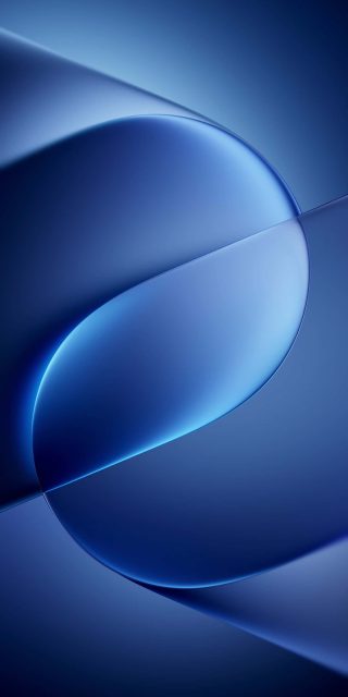
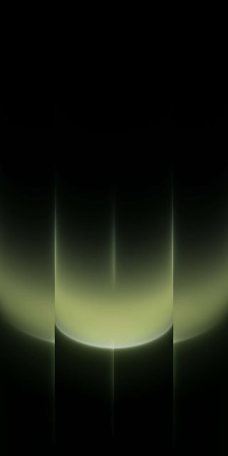
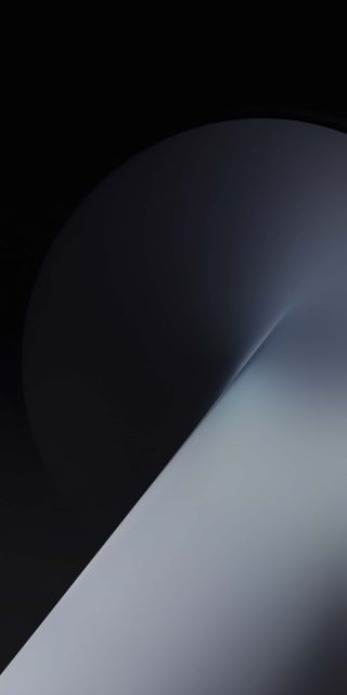
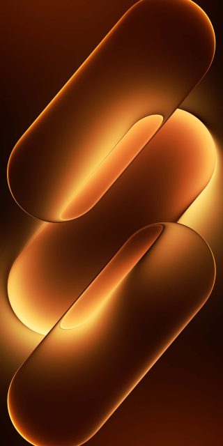
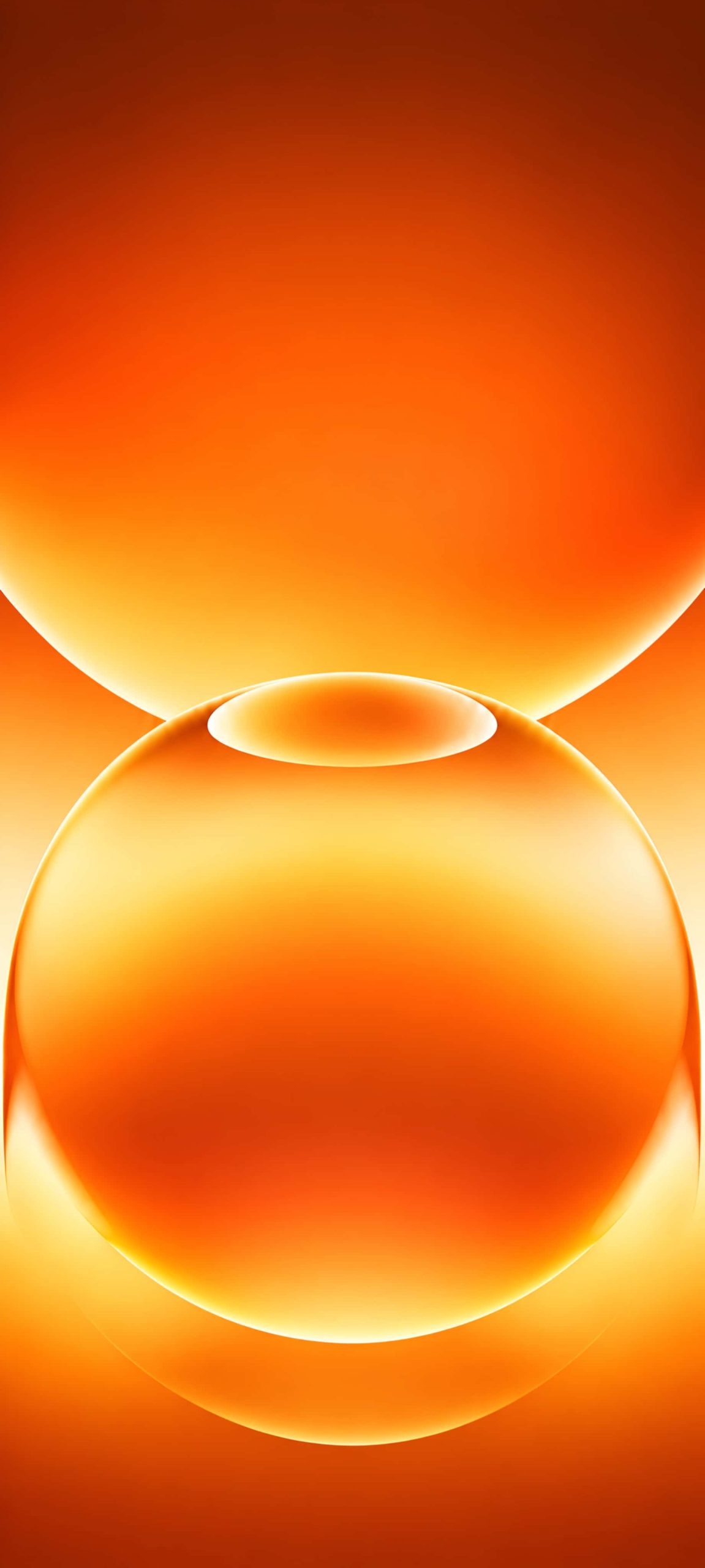
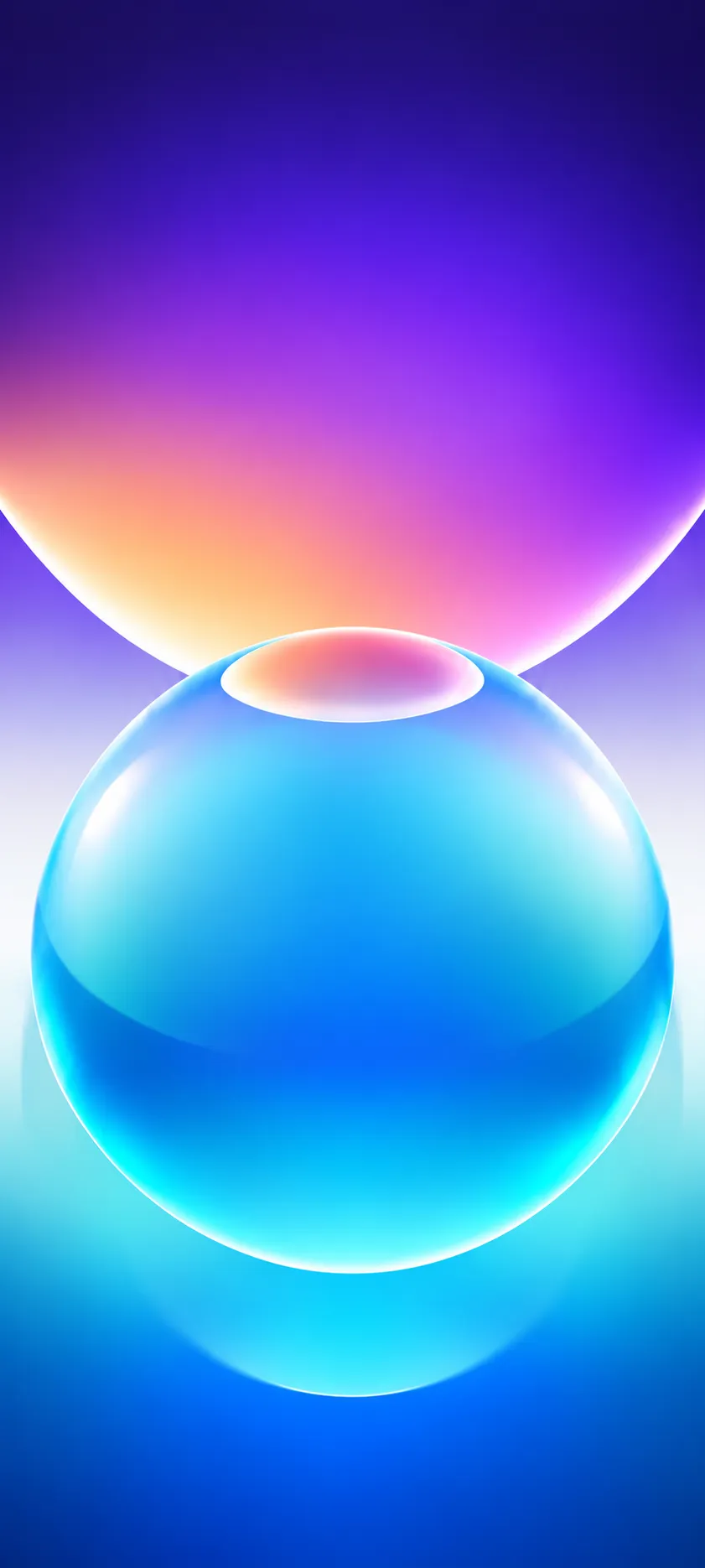
Stock wallpapers usually get a quick glance during setup and then a replacement. The MagicOS 11 set is different, because it rests on one strong idea: two glass-like spheres stacked on each other, with a small elliptical opening where they meet. The shape stays the same across the pack. Only the colour and lighting change, and that changes the mood completely.
The five colourways
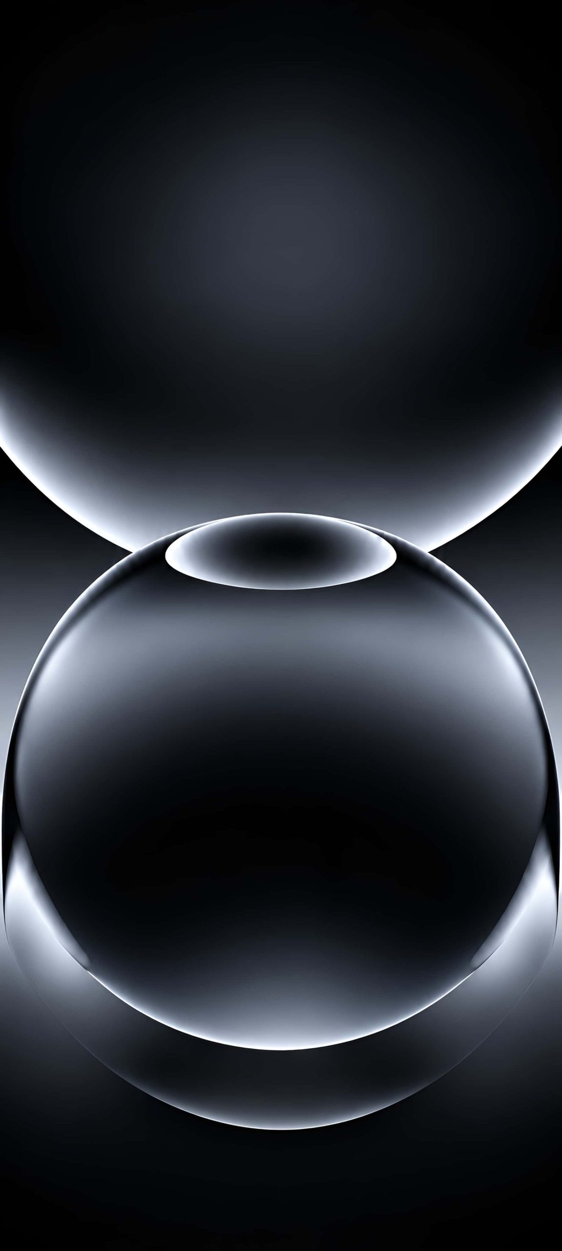
Obsidian black. The darkest version, with a charcoal sphere outlined by a thin silver rim. The upper sphere fades into near-black, and a faint grey glow sits in the centre. On an OLED iPhone this is the one to pick, since the deep areas switch off and the bright edges look like etched metal.
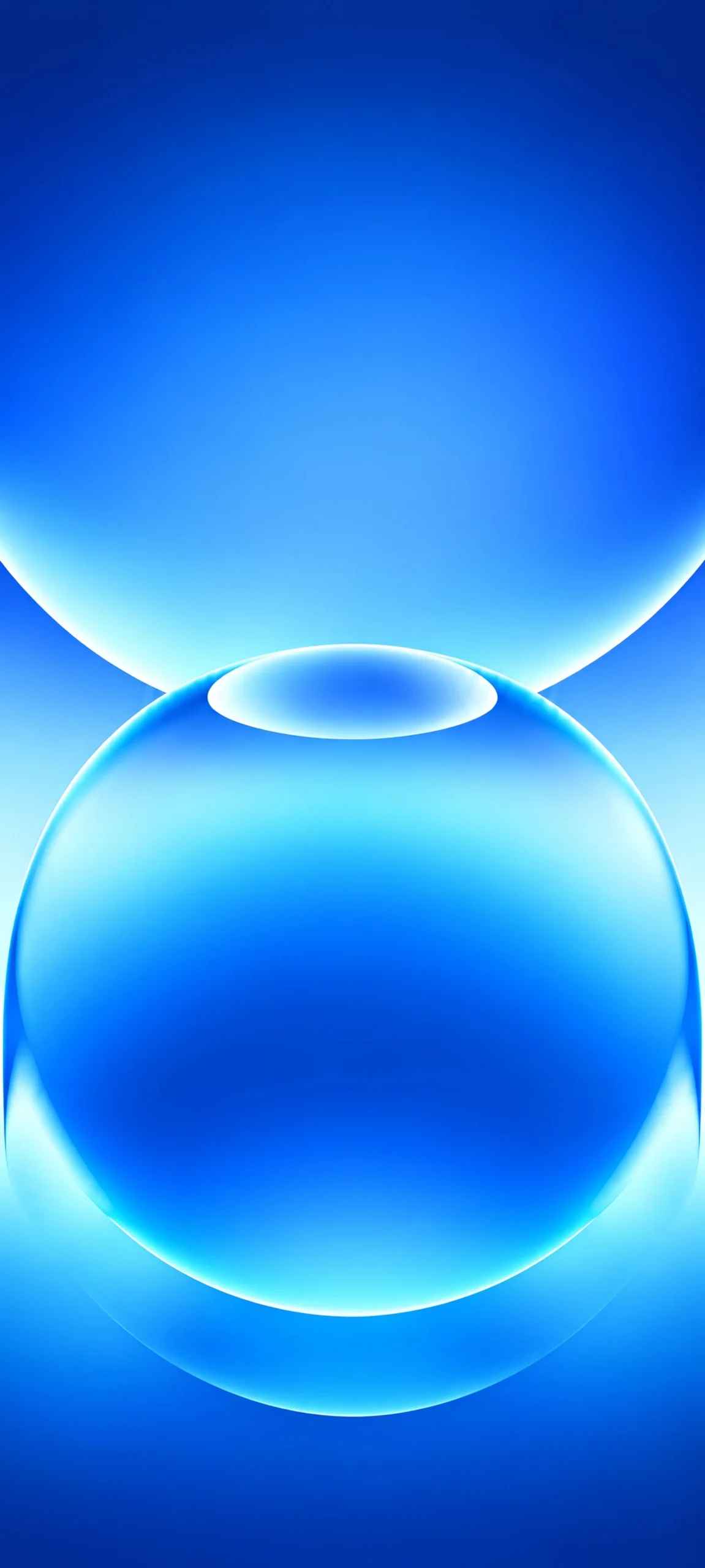
Electric blue. A saturated cobalt gradient that brightens to icy cyan near the contact point of the spheres. It’s cool, clean, and probably the closest to a classic “tech” look.
Mint green. Soft aqua and emerald tones with pale, almost white highlights along the curves. This is the gentlest option in the pack and works well for anyone who finds bright blue too sharp.
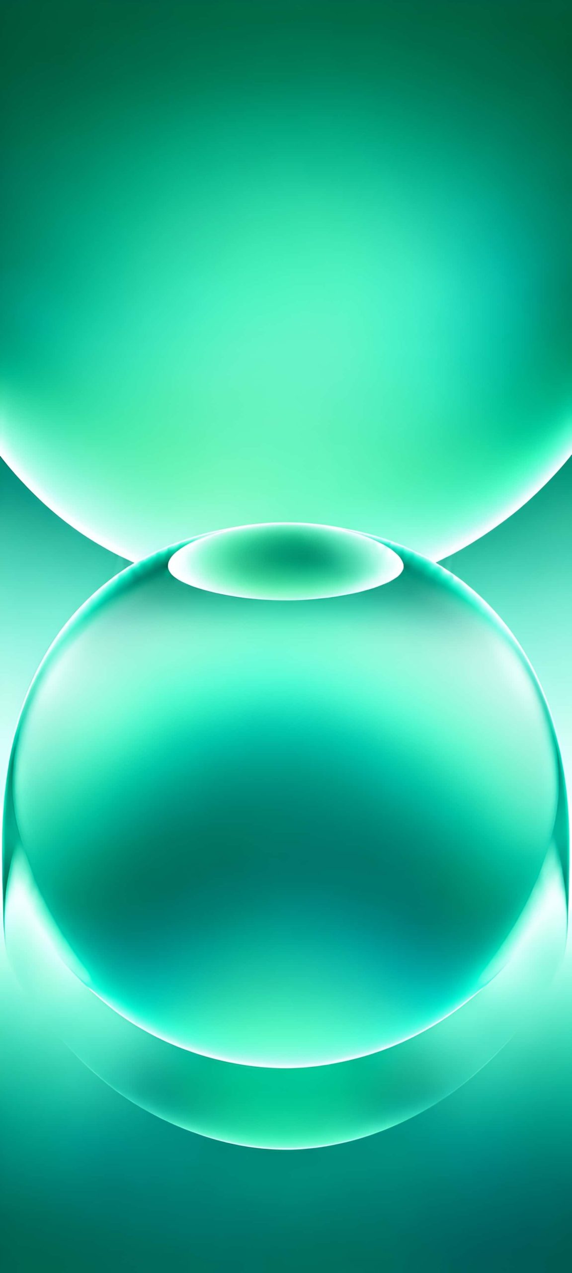
Sunset orange. Burnt orange at the edges, shifting to amber and cream where the light hits the glass. It looks warm, a bit like a lamp glowing behind frosted glass.
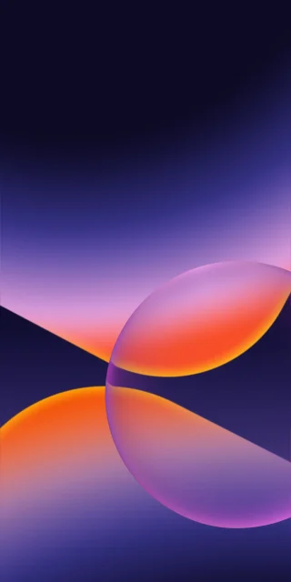
Violet and aqua. The only two-tone design. The top sphere moves from deep indigo through magenta to peach, while the lower sphere stays glassy aqua and blue. It’s also the only file with a rounder, more complete bottom sphere, so it feels slightly different from the rest.
Why it works on a phone
The composition places the small elliptical highlight about a third of the way down the screen, which is roughly where clock widgets sit on an iPhone lock screen. The large empty gradient above keeps the time readable, and the lower sphere gives the eye something to rest on without competing with icons. Because the gradients are smooth, they also hold up well when iOS applies its slight blur on the home screen.
Quality and file notes
These are tall, portrait files made for modern phone aspect ratios, so they crop cleanly on recent iPhones without stretching. The soft gradients are the main test of any wallpaper, and banding is the usual flaw. Here the transitions look clean, especially in the blue and green versions. If you plan to use them on an older or smaller display, keep the original file rather than a screenshot to preserve the colour depth.
How to apply
Save the image to Photos, open Settings, tap Wallpaper, and add a new wallpaper. Choose the picture, pinch to place the small ellipse just under your widgets, and set it for the lock screen, home screen, or both. Switch colours with the seasons, or keep the black version for night.