Pokémon iPhone Wallpapers
Pokémon wallpapers never really stop trending, but the style keeps evolving. The current wave leans hard into a torn-paper effect: a plain, minimal background with a jagged hole ripped through it, and a Pokémon’s face or head pushing through the gap like it’s physically breaking out of the screen. It’s a clever bit of visual trickery — the flat white paper reads as “phone wallpaper,” while the character popping through reads as three-dimensional, giving the whole thing a pop-up-book quality that a plain character render doesn’t have.
This collection gathers ten wallpapers built around that exact effect, each featuring a different Pokémon breaking through the paper.
Why the torn-paper effect works so well on a phone screen
Most character wallpapers make one of two mistakes: they either fill the entire screen with the character (busy, hard to read app icons over) or they shrink the character down so much it loses impact. The torn-paper style splits the difference. The background stays almost entirely empty — flat, neutral, usually off-white or light gray — which means your lock screen clock, notifications, and app icons all stay perfectly legible. The character itself only occupies a small torn opening, usually positioned in the lower half of the screen, which keeps the top of the display clean while still giving you a strong, recognizable visual the moment you unlock your phone.
There’s also a simple psychological trick at play: a torn hole implies motion and surprise, like something reached through from behind the screen. That’s a very different feeling than a static character illustration just sitting in frame. It’s part of why this specific effect has spread so widely across wallpaper communities beyond just Pokémon — it works for pretty much any character-based design, but Pokémon in particular suits it well because so many of the creatures have exaggerated, expressive faces that read clearly even when only partially visible through a small opening.
What’s included in this set
The ten wallpapers in this collection intentionally mix tone and personality rather than sticking to one type of Pokémon:
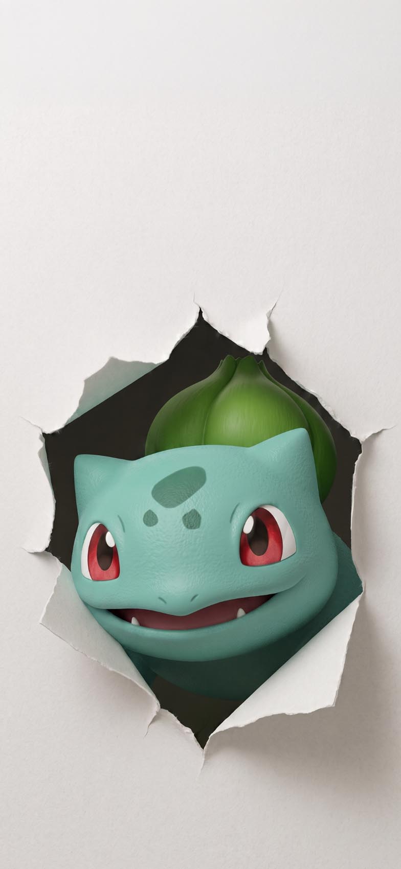
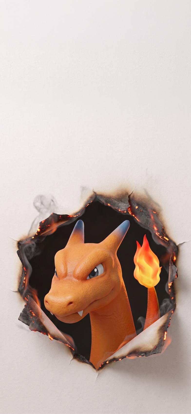
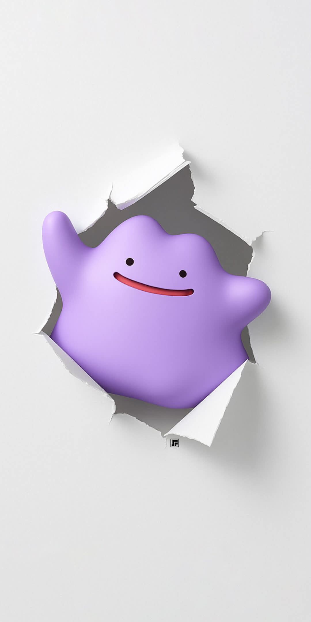
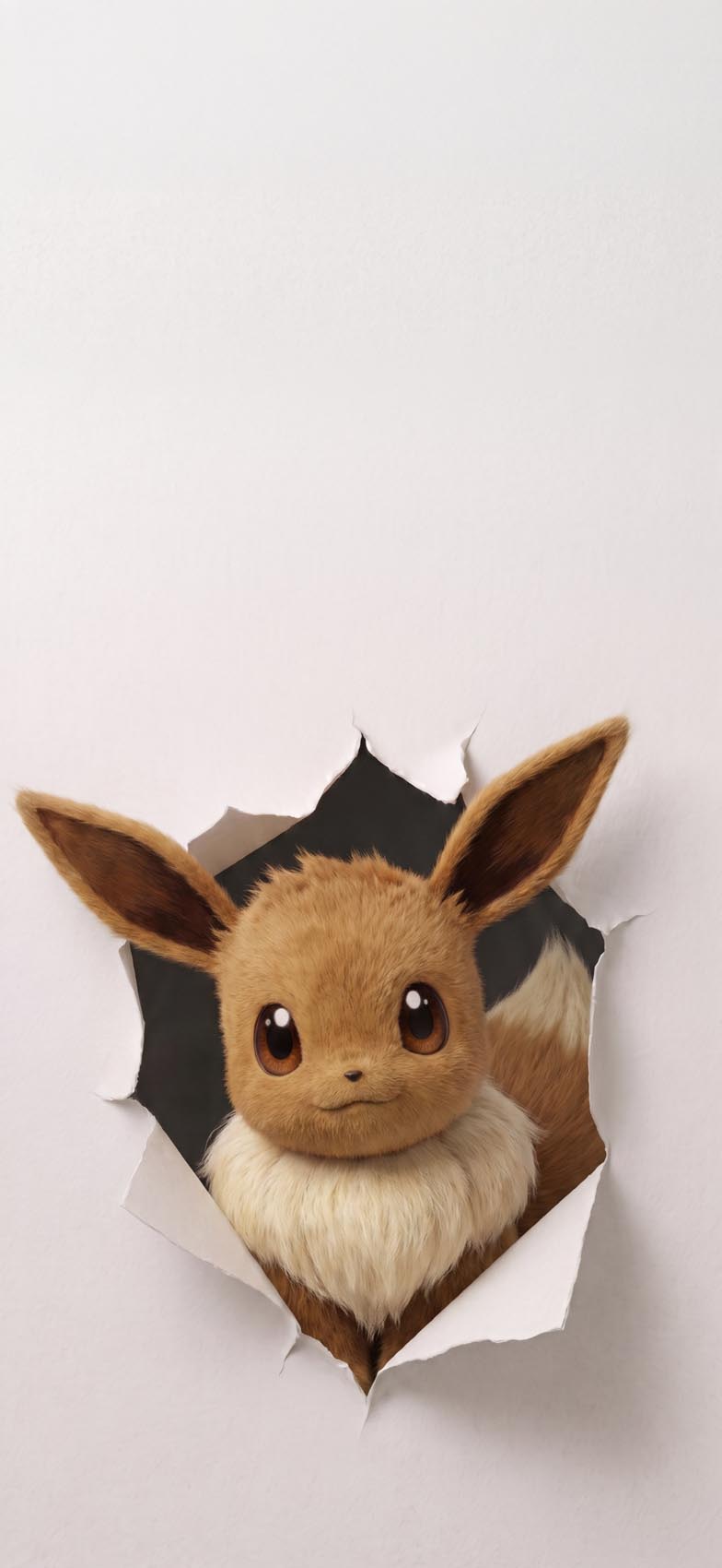
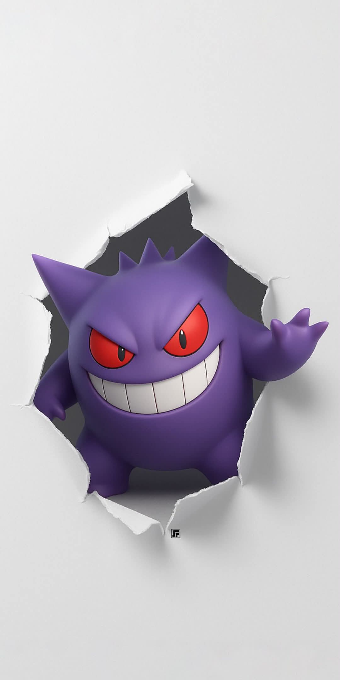
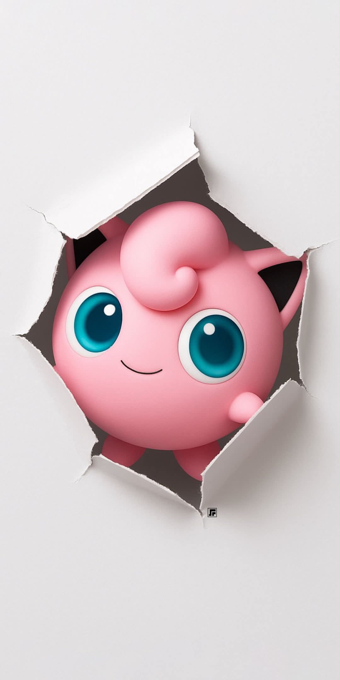
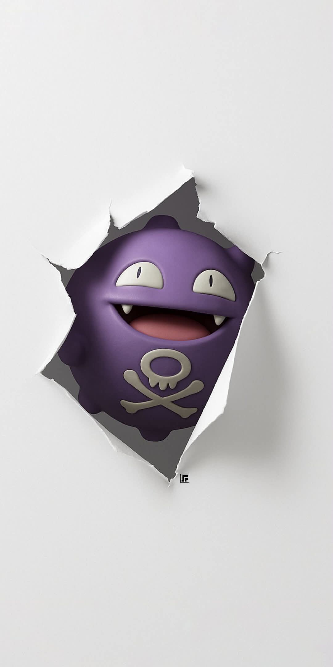
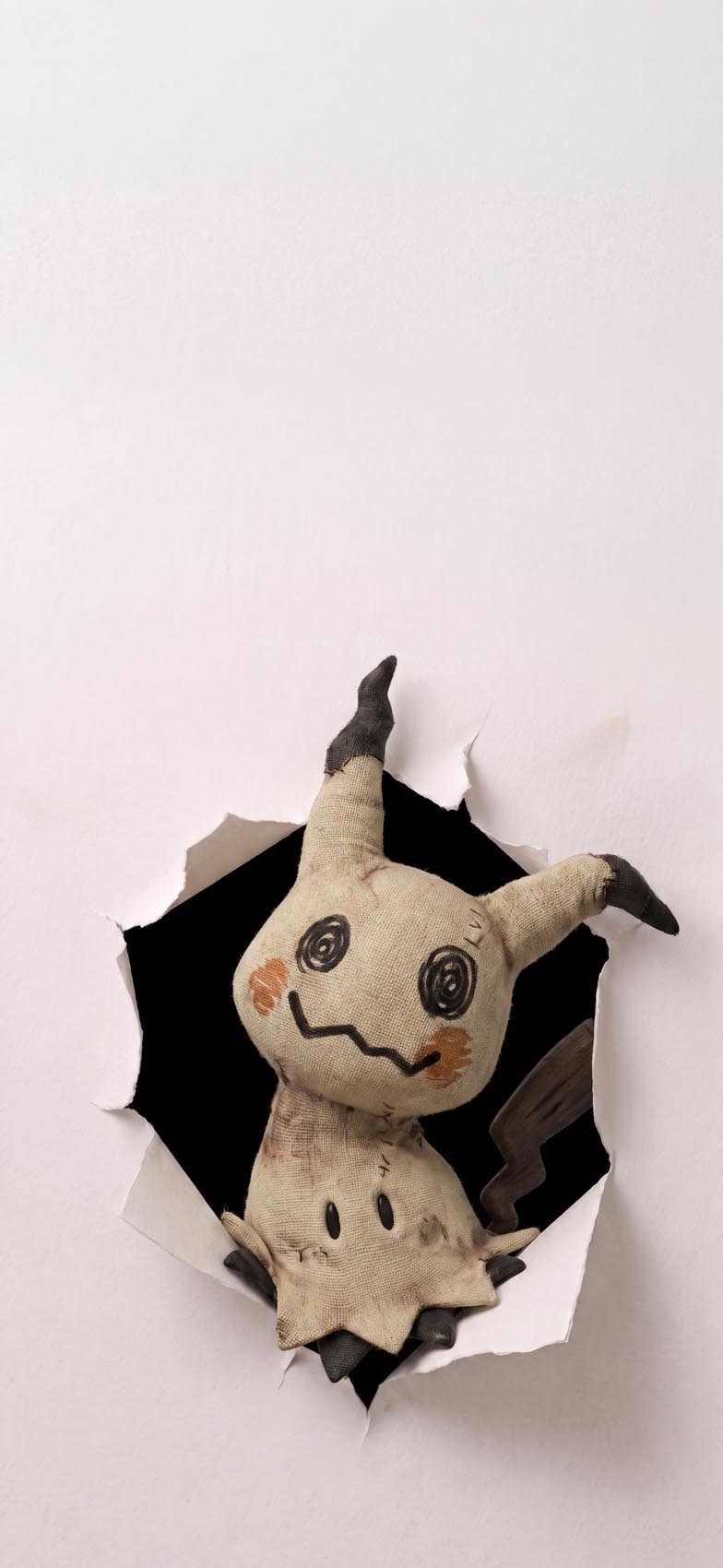
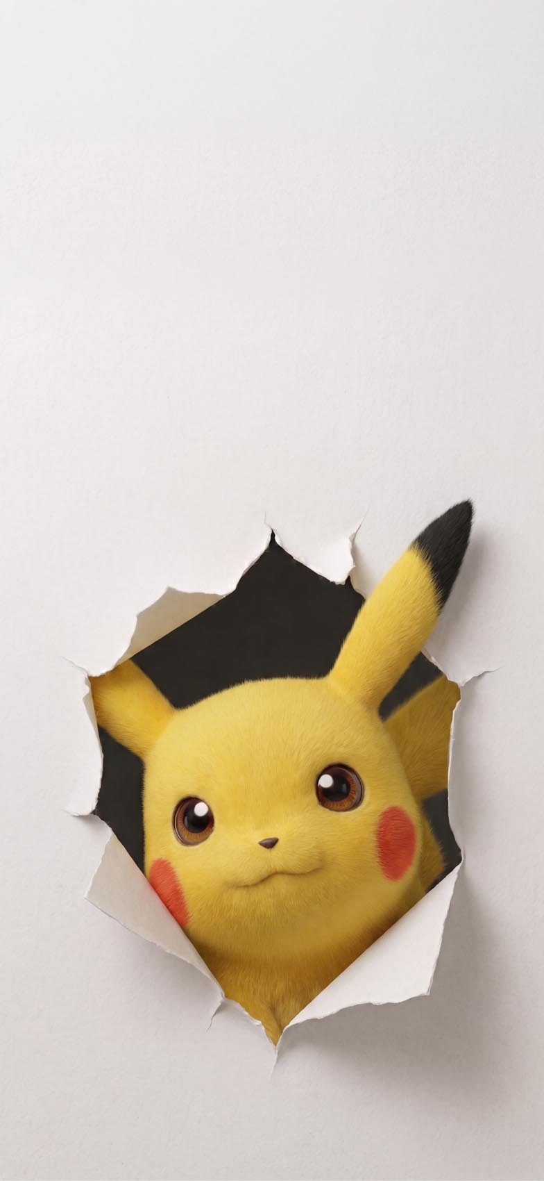
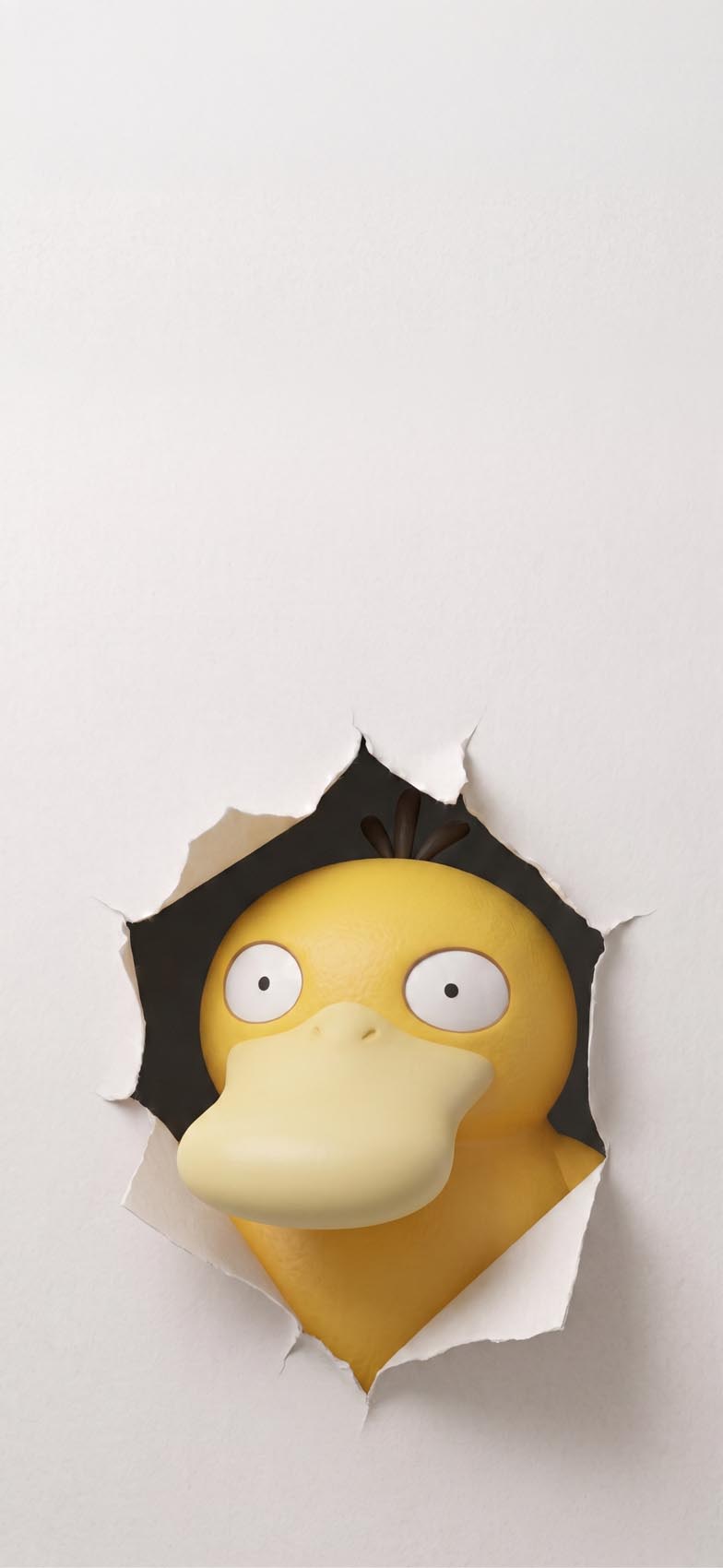 Pokemon wallpaper
- Classic starters and icons — Bulbasaur, Pikachu, and Charizard represent the most recognizable faces in the franchise, the ones most people picture first when they hear the word “Pokémon.”
- Fan-favorite oddballs — Psyduck’s permanently confused expression and Ditto’s blank, featureless smile bring a different kind of charm, leaning into the comedy of the character designs rather than raw power or nostalgia.
- Sinister and unsettling picks — Gengar’s sharp grin and Mimikyu’s stitched, slightly unnerving fabric texture cater to people who want something with a bit more edge than a cute mascot shot.
- Soft and pastel-toned characters — Jigglypuff’s pink roundness and Eevee’s fluffy fur render beautifully in this style, since the torn-paper frame gives their soft textures somewhere to visually “land” against the flat background.
- Effects-driven pieces — the Charizard wallpaper takes the concept further, adding scorched, burnt paper edges with embers and smoke instead of a clean tear, tying the visual damage to the character’s fire typing.
That last detail matters more than it might seem — a few wallpapers in sets like this go beyond the basic tear and adapt the damage itself to fit the character, which keeps a themed pack from feeling like the same template stamped out ten times in a row.
Getting the best result when you set one
A few things make torn-paper wallpapers look sharper in actual use rather than just in the preview thumbnail:
- Match the background color to your phone’s theme. Most of these use an off-white or light gray base, which pairs cleanly with both iOS light mode and dark mode, since the paper tone sits close to neutral either way. If you use widgets with light text, double-check contrast against the pale background before committing.
- Position the torn opening below the clock. Since these wallpapers deliberately leave the top of the screen empty, don’t crop or reposition the image in a way that pushes the character up into that space — the effect is built around that negative space staying open.
- Grab the full-resolution file. The torn-paper edges rely on fine detail — individual paper fibers, subtle shadow gradients around the tear — to sell the 3D illusion. A compressed or resized copy flattens those edges and makes the tear look pasted-on rather than physical.
- Pick a character that matches your icon style. A moody character like Gengar or Mimikyu pairs oddly with a bright, colorful icon pack; matching the wallpaper’s tone to your broader home screen aesthetic makes the whole setup feel more intentional.
Character wallpapers come and go in popularity, but a strong visual gimmick like this one tends to stick around longer than most, simply because it photographs well, works across dozens of different characters without getting stale, and does something a flat render can’t: it makes the screen itself feel like part of the illustration.