AMOLED Dark Wallpapers
Open the wallpaper section of almost any phone customization community and you’ll notice a pattern: the most-saved, most-shared images are almost never bright, busy, or colorful. They’re dark, quiet, and often built around a single small detail sitting in a sea of black. This is the world of AMOLED dark wallpapers, a design trend that’s less about following a fad and more about a genuine shift in how people think about phone screens as objects worth designing thoughtfully.
From Practical Trick to Design Philosophy
Dark wallpapers built for AMOLED and OLED screens started as a practical hack. Because these display types light up each pixel individually rather than shining a constant backlight through the whole panel, a screen filled mostly with black actually uses less power than one filled with white or bright colors. Early adopters of this trick weren’t necessarily chasing an aesthetic — they were chasing battery life, especially on phones with smaller batteries or heavy daily use.
Somewhere along the way, though, this practical habit turned into its own design language. Once people realized how striking a single glowing element looked against pure black, dark wallpapers stopped being just a battery hack and became a full-fledged style choice. Today, an entire visual culture has grown up around this idea: minimalist line art, moody landscape silhouettes, glowing app-icon-style shapes, and abstract gradients that fade into darkness at the edges. The battery benefit is still there, but for a lot of people, it’s now a secondary bonus rather than the main reason for choosing this look.
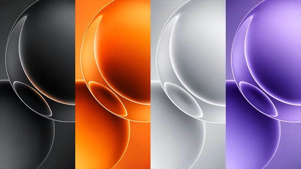
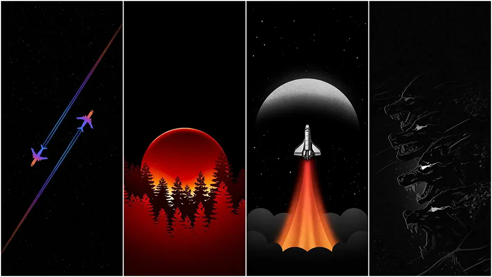
The Aesthetic Categories Worth Knowing
If you spend any time browsing AMOLED wallpaper collections, a few recurring styles show up again and again, each with its own personality.
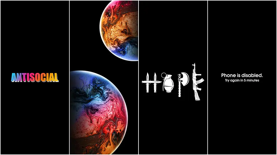
Minimalist silhouette designs are probably the most common — a mountain range, a tree branch, a city skyline, or an animal outline rendered as a thin, glowing shape against total darkness. These work well because the simplicity keeps the image from competing with your app icons, while the glow effect gives it just enough presence to feel intentional rather than empty.
Space and cosmic themes are the second major category, and they tend to lean into AMOLED’s contrast the hardest. A scattering of stars, a faint nebula cloud, or a crescent moon rendered in soft light all take full advantage of how AMOLED handles fine detail against black — each point of light appears to hover independently rather than blending into a washed-out sky, which is something LCD screens simply can’t replicate as convincingly.
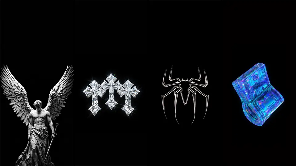
A third growing category is what’s often called “glitch” or neon-line design — thin, sharp geometric shapes outlined in a single accent color, sometimes with a subtle scan-line or grid texture layered in. This style tends to appeal to people who want something that feels more modern or tech-forward rather than nature-inspired, and it photographs particularly well on always-on lock screens.
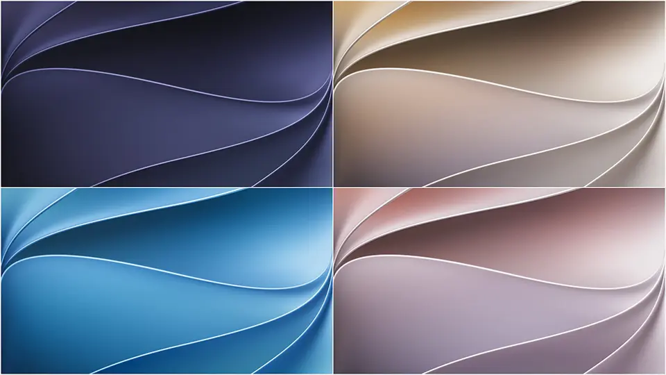
Matching a Wallpaper to Your Phone’s Personality
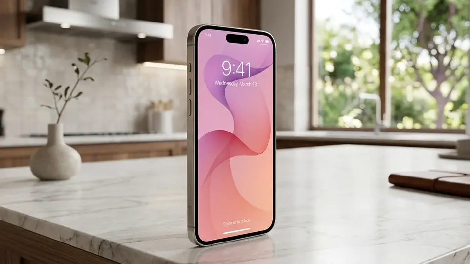
Because AMOLED dark wallpapers are so visually quiet by design, the small details end up mattering a lot more than they would with a busy, photographic background. A single accent color — a thin blue outline, a warm amber glow, a soft violet gradient — ends up defining the entire mood of your home screen, so it’s worth picking a tone that actually matches how you use your phone day to day. Cooler tones like blue, teal, or violet tend to read as calm and focused, which suits people who want their phone to feel less distracting. Warmer accents like amber, coral, or soft red feel more energetic and tend to stand out more against notification badges and colorful app icons.


It’s also worth considering where you’ll see the wallpaper most. If you mostly interact with your lock screen briefly to check notifications, a busier design with more visual detail can work well since you won’t be staring at it for long. If you’re someone who leaves your phone on an always-on display or spends a lot of time on your home screen between apps, a sparser design will feel less fatiguing over time.
Getting the Full Benefit
If part of your interest in this style is genuinely about saving battery, it’s worth double-checking that the “black” in your chosen wallpaper is actually pure black rather than a very dark gray, since even a small difference in pixel value changes whether those areas of the screen are fully powered off or just dimmed. Beyond that, pairing an AMOLED dark wallpaper with your phone’s dark mode setting compounds the effect further, since app backgrounds, keyboards, and system menus will also default to black rather than white throughout your day-to-day use.
Final Thoughts
What started as a niche battery-saving trick has grown into one of the most recognizable and enduring styles in mobile design. Whether you’re drawn to a glowing minimalist skyline, a quiet star field, or a sharp neon outline, AMOLED dark wallpapers offer something that few other styles can: a background that’s genuinely built around the way your specific screen technology works, rather than just borrowed from a stock photo library. That’s a rare case where good design and good engineering point in exactly the same direction.