Redmi K90 Ultra Wallpapers
Every flagship phone launch comes with more than just new hardware — it also tends to bring a distinct visual identity that shows up first in its stock wallpapers. The Redmi K90 Ultra is no exception. Its wallpaper set has been quietly circulating among Android enthusiasts, and it’s easy to see why: instead of photographic scenery or busy patterns, this collection leans into a smooth, glass-like abstract style that feels custom-built for the phone’s premium positioning.
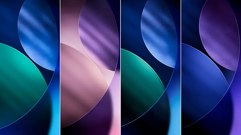
A Study in Glossy, Overlapping Orbs
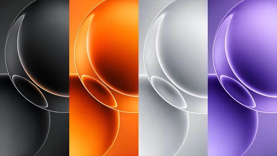
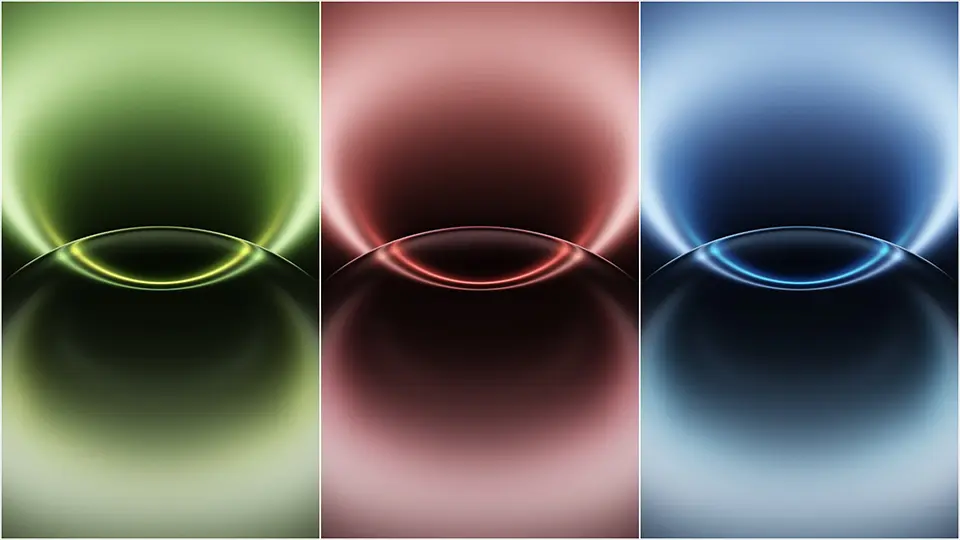
The defining visual motif across this wallpaper set is a cluster of large, glass-like spheres that overlap and catch light differently depending on the angle. Each piece in the collection uses the same underlying composition — a crescent-shaped highlight curving down the left side of the frame, with a thin rim of warm color glowing along certain edges — but the color treatment changes entirely from one wallpaper to the next, giving the whole set a cohesive yet varied feel.
The seven variations span a genuinely wide color range: a moody matte black version with a subtle copper-orange glow tracing the sphere’s edge, a warm all-orange rendition that leans almost amber in the shadows, a deep teal edition with the same orange highlight cutting through it, a clean white-and-silver take that feels closest to brushed metal, a rich violet-purple version, and two distinct blues — a lighter, sky-toned blue and a deeper, more saturated ocean blue. Because the underlying shapes stay consistent, switching between these wallpapers feels less like changing your background entirely and more like changing the “mood lighting” of your home screen.
Why This Style Works So Well on a Phone Screen
There’s a practical reason this kind of wallpaper design has become so popular on premium Android devices, and it comes down to how modern smartphone displays actually render color and depth. AMOLED and OLED panels, which the K90 Ultra is expected to use, produce their deepest blacks and richest color saturation when large areas of the screen are filled with smooth gradients rather than fine detail. A wallpaper built from soft, rounded glass shapes plays directly into that strength — the gradients blend seamlessly at full brightness, and the small rim-light details along the sphere edges give just enough visual interest without cluttering the screen.
This same design logic explains why the icons and widgets on your home screen stay easy to read against this kind of background. Unlike a busy photo with lots of competing detail, these wallpapers have large calm areas — particularly toward the upper right of the frame — where app icons and clock widgets can sit without fighting for visual attention. It’s a deliberate design choice, and one that’s become something of an industry standard for flagship wallpaper sets over the past few years, especially as brands compete to show off their display technology at launch.
Picking the Right Color for Your Setup

 Download Image
  Download Image
  Download Image
  Download Image
  Download Image
  Download Image
With seven tones to choose from, the color you land on will probably come down to two things: your phone’s case color and your own visual preference. If you’re using a black or dark-colored case, the black or deep teal wallpaper will blend almost seamlessly with the bezel, creating a more immersive, edge-to-edge look when the phone is off or in standby. If your case is a lighter shade — silver, white, or a pastel tone — the white or sky-blue version tends to complement it best without looking washed out.
The two blues are worth calling out separately since they photograph very differently despite coming from the same base design. The lighter sky-blue variant feels airy and works well as a daytime, always-on-display style background, while the deeper ocean-blue version has more contrast and tends to look richer in low-light environments, like when you’re using your phone at night with brightness turned down.
The orange and purple options are the boldest choices in the set, and they’re best suited to anyone who wants their lock screen to stand out rather than blend in. Both carry noticeably warmer undertones than the blues and teal, which makes them a good match if you tend to prefer warm-toned UI themes or amber-tinted always-on-display clocks.
A Few Tips for Setting These as Your Wallpaper
Because these designs use large smooth gradients, they hold up extremely well even when cropped for smaller elements like your lock screen clock widget or app folders. If your device supports a dynamic or “breathing” wallpaper mode, several of these tones — particularly the teal and purple — tend to look especially good with subtle brightness animation enabled, since the gradient shifts make the glass-like highlight appear to shimmer slightly as the screen’s ambient light adjusts. If you’re setting one manually, it’s generally best to disable any heavy blur or parallax effects your launcher might add by default, since the wallpaper’s own depth already does most of that work.
Final Thoughts
Whether your taste runs toward moody blacks, warm ambers, or cool blues, the Redmi K90 Ultra wallpaper collection offers enough range to match almost any preference while keeping a consistent, polished visual identity across every color option. It’s a strong example of how a single well-executed design concept — in this case, layered glass spheres with warm rim lighting — can be reworked across a full palette without losing its sense of cohesion, making it one of the more versatile stock wallpaper sets to come out of a recent flagship launch.
1 thought on “Redmi K90 Ultra Wallpapers: Download the Glossy Orb Collection in 4K”