
3D Spatial iPhone Wallpapers
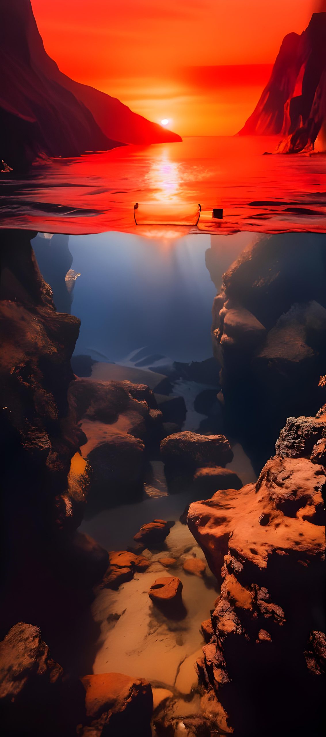
There’s a specific kind of wallpaper that’s been taking over iPhone home screens lately, and it’s not just another sunset or mountain shot. It’s the split-view, 3D-feeling image — half above a surface, half below it, or built around a torn opening, a doorway, a gap in a fence, something that tricks your eye into reading depth instead of a flat rectangle. Call it spatial, call it dimensional, call it whatever — the effect is the same: your lock screen stops looking like a photo and starts looking like a window.
This collection pulls together eighteen wallpapers built around exactly that illusion, sized and cropped for iPhone’s portrait display.
Why split-view and spatial wallpapers actually work
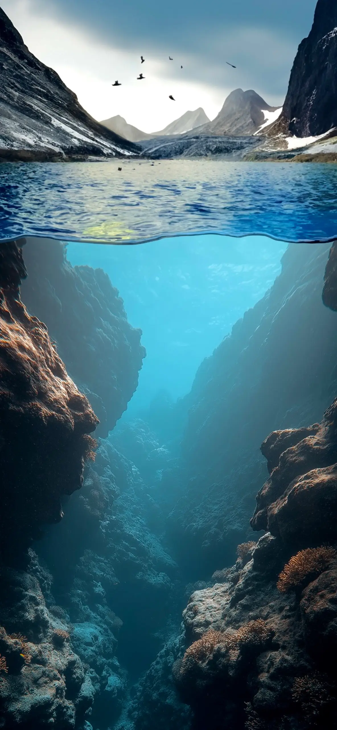
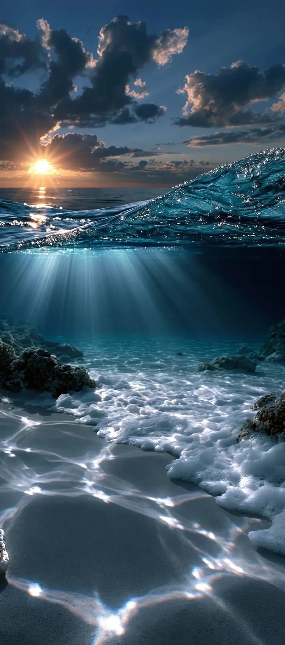
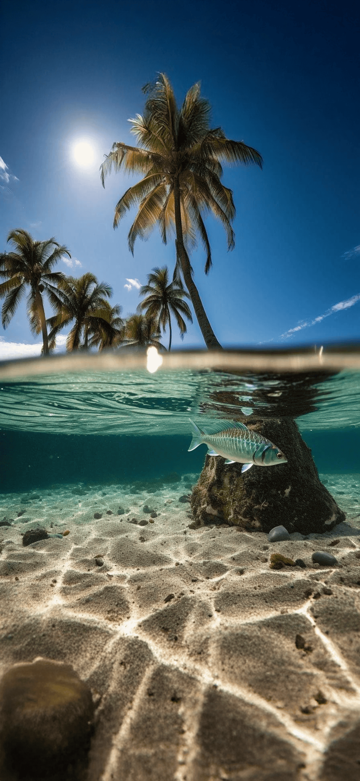
Most wallpapers are single-plane images: one horizon, one light source, one mood. Spatial wallpapers break that on purpose. A shot that shows a coral reef falling away beneath a calm turquoise surface, with palm trees and sky sitting above the waterline, gives your eye two distinct zones to read — and that contrast is what makes the image feel three-dimensional even though it’s still just a flat picture on a screen.
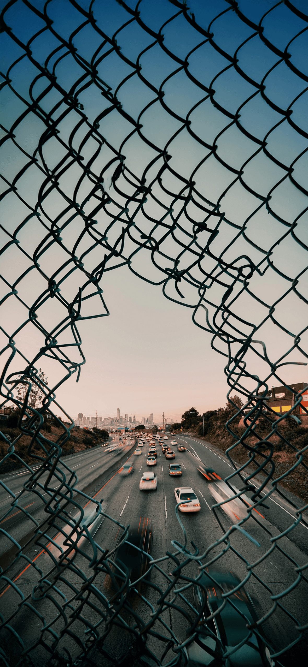
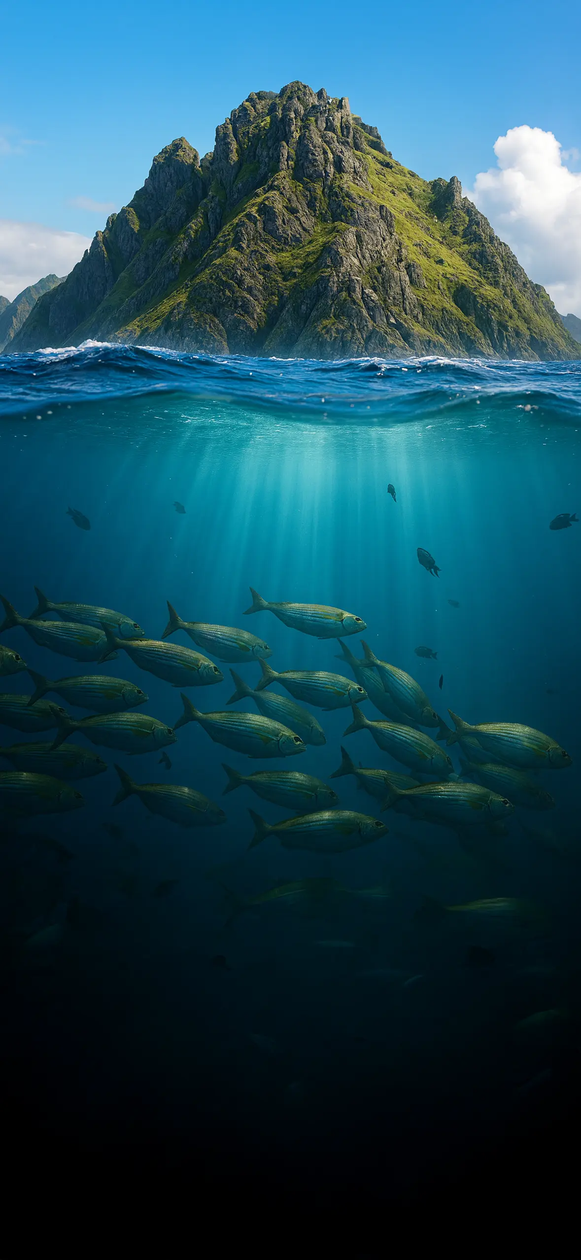
The same trick shows up in different forms throughout this set: a torn chain-link fence framing a freeway and city skyline behind it, a shipwreck’s hull disappearing into teal water, a mossy sea stack rising out of the ocean while a school of fish drifts below the surface line. Each one uses a hard visual break — a waterline, a hole, an edge — to separate foreground from background more aggressively than a normal landscape shot would. That separation is what reads as “spatial” or “3D” even on a completely flat phone screen.
There’s also a practical reason these work so well specifically on iPhone. The portrait aspect ratio naturally suits a top-half/bottom-half composition. A wide landscape photo has to be cropped down for a phone, often losing the parts that made it interesting. A vertical split-view image, on the other hand, was basically made for this shape — the transition line (water’s surface, a canyon gap, a fence hole) tends to land right around the middle of the screen, leaving open space near the top for the clock and near the bottom for the dock.
What’s in this set
The collection isn’t limited to just one type of “spatial” shot. It ranges across:
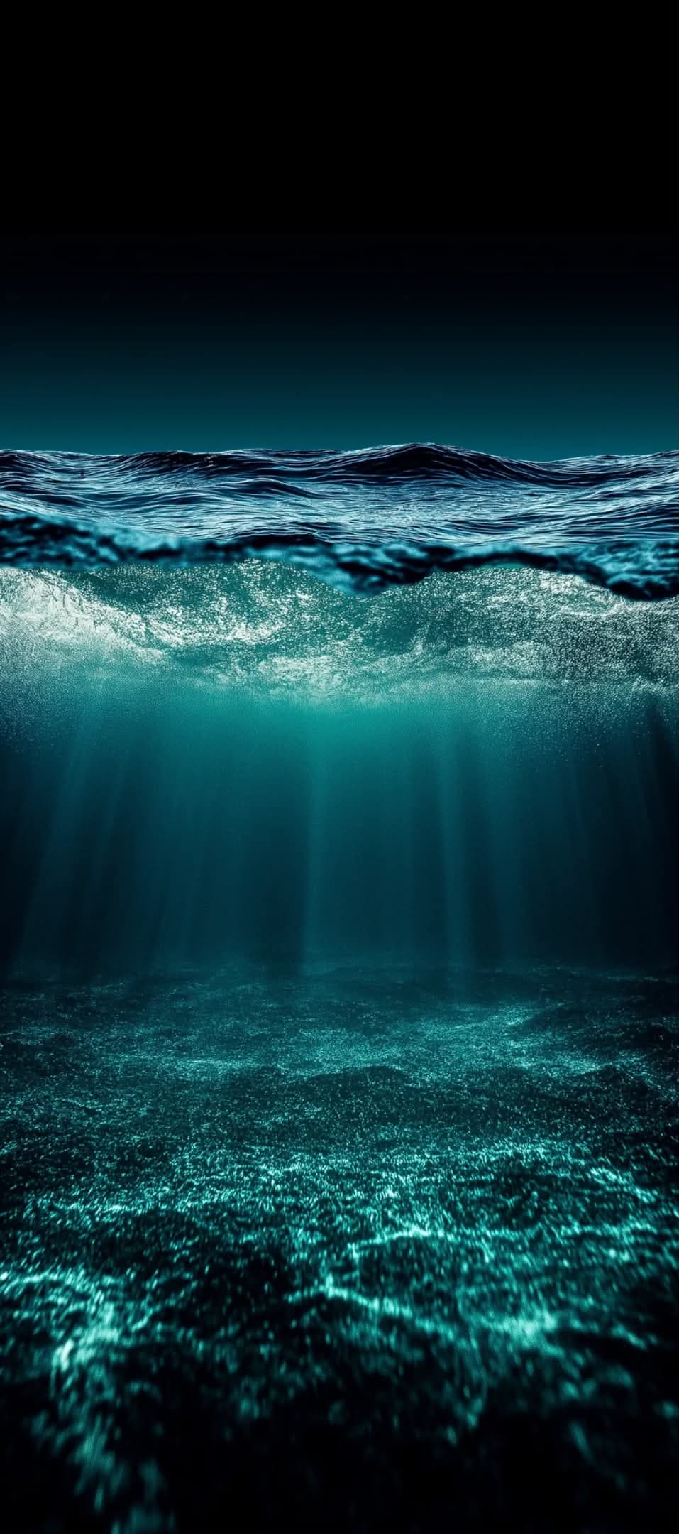
- Underwater split-views — coral reefs, sharks, shipwrecks, and fish schools shot from just below the surface, with the sky and shoreline still visible above the waterline.
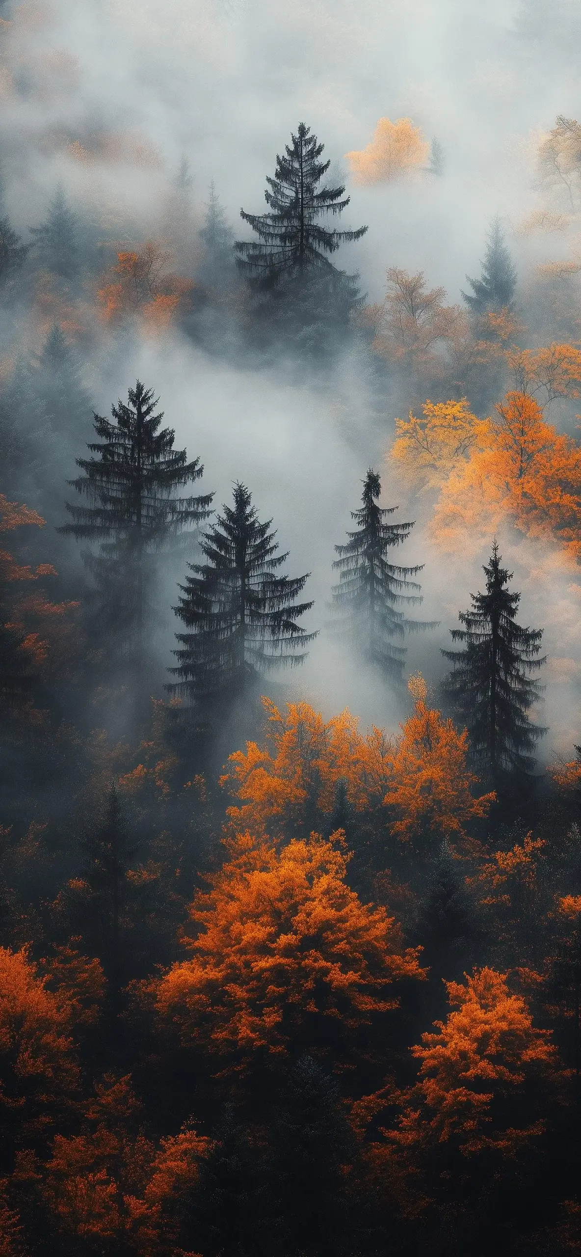
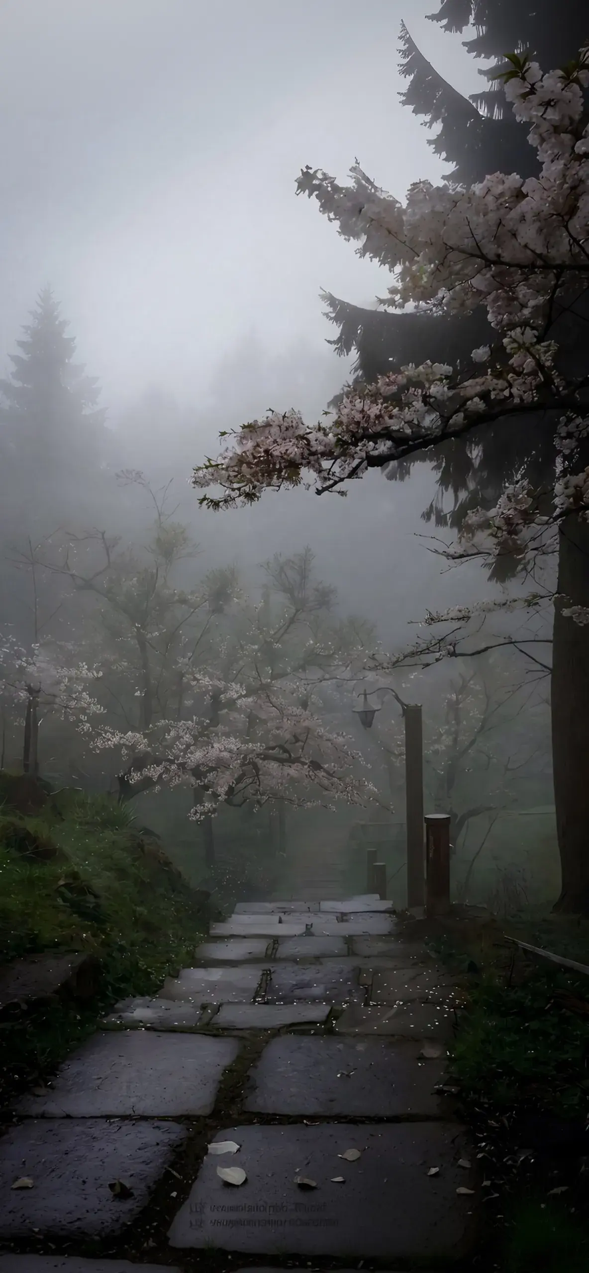
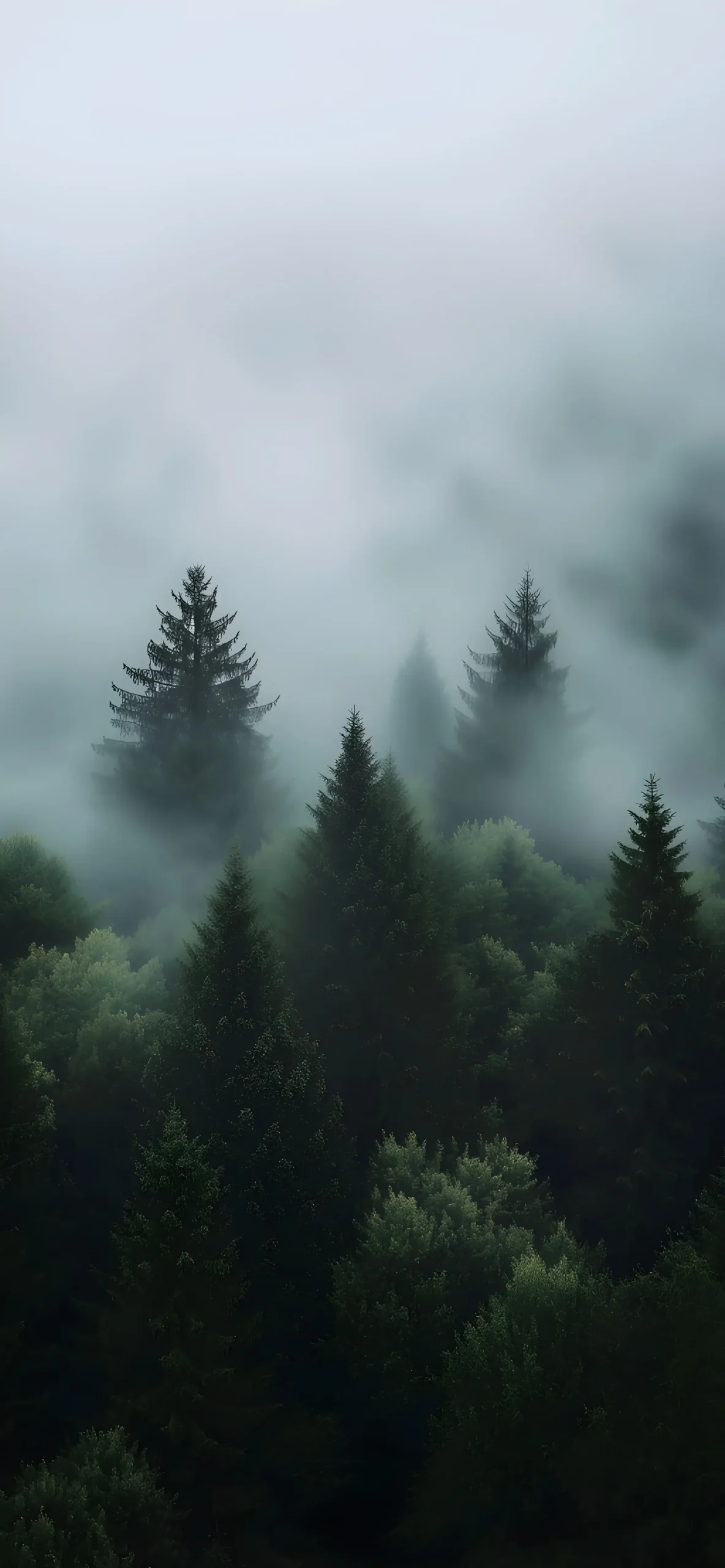
- Fog and depth-of-field forest shots — pine and autumn forests where mist naturally separates near, middle, and distant trees into layers, creating depth without needing an actual physical split.
- Urban and surreal framing shots — a torn chain-link fence opening onto a freeway and skyline, an airplane descending over a city street, images that use a foreground object as a frame around the background scene.
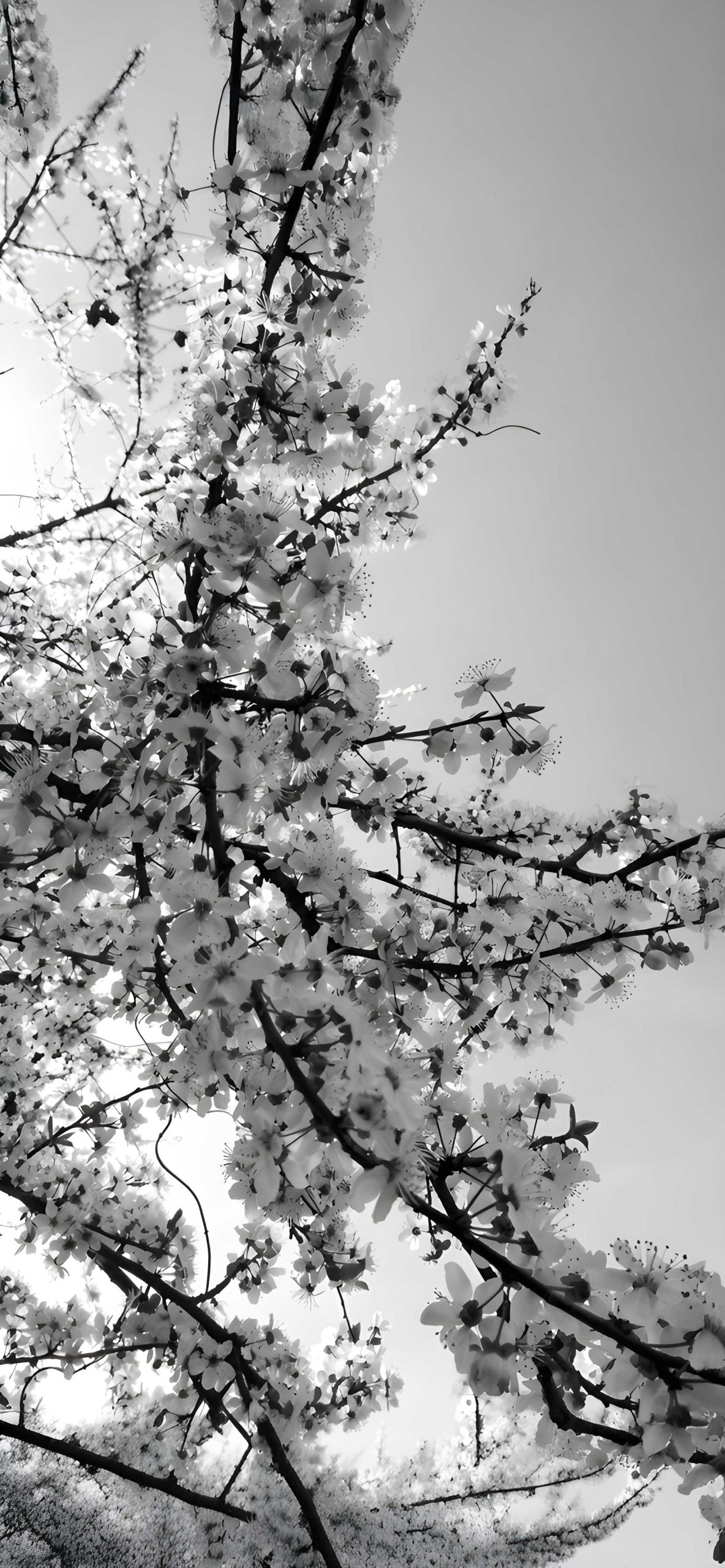
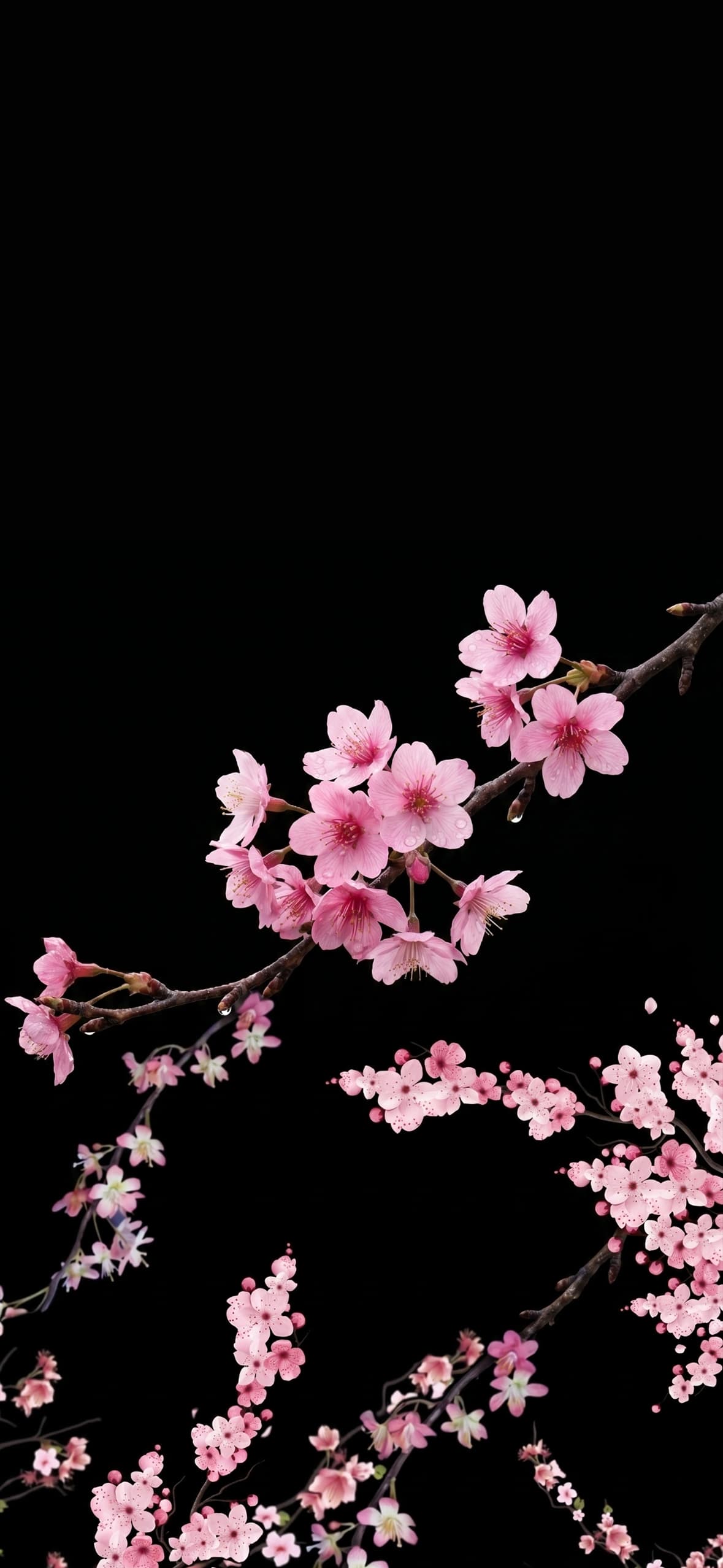
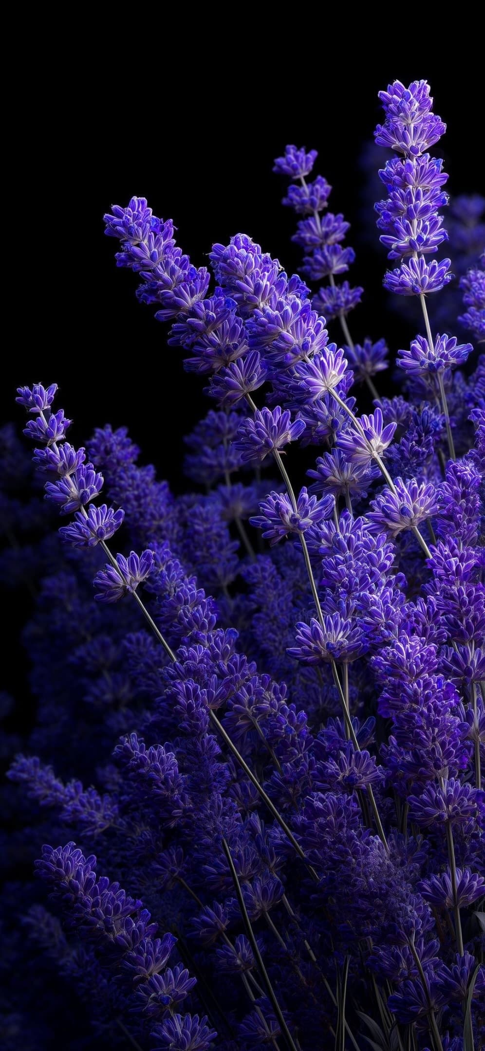
- Close, dark floral shots — cherry blossoms and lavender set against pure black, which don’t use a horizontal split but instead rely on lighting contrast to make the flowers pop forward off the screen.
Mixing these types matters, because a full set of only underwater shots gets repetitive fast, even if every individual image looks great. Variety in how the depth illusion is built keeps the whole collection feeling fresh rather than like the same trick recycled eighteen times.
Getting the most out of a spatial wallpaper




A few things make these look better in practice, not just in the preview thumbnail:
- Let the split line breathe. If a wallpaper has a clear top/bottom or foreground/background division, try not to center your clock or widgets directly on top of that line — it competes with the illusion instead of supporting it.
- Pick contrast over similarity. The wallpapers here that read as most “3D” are the ones with the biggest tonal difference between foreground and background — bright sky over dark water, sharp foreground detail against a blurred distance. If two zones in an image look too similar in brightness, the depth effect flattens out.
- Use these more on lock screen than home screen. The depth effect is most convincing before app icons get laid on top of it. Save the busiest, most detailed spatial shots for your lock screen, and consider a simpler image for the home screen underneath your apps.
- Download full resolution. Compression flattens fine detail fast, and depth-heavy images rely on that detail — light rays, water texture, mist gradients — to sell the illusion. A soft, over-compressed version loses most of what makes it work.
Spatial wallpapers aren’t a passing trend so much as a natural next step for phone backgrounds — once you’ve seen a screen that looks like it has actual depth instead of a printed photo, it’s hard to go back to a flat sunset. This set was built to give that effect across as many moods and settings as possible, from ocean depths to foggy forest paths, without repeating the same shot twice.

3 comments