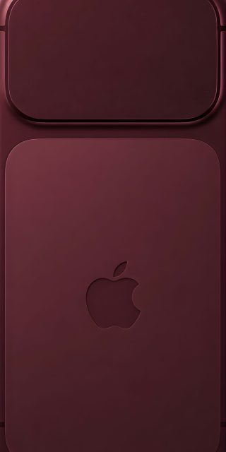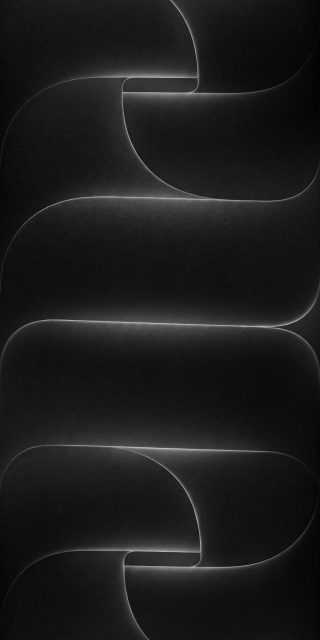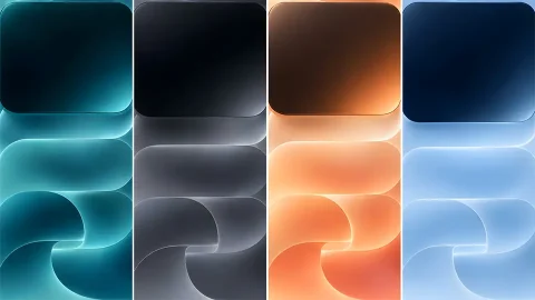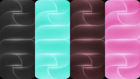
iPhone 13 Official Wallpapers
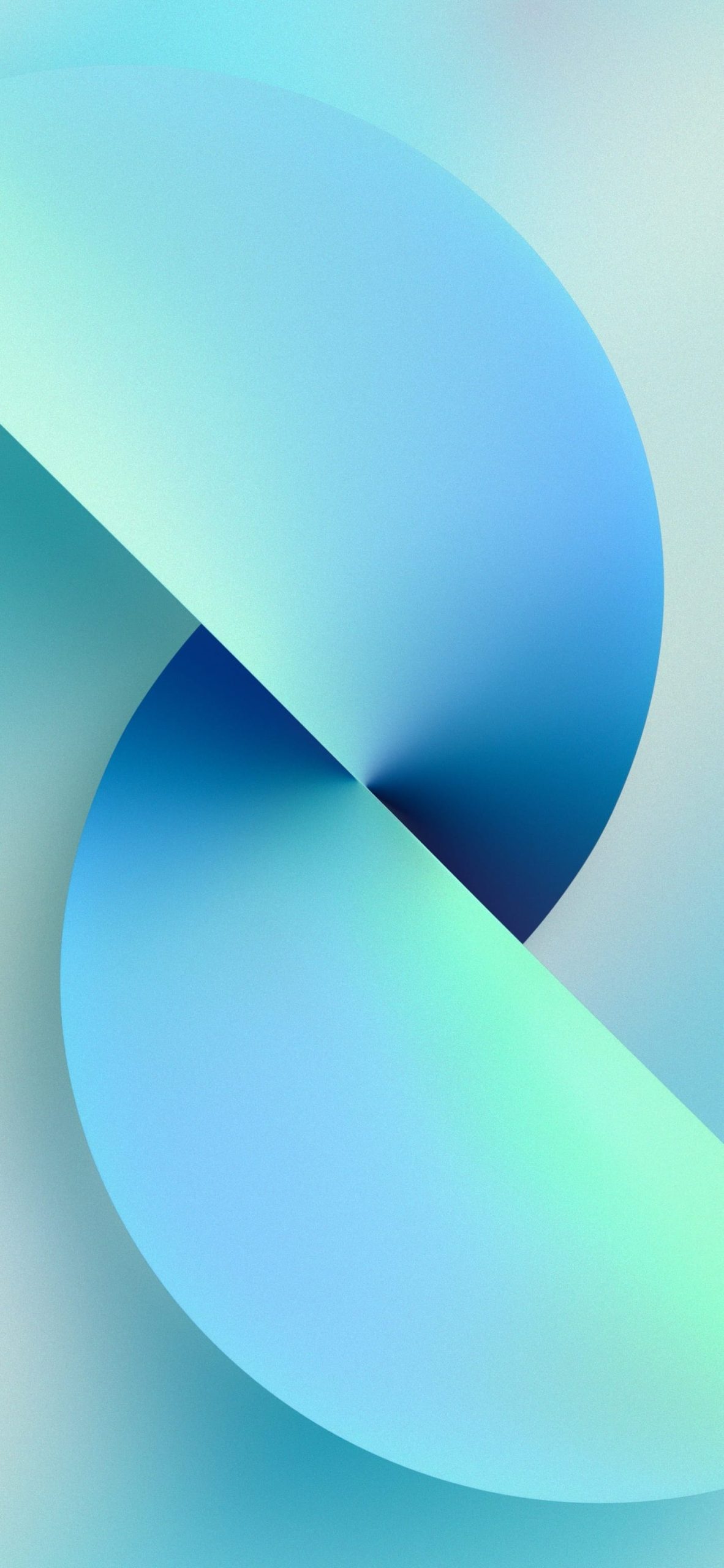
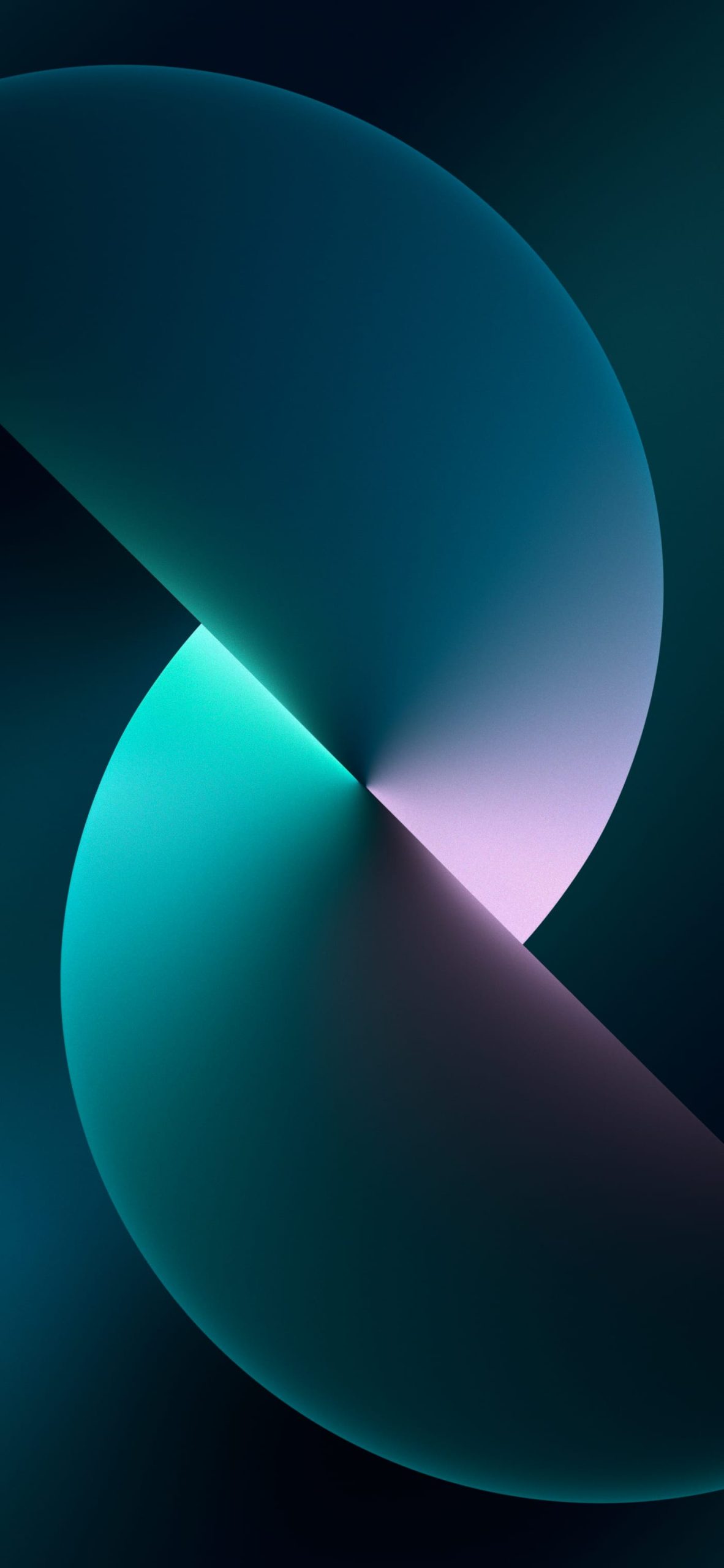
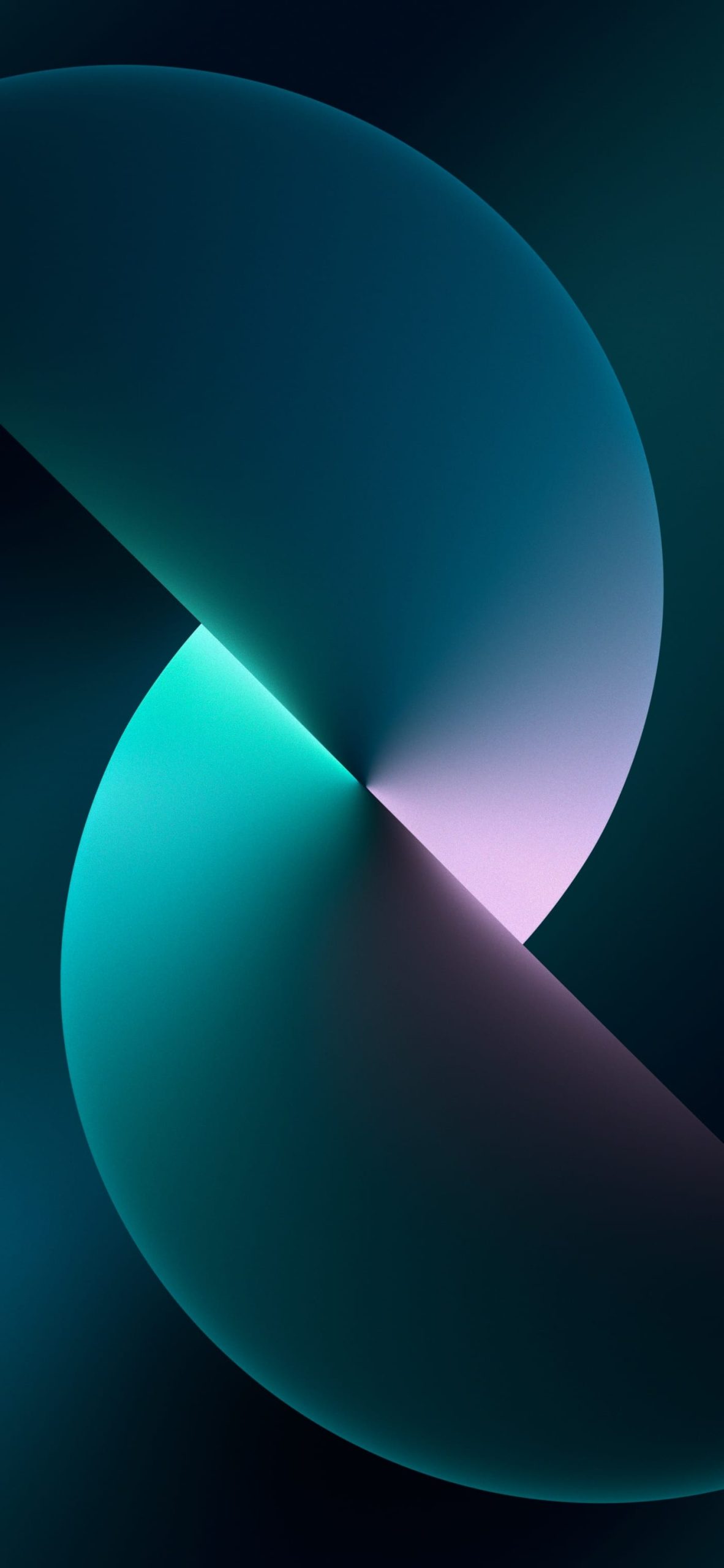
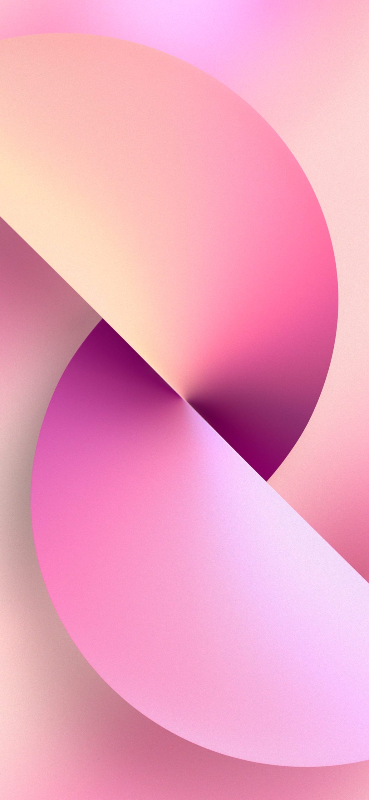
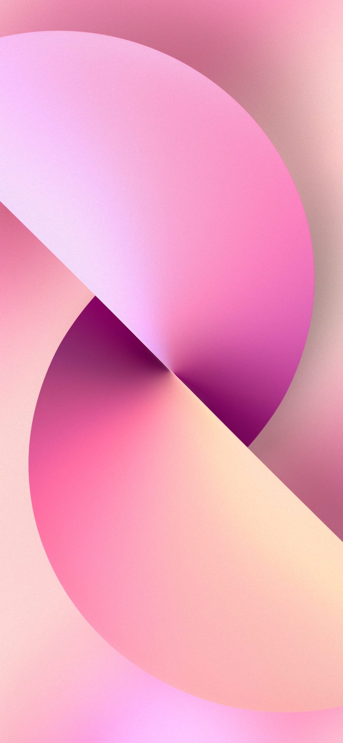
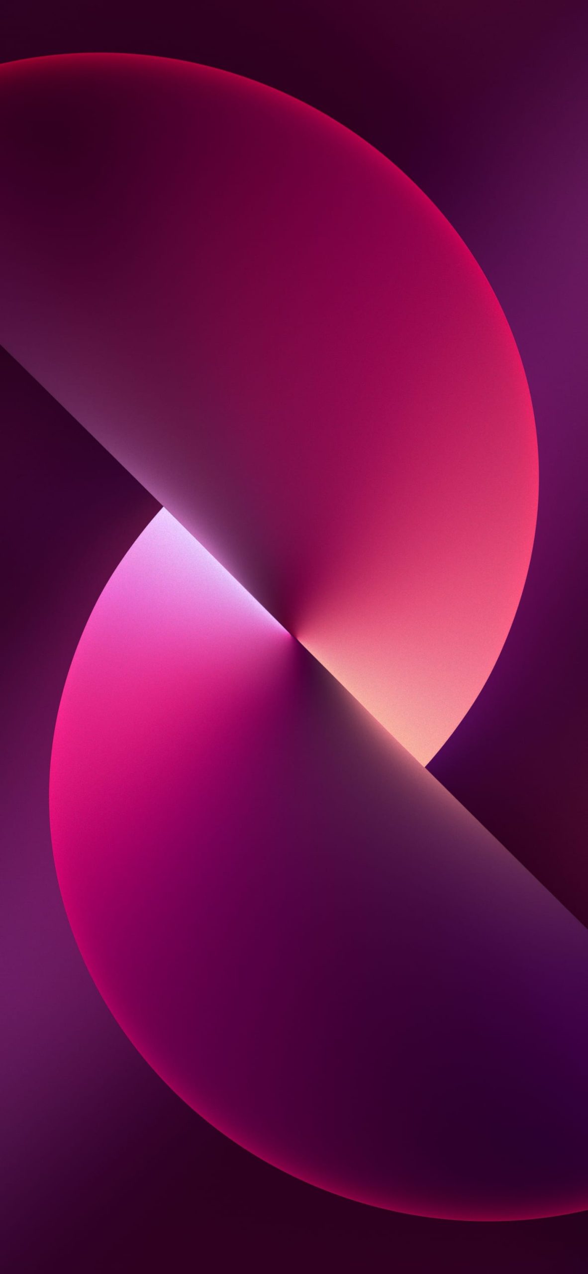
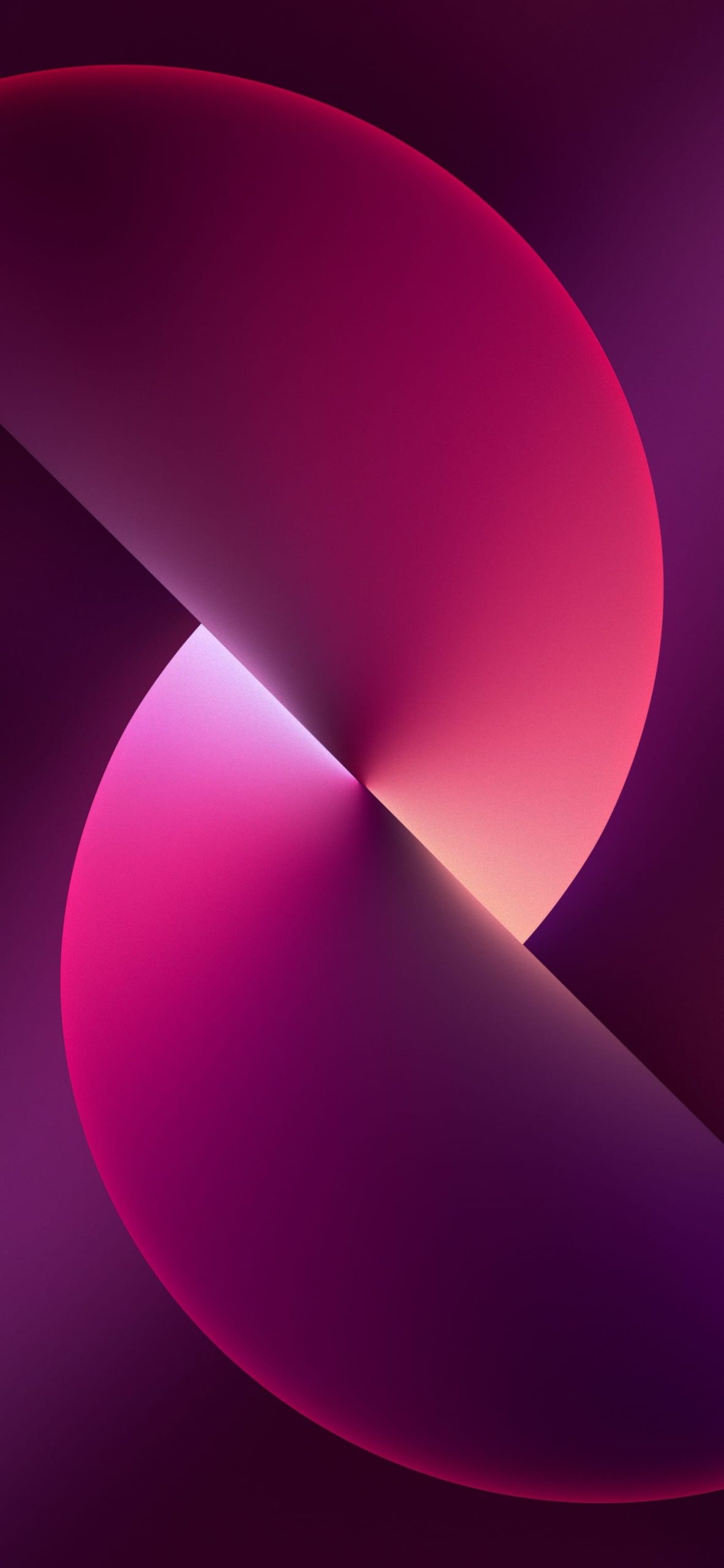
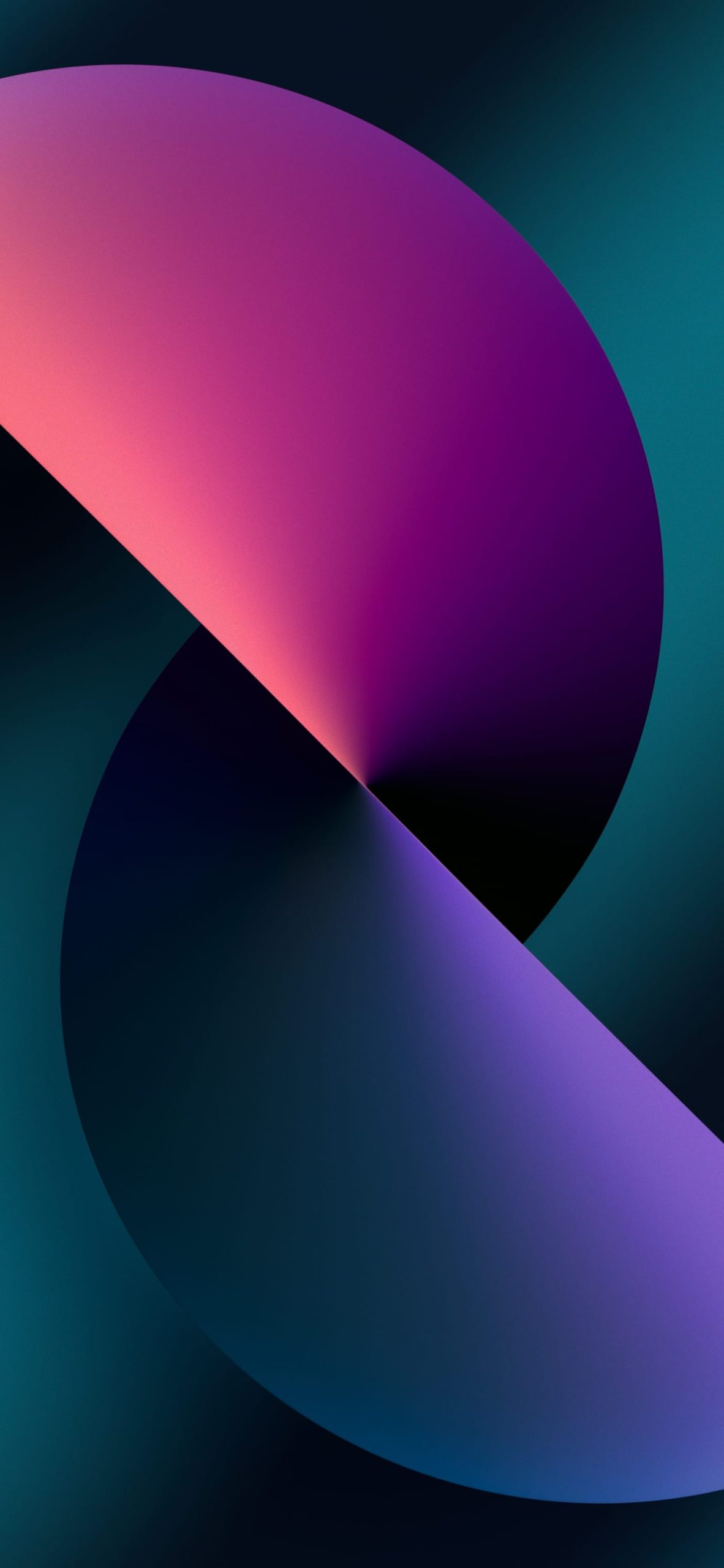
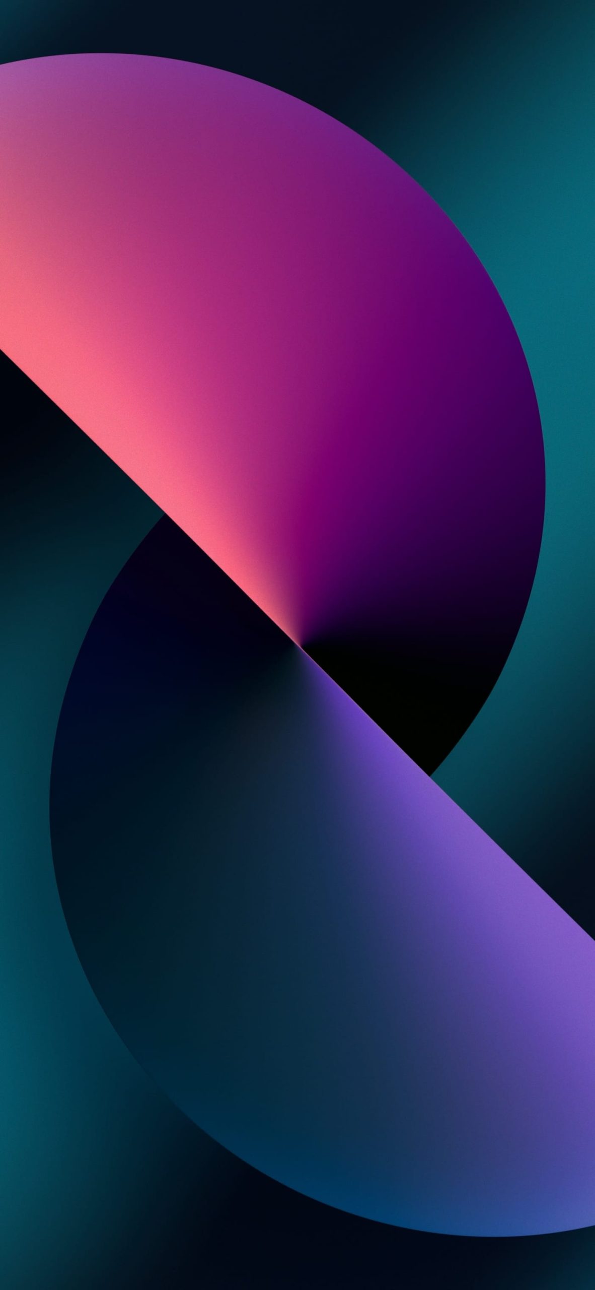
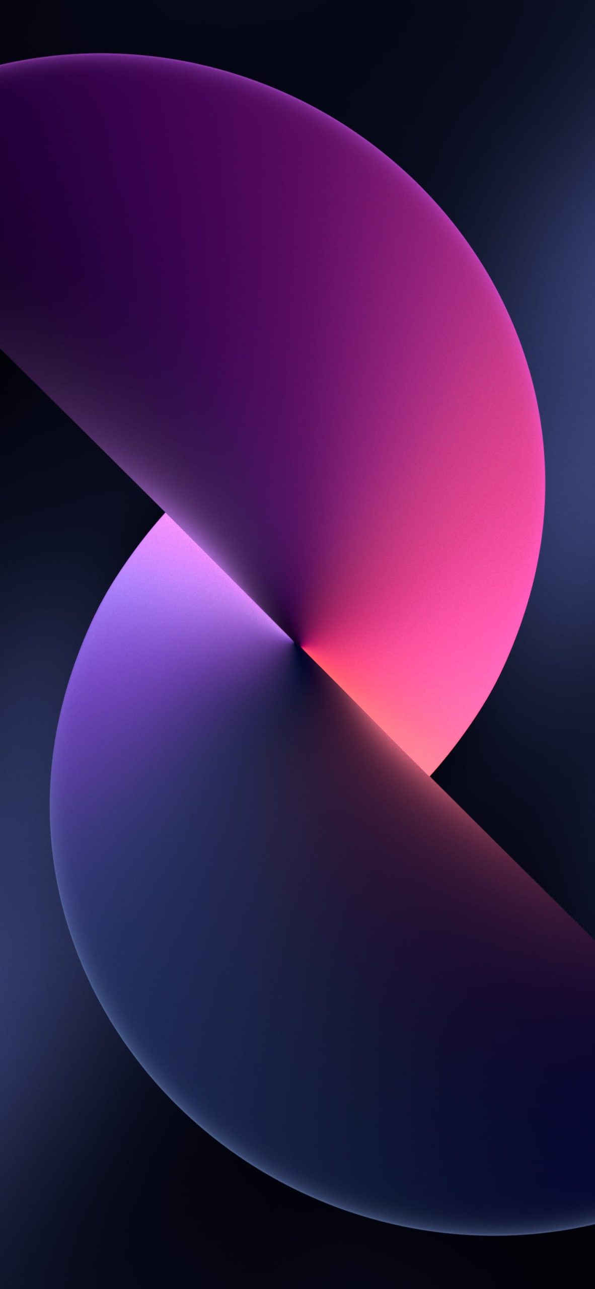
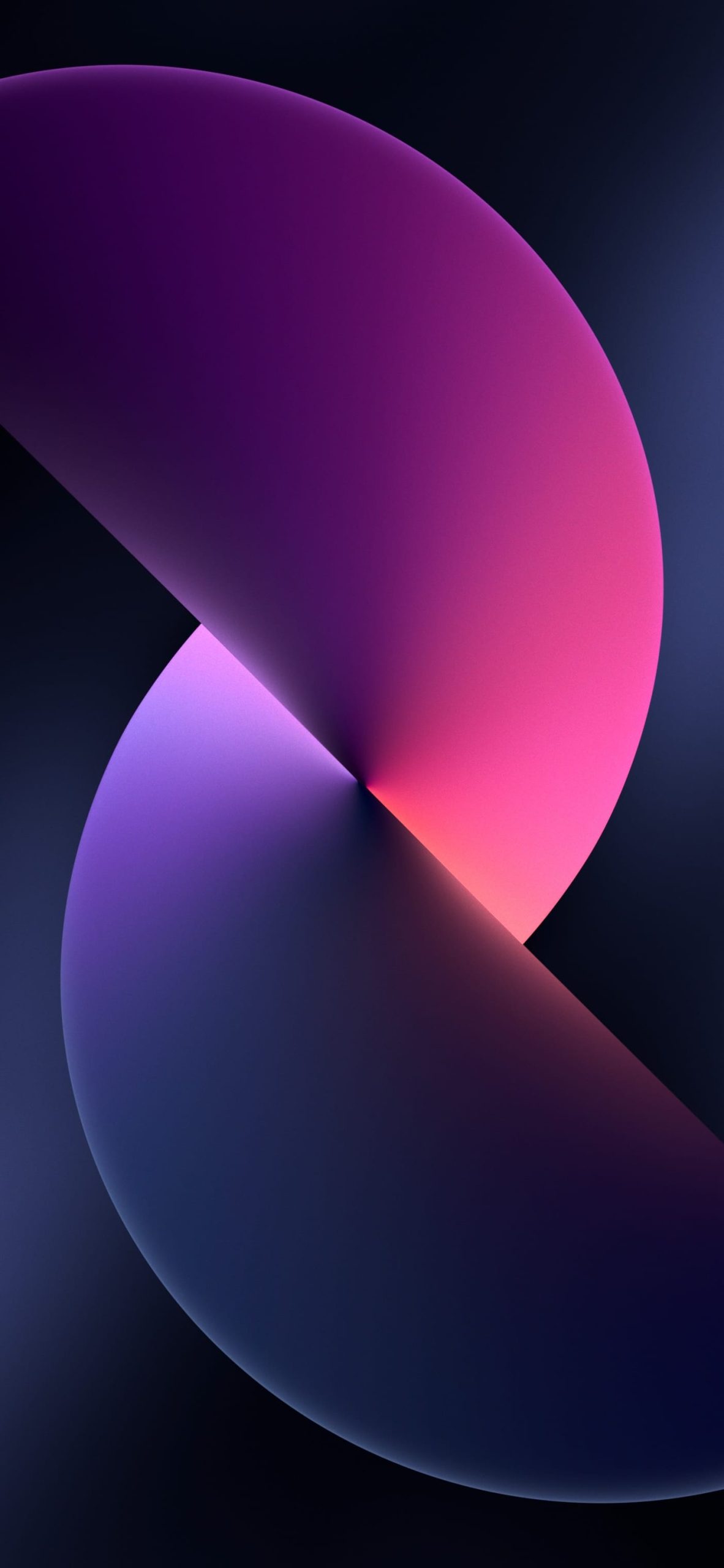
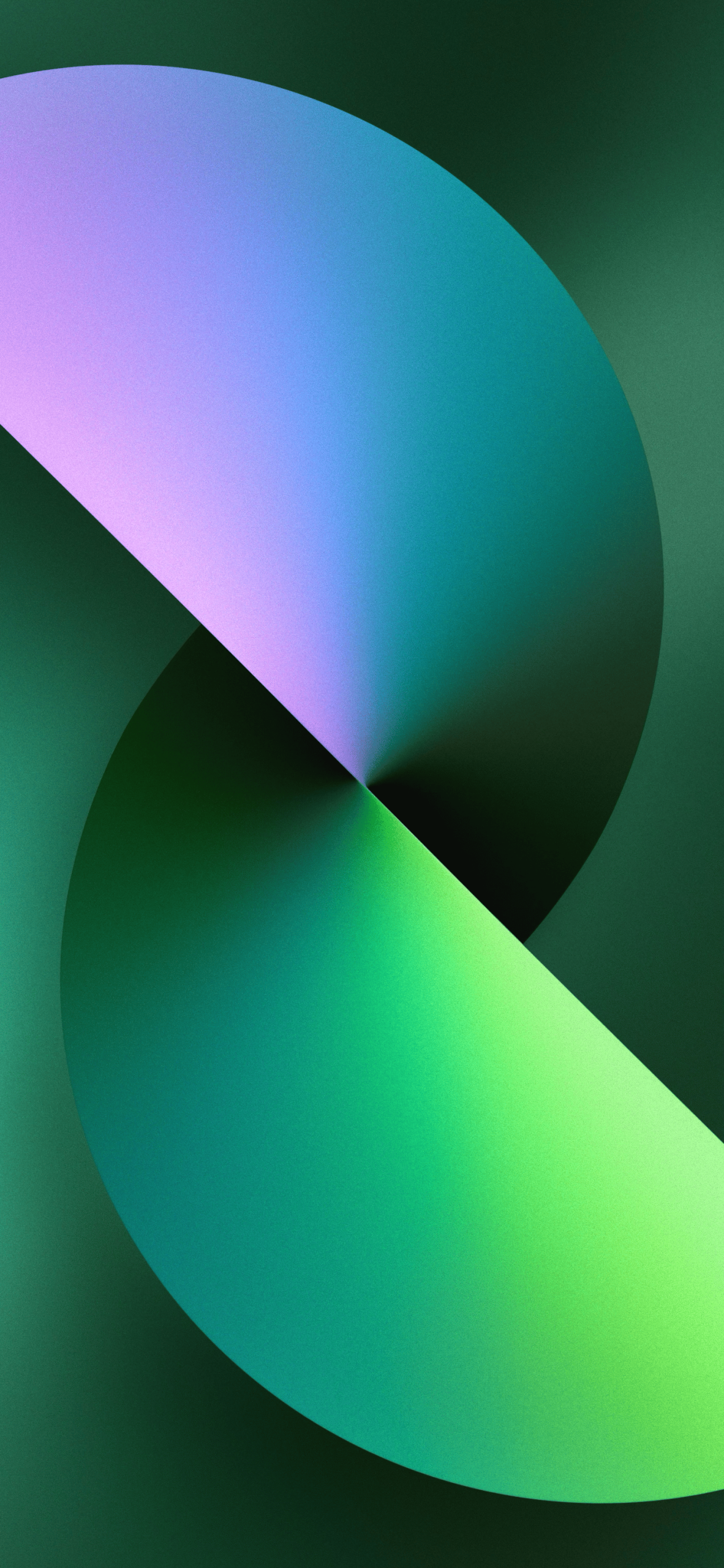
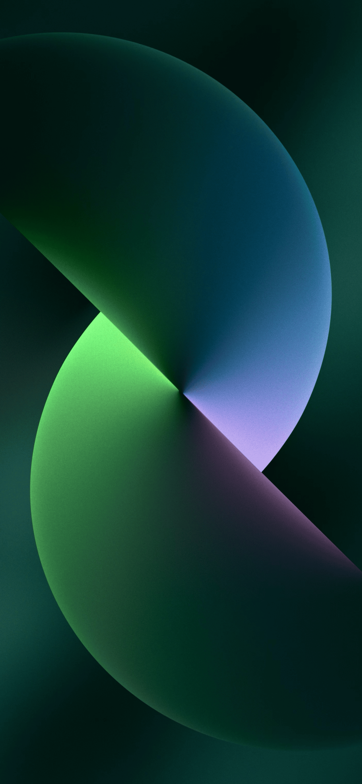
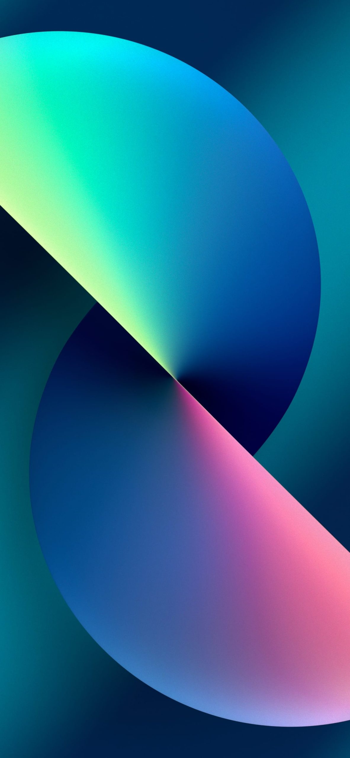
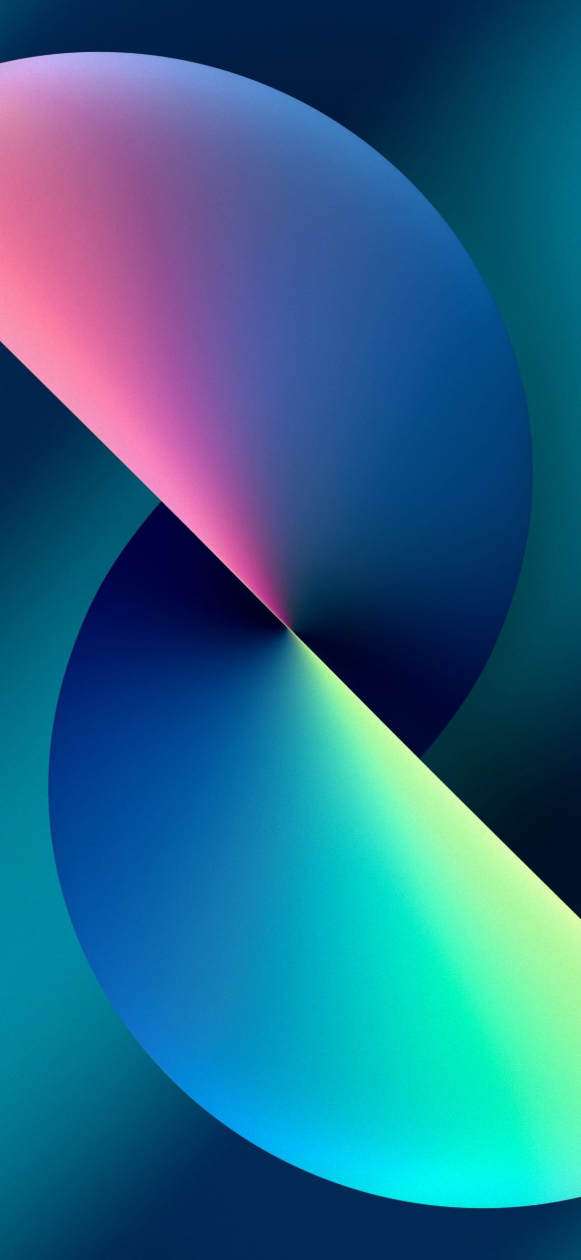
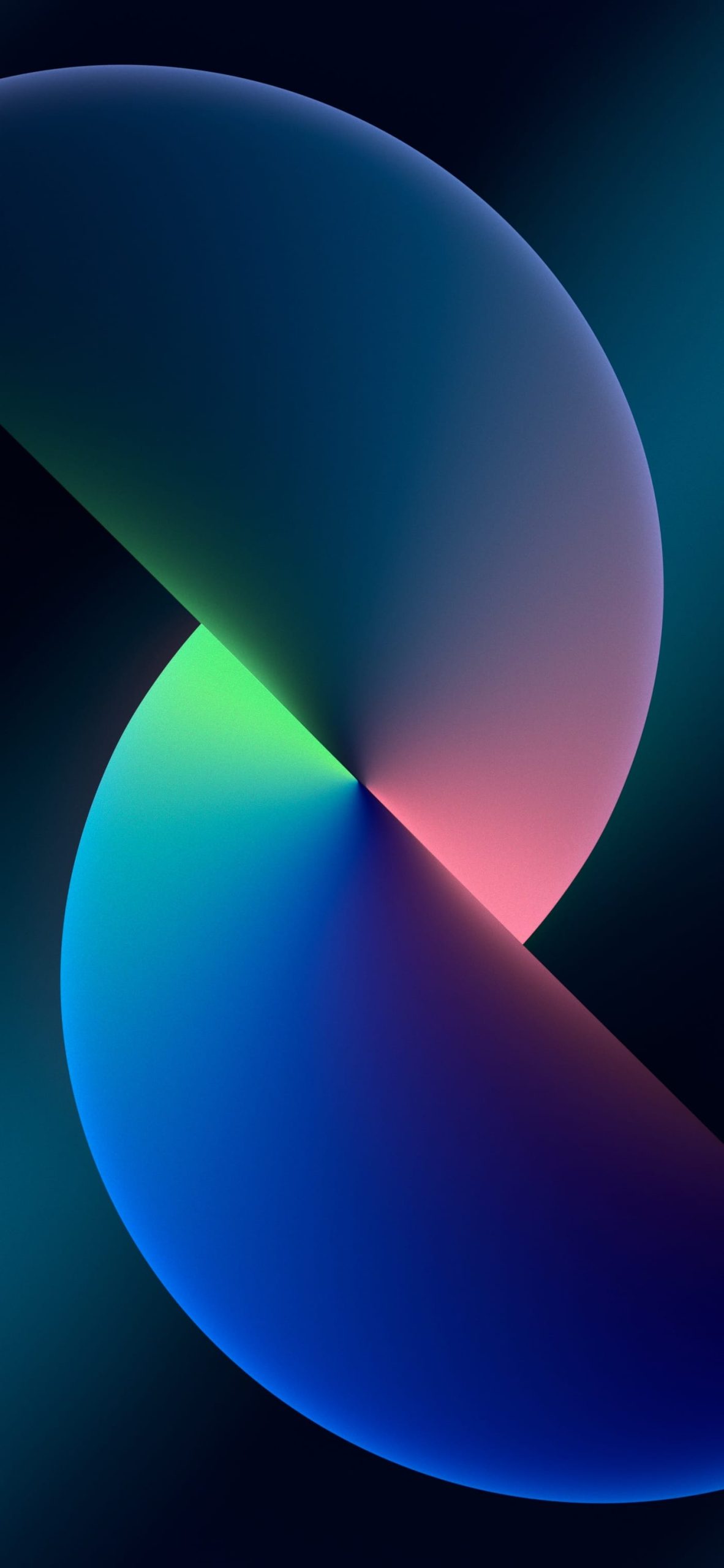
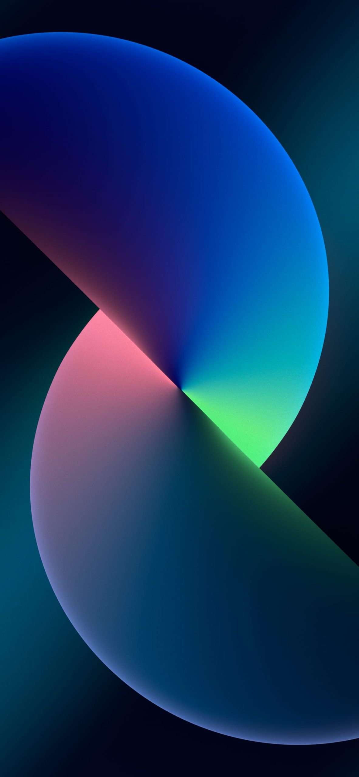
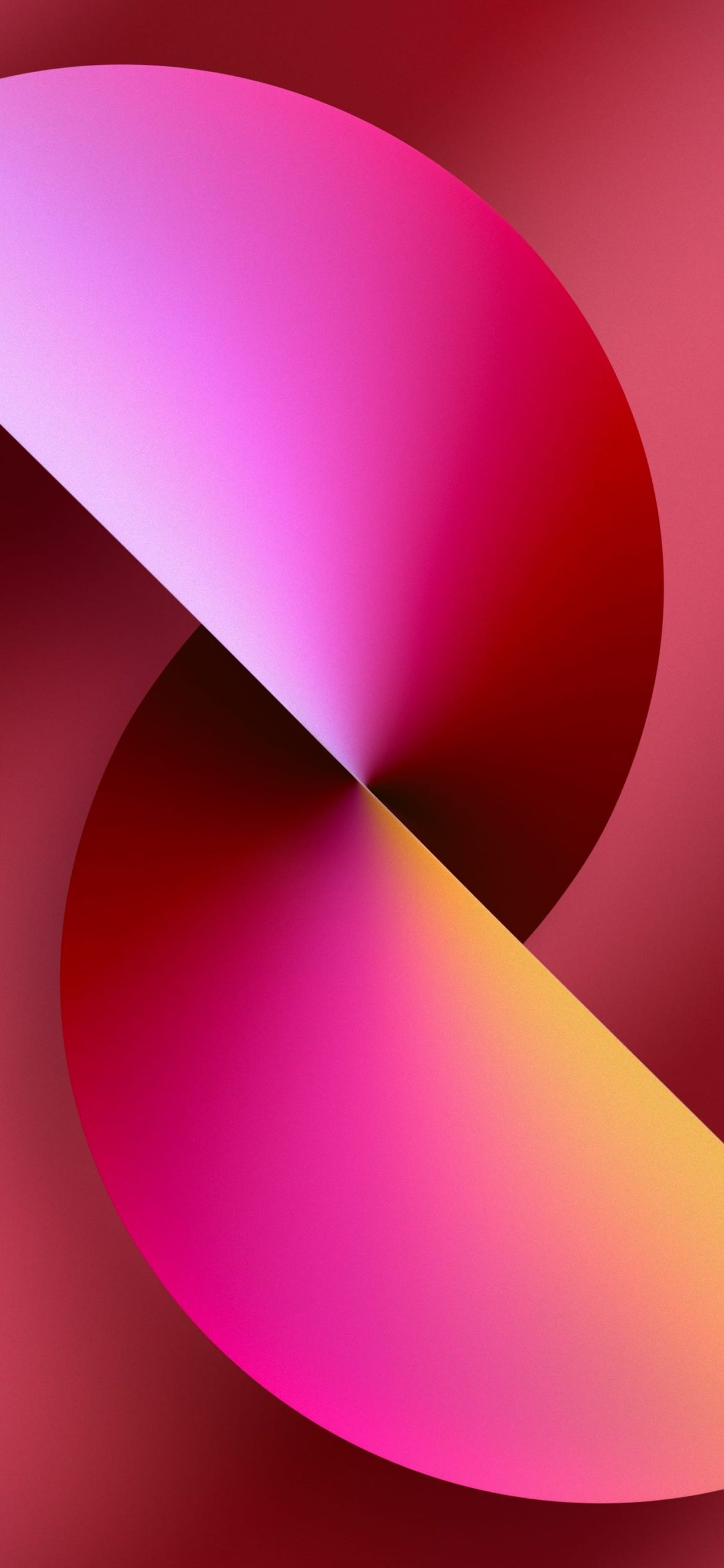
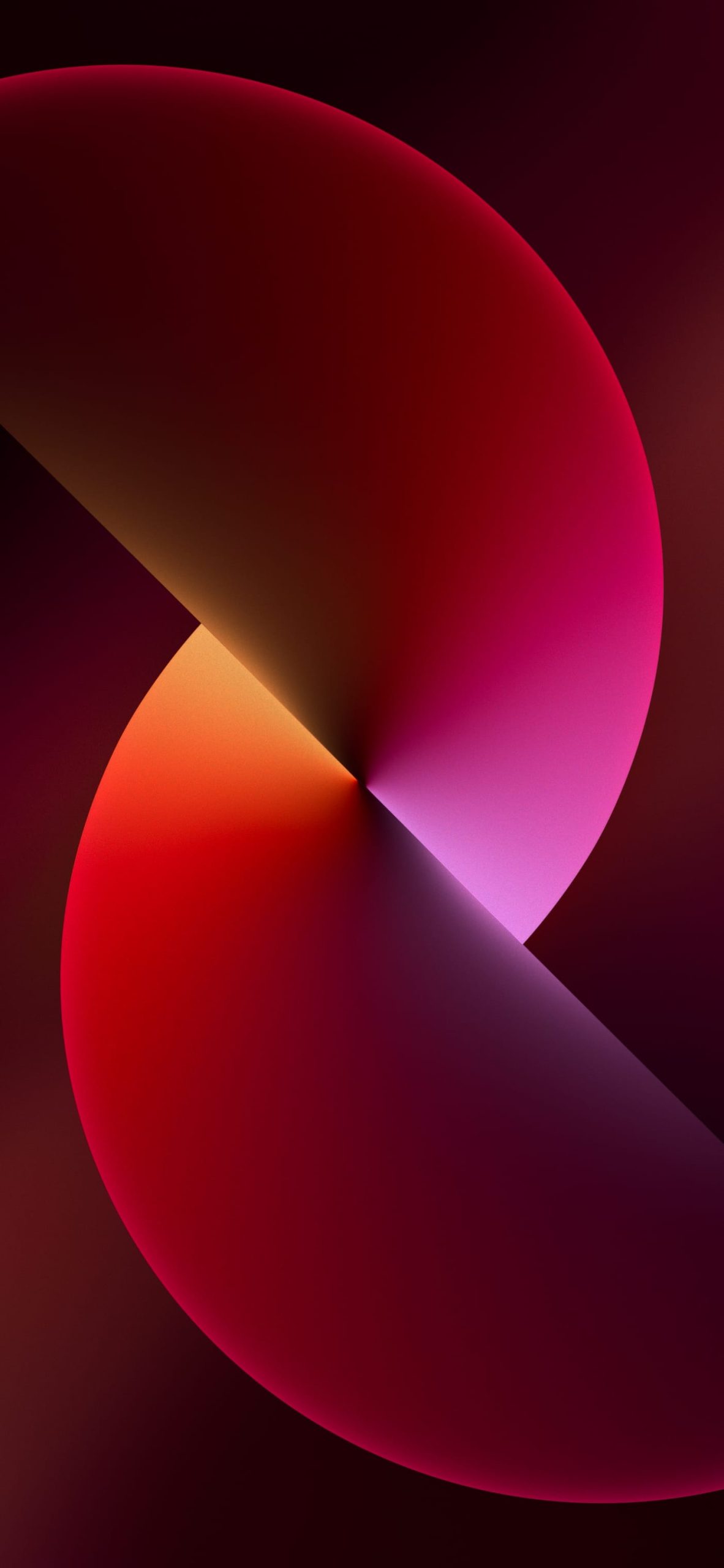
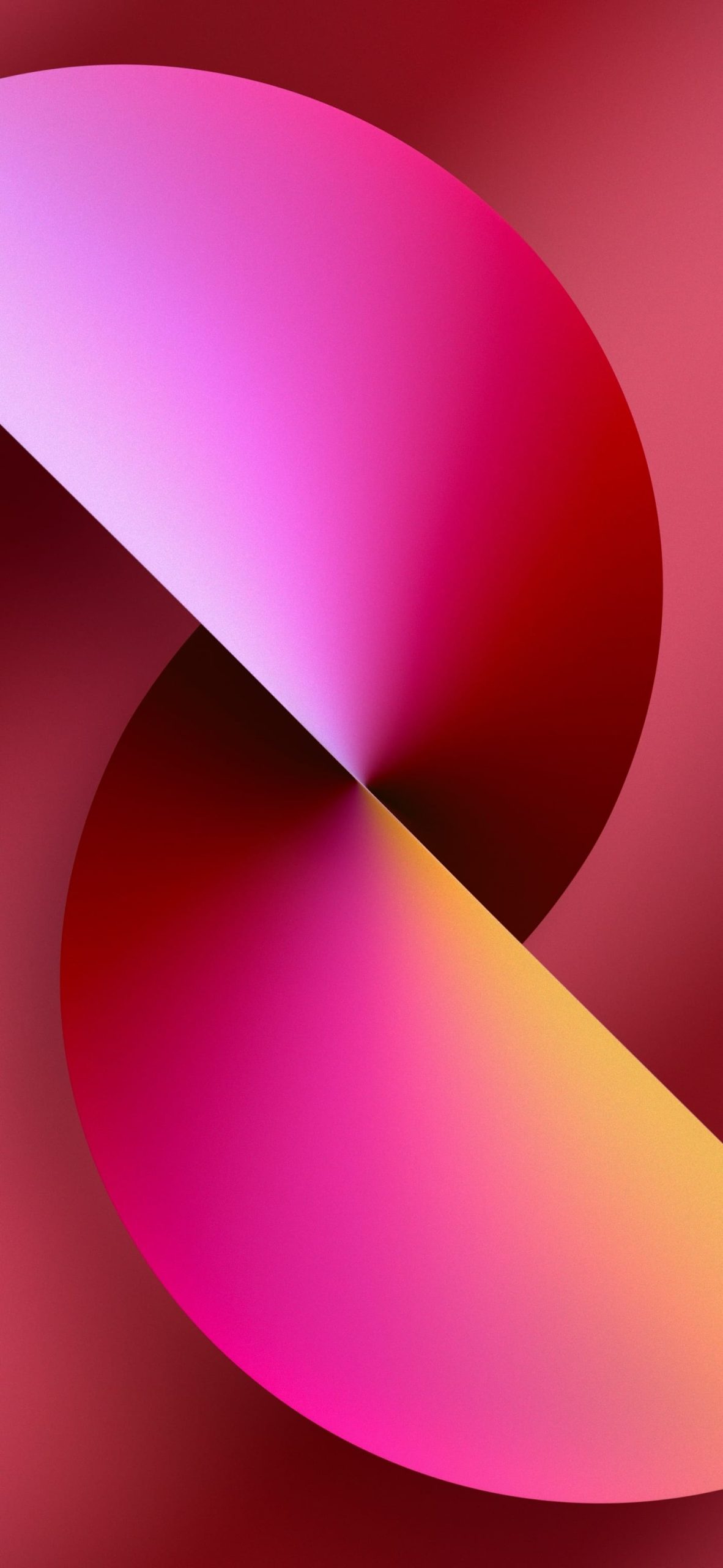
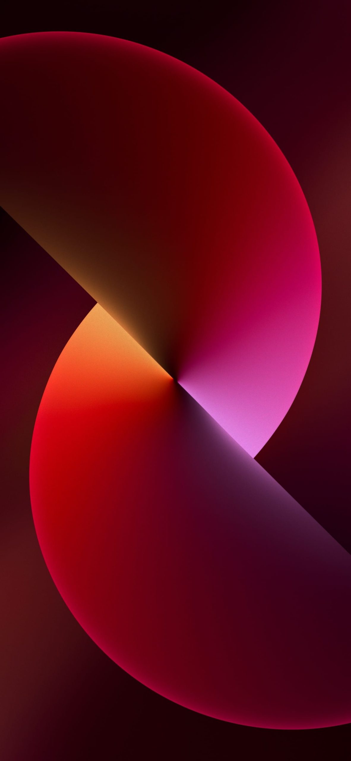
When the iPhone 13 launched, it brought a wallpaper design that ended up outlasting most of the hardware trends around it. Two overlapping spheres, a soft diagonal light beam splitting the colors apart, rendered in a gradient that somehow looks both minimal and dimensional at the same time. It’s become one of the more recognizable default wallpapers Apple has shipped in years, and it still gets downloaded constantly by people who never even owned the phone it came with.
Why this particular wallpaper stuck around
Apple’s default wallpapers usually get replaced in public memory the moment the next model ships. The iPhone 13 set is an exception. Part of that comes down to how well it was designed for iOS itself: the two-sphere composition creates a natural diagonal split that keeps the top third of the screen relatively open for the clock, while the bottom half carries more color and visual weight, balancing nicely against the dock.
The other part is the color system behind it. Apple didn’t just make one wallpaper — it built the design as a template and reissued it in a different palette for every finish the iPhone 13 shipped in: Blue, Pink, Starlight, Midnight, and later Green. Each variant keeps the same geometric structure but shifts the gradient completely, so the wallpaper doubles as a way to match your lock screen to your actual phone color, something surprisingly few default Apple wallpapers do this precisely.
Understanding the full official set
The official collection isn’t just five images — each colorway ships with both a light and dark mode version, and most also include a separate “mobile” variant optimized specifically for iPhone’s aspect ratio versus a slightly different desktop-oriented crop. That adds up to a fairly large set once you count every combination:
- Blue — the flagship colorway, cool cyan-to-navy gradient with a pink accent streak.
- Pink — warmer tones, shifting from soft blush to deep magenta.
- Starlight — the most neutral of the set, pale golds and warm off-whites rather than saturated color.
- Midnight — dark, moody purples and near-blacks, closest to a true dark-mode-first design.
- Green — added slightly later to match the Alpine Green finish, cool teal-to-emerald tones.
Light mode versions generally sit on brighter, more saturated backgrounds, while dark mode versions push the background toward black or near-black, letting the gradient spheres glow more intensely against it — closer to how the wallpaper looks on an always-on or dimmed display.
Getting the real files, not a re-upload
Because this wallpaper set is so widely shared, a lot of what circulates online is several generations removed from the original file — recompressed, resized, sometimes even color-shifted slightly from repeated JPEG saves. A few things worth checking before downloading from a random source:
- Look for banding in the gradient. These wallpapers rely entirely on smooth color transitions across the spheres. If you see visible stepping or blockiness in the gradient rather than a clean blend, the file has already been compressed multiple times.
- Match resolution to your device. The mobile-optimized crops are built for iPhone’s specific aspect ratio; a desktop-oriented version stretched to fit a phone screen will look subtly off, usually with the sphere intersection point sitting in the wrong spot relative to the screen’s center.
- Check light vs. dark carefully before setting it. Some of these colorways look similar enough at a glance that it’s easy to grab the wrong mode — worth double-checking against your system’s actual appearance setting rather than assuming.
- Prefer PNG or a high-bitrate JPEG for the darkest colorways. Midnight and the darker variants are the most prone to visible compression artifacts since dark backgrounds show banding more obviously than bright ones.
Using them beyond the iPhone 13
Because the design maps so cleanly onto any Retina-class display, this wallpaper set has become common well outside its original context — iPads, MacBooks, even Android phones running custom launchers, since the layout translates reasonably well across most modern aspect ratios. If you’re chasing a matched look across multiple Apple devices, using the same colorway across an iPhone, iPad, and Mac is a simple way to keep things visually consistent without hunting down a different wallpaper for each.
Final thought
Most default wallpapers exist to fill a blank screen for the first five minutes before someone replaces them. The iPhone 13 set broke that pattern by giving people an actual reason to keep it around — genuine design intent, a full color system tied to the hardware, and light/dark variants that hold up well years after the device itself became a previous-generation phone. Whether you’re setting up an actual iPhone 13, restoring an old backup, or just want the exact wallpaper without a compressed copy, tracking down the original files is worth the small extra effort.
Explore More:
- Download Official iPhone 17e Wallpapers in 4K | New Floral Glass Collection
- Official iPhone 16 Wallpapers [Free High-Res Download]
- Official iPhone 16 Pro Wallpapers [Free High-Res 4K Download]
- Download Official iPhone 17 Stock Wallpapers (Original Quality)
- Official iPhone 17 Pro Wallpapers [Free High-Res 4K Download]
- Download Official iPhone Air Wallpapers in Full 4K Resolution
- iPhone 15 Pro Wallpapers | Download 4K & HD Titanium Backgrounds
- iPhone 14 Pro Stock Wallpapers | Download Official 4K & HD
- iPhone 14 Stock Wallpapers (Official 4K HD) – Free Download