Apple WWDC26 Wallpapers: Vibrant 4K Lock Screen Picks
Every year, Apple’s Worldwide Developers Conference brings more than new software announcements — it brings a fresh wave of visual identity that quickly makes its way into fan-made and official-style wallpapers. Apple WWDC26 wallpapers carry on that tradition, built around the bold, colorful, abstract design language Apple has used for its keynote branding in recent years. This guide covers what defines the WWDC visual style, the key design elements to look for, how to judge image quality on modern displays, and how to set these wallpapers up properly on your iPhone or Mac.
What Defines the WWDC Visual Style
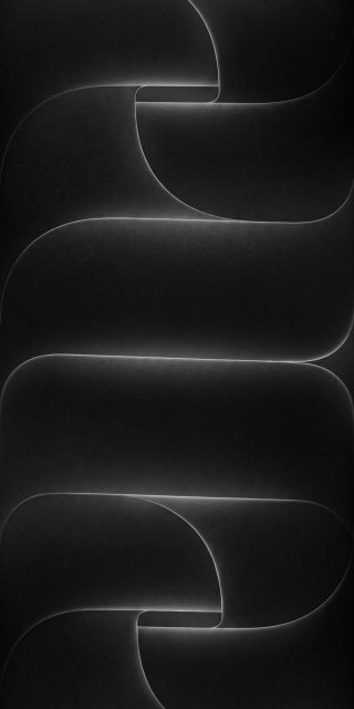
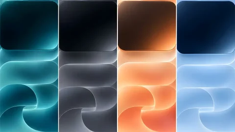
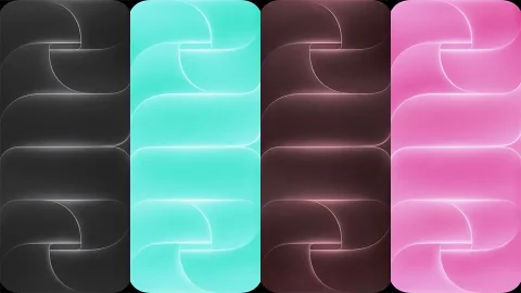
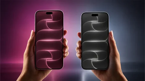
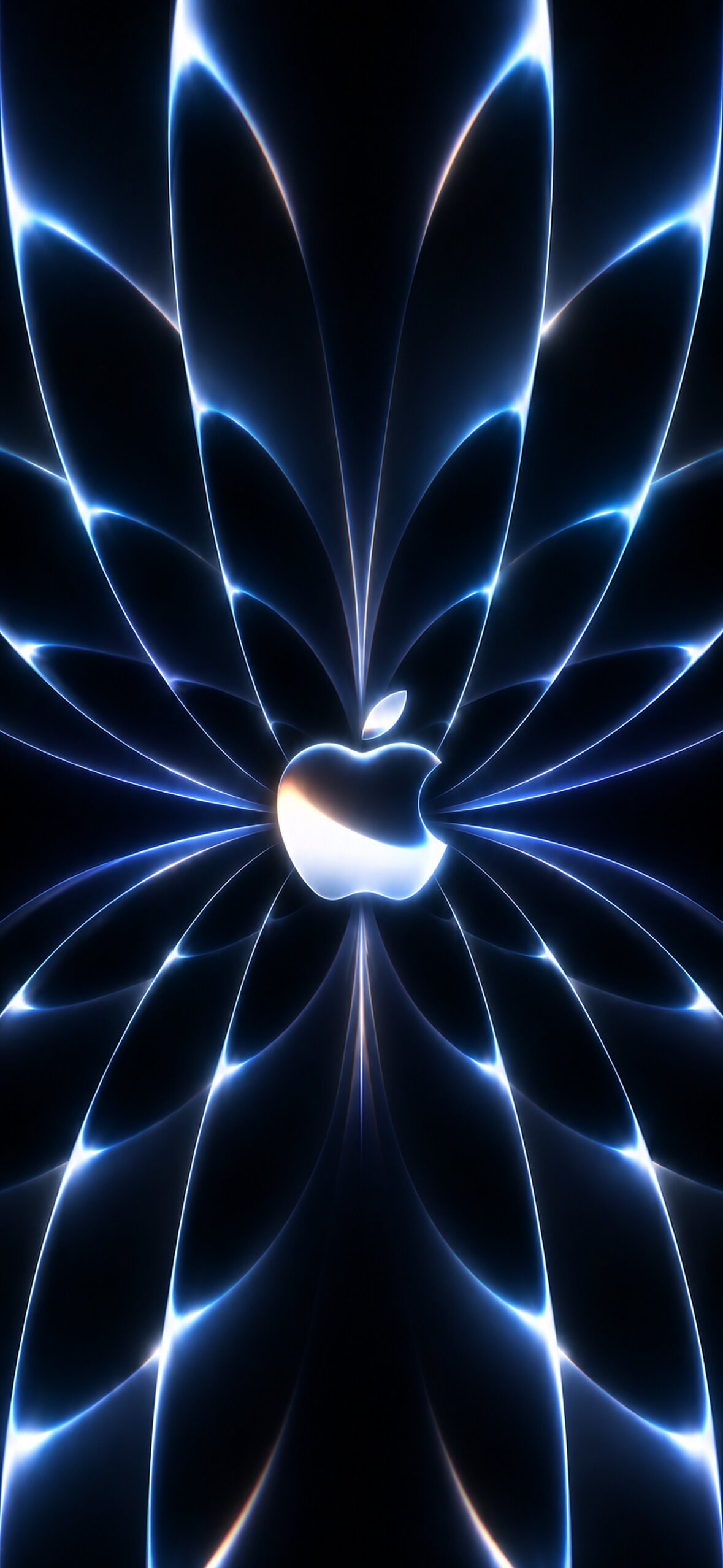
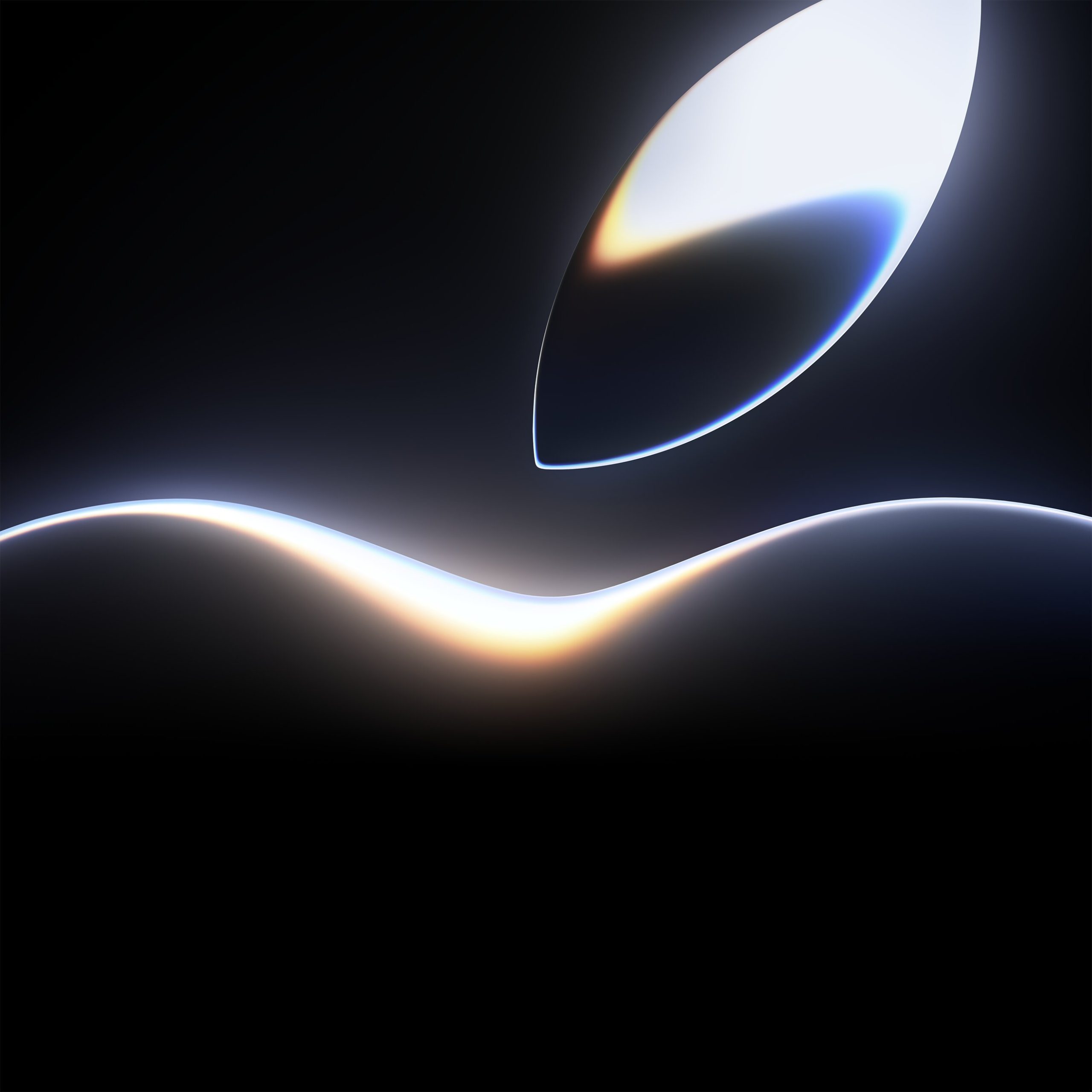
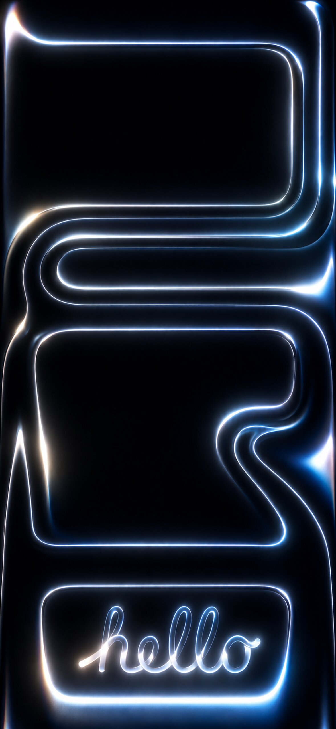
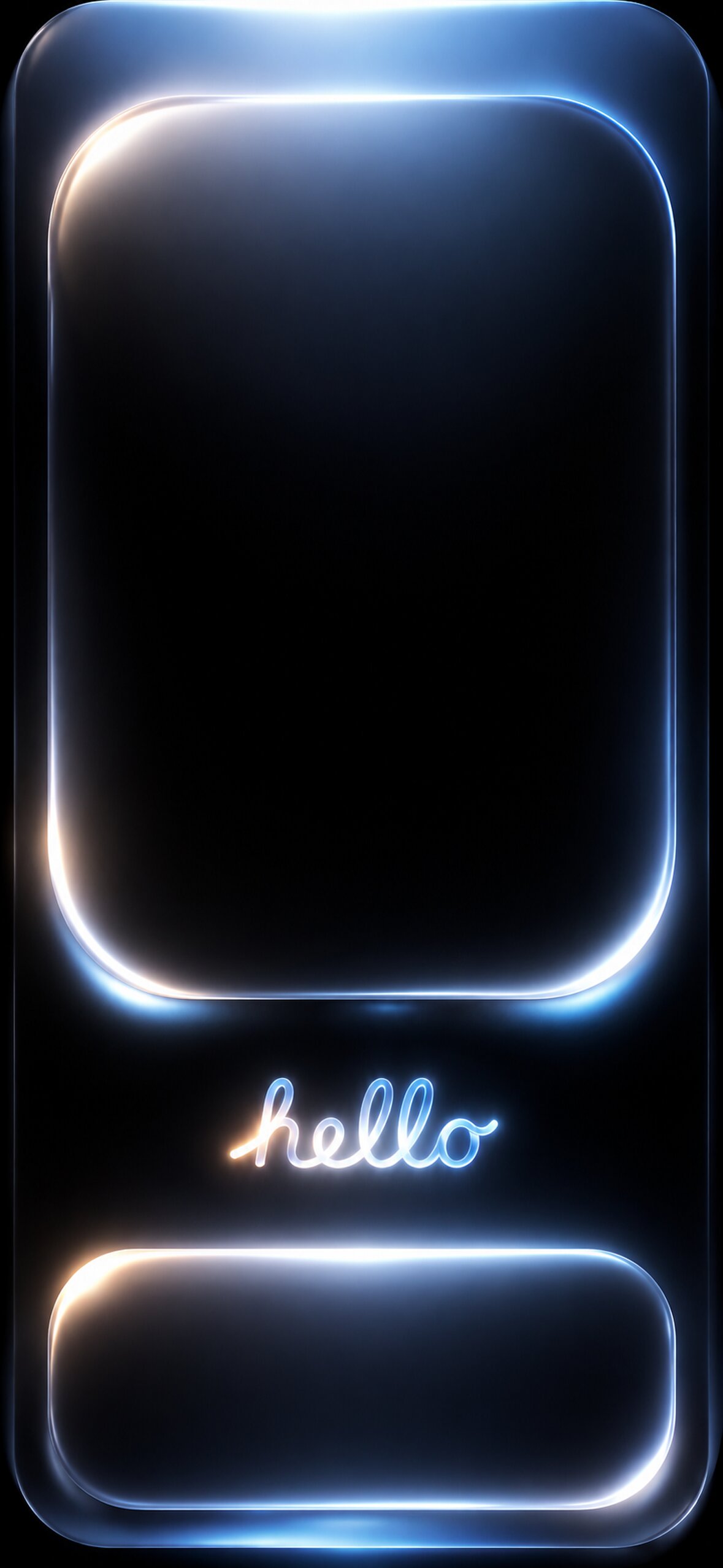
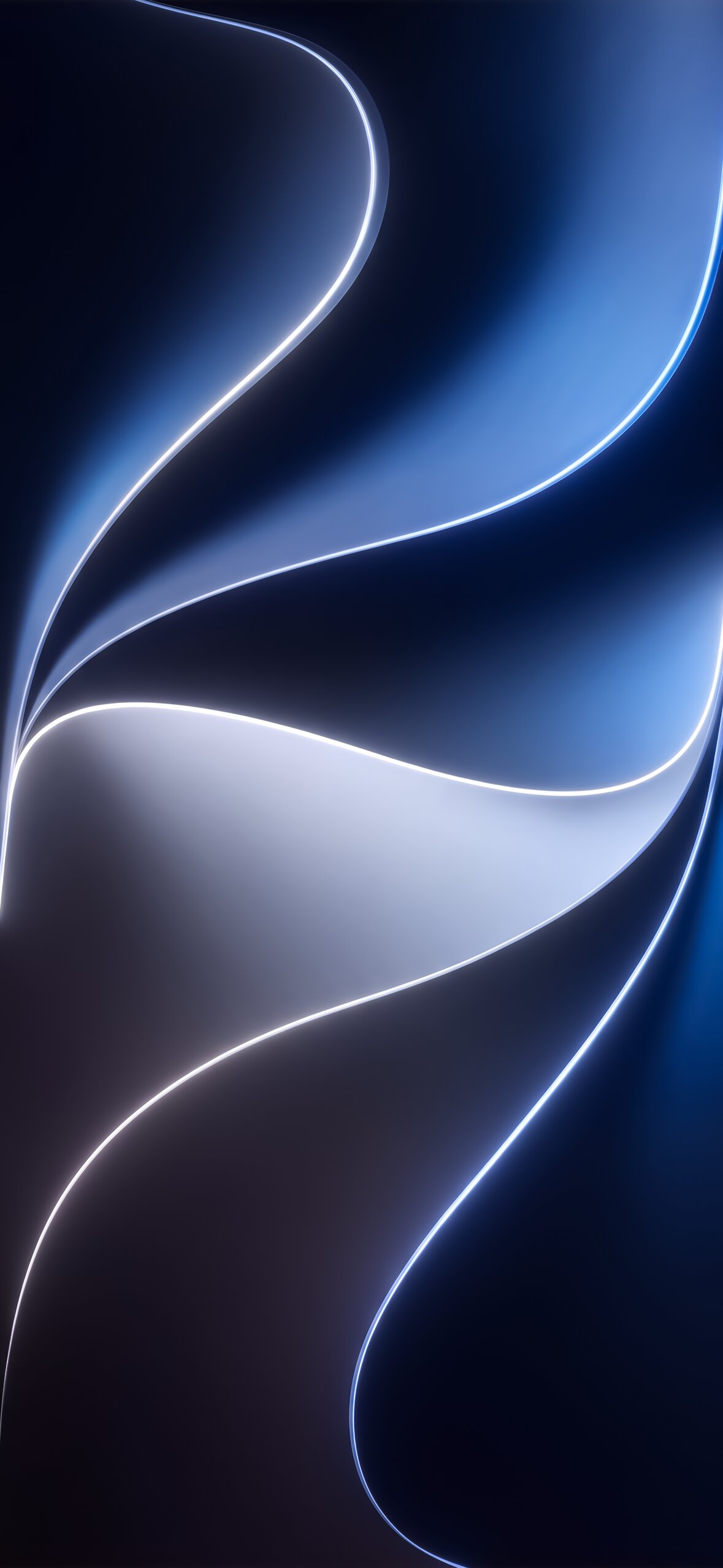
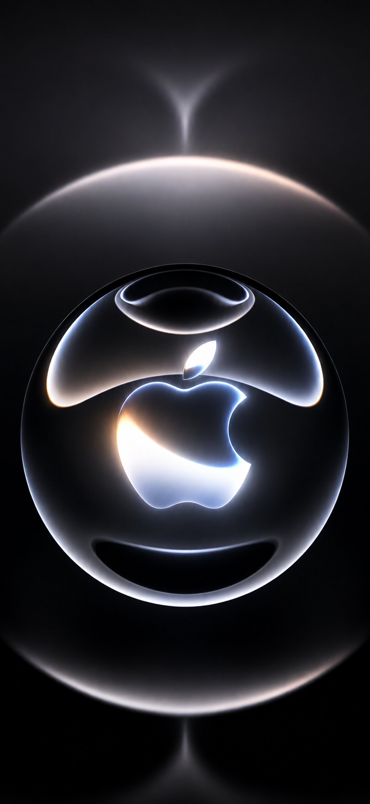
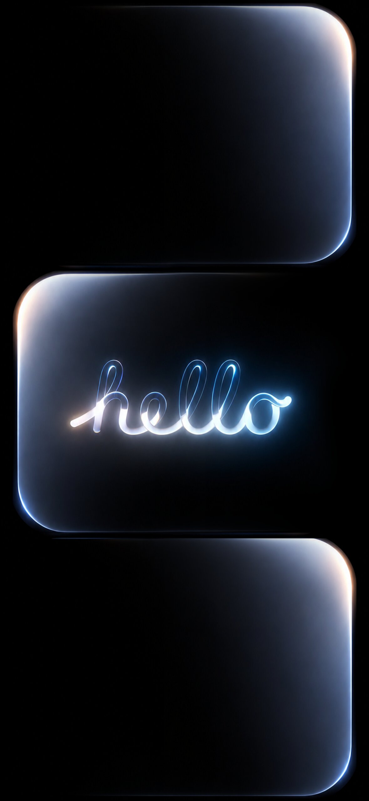
Apple’s WWDC branding has evolved into a recognizable aesthetic of its own over the past several years: fluid, ribbon-like shapes in saturated, multi-tone gradients, often rendered with a glossy, almost liquid-metal quality. Rather than photographic imagery, this style leans entirely into abstract digital art — sweeping curves, layered translucency, and color transitions that shift smoothly from one hue to the next across the frame.
This visual language serves a specific purpose for Apple: it’s energetic and forward-looking without referencing any specific product, which makes it flexible enough to represent an event covering everything from iOS to macOS to spatial computing. Wallpapers inspired by this aesthetic borrow that same energy, making them popular with developers, designers, and general Apple fans alike, whether or not they’re actually attending or following the conference itself.
Key Design Elements to Look For
Ribbon and wave forms. The signature shape of WWDC-inspired art is a smooth, twisting ribbon or wave that flows across the frame, often doubling back on itself to create layered depth. These shapes give the eye a clear path to follow, which is part of why the style feels so dynamic even in a completely static image.
Multi-tone gradients. Rather than a simple two-color fade, WWDC-style wallpapers typically blend three or more colors — a shift from deep blue into purple into pink, for example, or green into teal into gold. The transitions are smooth and glossy rather than sharp, giving the image a polished, almost liquid quality.
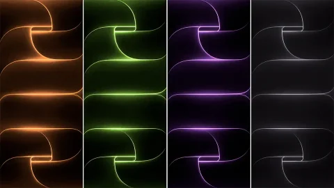
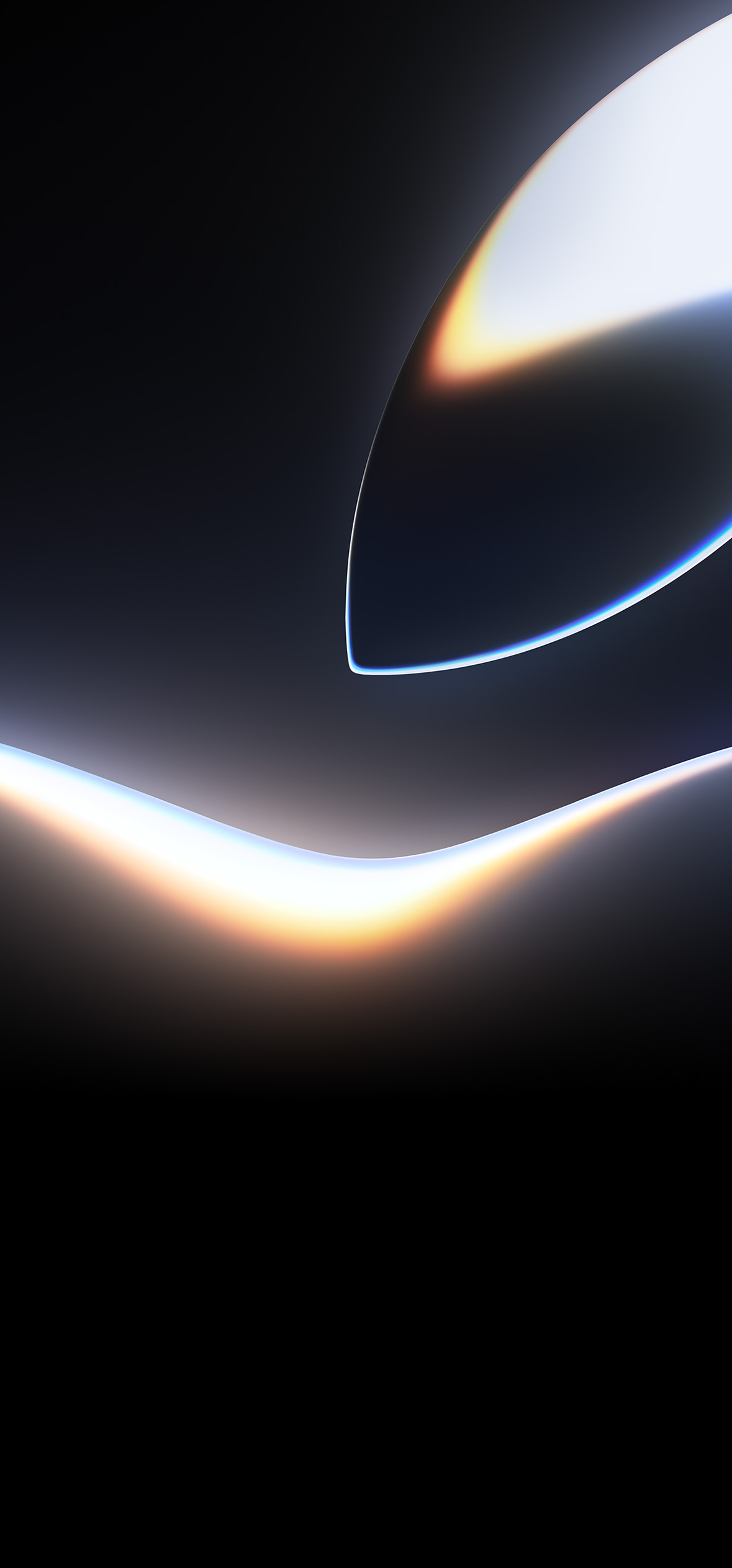
Dark, high-contrast backgrounds. Many WWDC-inspired designs use a black or very dark backdrop, which makes the saturated ribbon colors pop dramatically. This also happens to make these wallpapers well-suited to OLED iPhone displays, where true blacks render with no backlight bleed.
Glossy, reflective highlights. A subtle sheen or light reflection along the curves of the ribbon shapes adds a sense of dimensionality, mimicking the look of polished glass or liquid metal rather than flat, printed color.
Grain and texture overlays. Some designs add a very fine grain texture over the gradient, which helps prevent visible color banding in the smoother areas of the image while also giving it a slightly more tactile, less digitally “flat” feel.
Minimal or absent typography. Unlike quote-based or text-heavy wallpaper styles, WWDC-inspired designs are almost always purely visual, letting the color and shape carry the entire composition without any text competing for attention.
What to Look for in Image Quality
Because this style relies so heavily on ultra-smooth gradient transitions, compression quality is especially important. A heavily compressed JPEG can introduce visible banding — hard lines between color bands that are supposed to blend seamlessly — which immediately undermines the polished, glossy look these designs are going for. Where possible, choose PNG files or high-quality JPEGs specifically labeled as high resolution, since gradient-heavy images are one of the fastest ways to spot low-quality compression.
As with most wallpaper searches, “4K” here refers to overall sharpness and color depth rather than a literal 3840×2160 display resolution, since iPhone and MacBook screens use their own native resolutions. What matters in practice is starting from a high-resolution source file with a long edge of at least 2000–3000 pixels, which gives you plenty of room to crop or scale without introducing visible artifacts in the gradient work.
How to Set a WWDC26 Wallpaper on iPhone
- Save your chosen image to the Photos app.
- Open Settings and tap Wallpaper.
- Tap Add New Wallpaper, then choose Photos.
- Select your image and adjust zoom and position so the main ribbon shape or focal color transition is well-centered.
- Choose whether to apply it to your Lock Screen, Home Screen, or both, then tap Set.
How to Set a WWDC26 Wallpaper on Mac
- Save the image to a folder you’ll remember, such as Pictures.
- Open System Settings and click Wallpaper in the sidebar.
- Click Add Photo, then select your downloaded image.
- Choose Fill Screen for the cleanest full-bleed look with this style of abstract art, since cropping tends to preserve the flowing ribbon shapes better than stretching or fitting.
Styling Tips for a Cohesive Look
- Pair a WWDC-style wallpaper with a dark or translucent Dock and menu bar setting on Mac, since the glossy, dark aesthetic tends to clash with a bright, opaque interface.
- Keep Home Screen widgets minimal on iPhone so the flowing gradient shapes remain the visual focus rather than being broken up by icons and text.
- If you use multiple desktops or Spaces, consider assigning different color variations of the same ribbon style to each one for a cohesive but varied set.
- Match your accent color settings (where customizable) to one of the dominant tones in your chosen wallpaper for a more unified system-wide look.
Final Thoughts
Apple WWDC26 wallpapers capture a distinctive, instantly recognizable aesthetic — bold ribbon shapes, glossy multi-tone gradients, and a dark, dramatic backdrop that looks especially striking on modern OLED displays. Whether you’re a developer who follows the conference closely or simply drawn to the polished, futuristic look, choosing a high-resolution, well-compressed image will make sure the smooth gradient work that defines this style renders exactly as intended on your device.
Explore More
- iOS 27 Liquid Glass Wallpapers for iPhone (4K) – Free Download
- Premium iPhone Air 4K Stock Wallpaper Collection in Green, Orange & Red
- Apple Logo Wallpapers: Best 4K, OLED & Aesthetic Backgrounds
- 18 Free “Hello” iPhone Wallpapers — Neon, Gradient & Glass Style
- Download Official iOS 27 Wallpapers | 4K & Ultra HD Mobile Pack
- 10 Free HD Apple Pride iPhone Wallpapers & iOS Setup Guide